
Write something
Pinned

5d •
WELCOME TO #1000!!!
We just had our 1000th member join, and I am so excited to say it's @Brian Hall Watch your mailbox because @Angela Jones is going to reach into her swag closet and send you a little something extra for being the 1000th person to join Author Lab!! Not to sound creepy ... but we have your address, so no need to do anything. 😁 We are so excited about this community and we're deeply grateful to everyone for your participation and sharing. The members are what make this special and valuable.


2d •
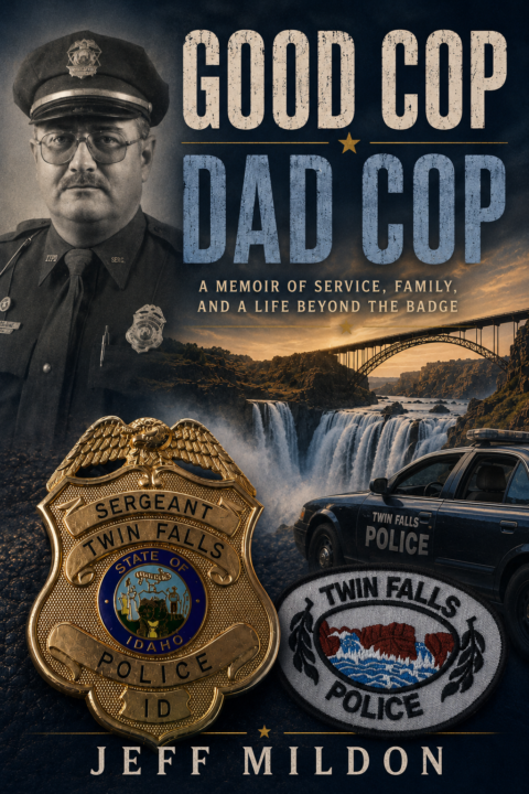
Thoughts on cover
My last 2 published projects were sci-fi novels, and now I am back to NonFiction. My latest project is a biography of my father. Here is a snippet about the book. I would love any feedback on the cover. Thanks! Good Cop Dad Cop is the true story of Sergeant Jim Mildon, a beloved Twin Falls, Idaho police officer whose greatest legacy wasn't the badge he wore—it was the lives he touched. Part biography, part small-town history, and part collection of unforgettable stories, the book follows Jim from his mischievous childhood in the 1950s and 60s, through military service, ambulance work, and a 31-year career with the Twin Falls Police Department. Along the way are humorous pranks, dangerous police calls, championship coaching seasons, acts of quiet generosity, and countless moments that earned him the respect of an entire community. Told through the eyes of family, friends, fellow officers, and the people whose lives he changed, Good Cop Dad Cop is ultimately about character, service, fatherhood, and the lasting impact one ordinary man can have on an extraordinary number of people. It is a celebration of a life well lived and a reminder that the greatest measure of success is the difference we make in the lives of others.

2d •
Pricing
Would the goal be to have your Ingram retail price and your Amazon retail price the same, except for maybe temp changes to Amazon price if you want a short term sale?
2d •
Ingram paper
For my book about treating digital addiction, I want it to be professional looking. Should I choose the 70lb paper? I don't want there to be any see-through that might happen with the 50lb. What has been your experience?
5d •
The Challenge We've Found with AI Facts
They SOUND SO TRUE .... but they often are just a tiny bit false! And that is the problem.
1-30 of 1,115
skool.com/selfpublishingbooks
Community for nonfiction authors writing, self-publishing, and marketing books to grow their brand and business.
Leaderboard (30-day)
1

+123
2

+114
3

+95
4
+88
5

+87
Powered by