Activity
Mon
Wed
Fri
Sun
Mar
Apr
May
Jun
Jul
Aug
Sep
Oct
Nov
Dec
Jan
What is this?
Less
More
Memberships
Non-Fiction Author Lab
712 members • Free
9 contributions to Non-Fiction Author Lab

3d •
HELLO EVERYONE
Hey , Im Allison and glad to be in the midst of you all. Let us grow together and share experience

0 likes • 7h
We are glad to have you here as part of the community Allison. You will find support and friendship in this group, you already have. :)

0 likes • 19h
@George James Going by your avatar it appears that you are a spiritual thinker Geroge. In the book I am currently publishing, I wrote extensively about King Nebuchadnezzar of Babylon and his staff of spiritual advisors. Interesting and relevant material.
0 likes • 7h
@Koli Cutler Wow, those are two great questions Koli, and thank you for asking. What is in my heart is a love for all people, and a desire through what God has invested in me to share the grace that I have been given, as I have been rescued out of many things in my life. What is in my book is the True Story of a Judaen teenager taken captive by King Nebuchadnezzar of Babylon, who through faith and blessing rose to great power in that strange and foreign land. His name was Daniel, and the spiritual visions of future events that he received prove with pinpoint accuracy the validity of Biblical prophecy, much of which is unfolding in the time that we live. God gave me a clear roadmap to write this book for the benefit of all who will read it with an open heart. "DANIEL THE PROPHET, SERVANT OF GOD IN A STRANGE LAND" I will be running a pre-order campaign on Amazon beginning in a couple of days. My target date to publish is 2/28, and those who order in advance can receive a portion of the manuscript in a PDF. Just let me know in chat that you have taken up my offer. I would appreciate honest reviews of this work as well... It if for all of you that I have devoted myself to writing, so get in touch and let's be friends! Sincerely, Gerard Troise

2d •
Hi!
Hello! I've been on here for a few months. I just wanted to greet everyone for the first time.
1 like • 1d
Hello Atiba, it is good to receive your greeting. You will find that this community is very supportive.
3d •
The Fickleness Of Formatting; (Can I Get A Witness?)
Ok, so you've ingenuously woven together the plot of your amazing book, working tirelessly into the wee hours of the morning pouring your heart and soul into every last line. When your story is complete, you do multiple revisions, making sure that your wording and grammar are completely polished and publish ready... But then, us indie authors have the "fun" task of perfectly formatting our books to meet with professional publishing standards. For my first book, I used Kindle Create, which is a simplistic formatting tool. (of course I needed to use their default font, which came out terribly light on the page after publishing, not to mention that my chapter 1 began on page 2.) I am now at this critical juncture once again with my 2nd book, and I do not wish to rely on Kindle Create for this one... What do some of you folks use to correctly mirror your pages and to place your headers and footers so that they are elegant and your roman numerals are correct? (ii for copyright, v for TOC with other front matter correctly unnumbered.) I've typed everything out on microsoft 365, and they don't even have a means to mirror pages... Please share your thoughts, and your well appreciated tips with me. :)
2 likes • 3d
@Jared R. Henderson Excellent response Jared, I'm glad that you can relate to this. (It's good to know we are not alone in our battle!) I actually tried Attticus's free subscription, but couldn't even find my manuscript on their website after loading it up... Another thing that makes this book a bit more challenging is that I have an extensive reference section at the end... 110 historical references with superscripts throughout the text. Many of the free and more simple formatting tools do not even have the means to handle a book with these features, but Bless God, I've gotten this far, so this too shall pass. Maybe some of our other team members can weigh in on this one as well. Blessings!
1 like • 2d
@Bruce Wayne Thanks for sharing Bruce; 800 pages is a lot of dedication! Mine is just under 300, and yet, this step that I thought would be simple has turned out to be a real conundrum. One program inflates my file, throwing off all my line spacing, another misaligns all justified text boxes and on and on. Since this manuscript contains some sensitive material that is controversial to some people, (Biblical Prophecy), I really wanted to do all my own formatting, as I did my own edits through 6-7 careful revisions to polish the text. I finally broke down and hired 200 Covers to handle this task, as their reviews for this are very positive. If they do a professional job for me, while preserving the integrity of my entire manuscript, the price will have been worth it. My next move is the pre-launch. If anybody reading this thread has good advice as to how to go about this successfully, please share your tips with me. Gerard

10d •
Movie Rights?
Great news, everyone! Be a Nerd That Talks Good is going to get turned into a movie! Jennifer Lawrence, a Cinematic Director at Film 14 and Apple Studios, just reached out to tell me that my book has "cinematic potential!" I guess you'd better jump on the bandwagon and buy the book now, so you can say you knew me before my big fame blow-up! 😂
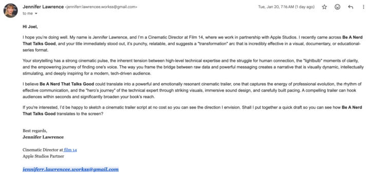
1 like • 3d
I'm sure that Jennifer will take excellent care of you for a small upfront fee.
1-9 of 9
@gerard-troise-4507
Hello friends, my name is Gerard Troise and I was born in New York City. I am a dedicated Christian who has written a book on end-time prophecy.
Active 7h ago
Joined Jan 26, 2026
Powered by