Activity
Mon
Wed
Fri
Sun
Jun
Jul
Aug
Sep
Oct
Nov
Dec
Jan
Feb
Mar
Apr
May
What is this?
Less
More
Memberships
Oil Painting Academy Online
56 members • $15/month
Painters Hub
7.9k members • Free
Landscape Painters Group
1.1k members • $9/m
359 contributions to Painters Hub

19h •
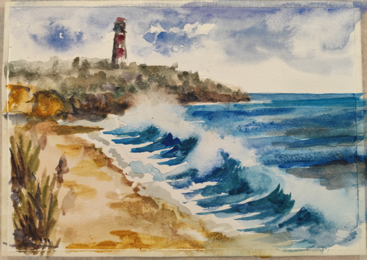
Quick one
@Peggy Bishop it was a fun. Thanks. Not very happy with the result but at least I made it within video duration. Kind of sketch, good idea for watercolor plein air. BTW, it's made with extremely cheap but surpisingly usable for a price Crelando watercolor kit from Lidl on the cheapest Daler Rowney Aquafine watercolor paper.
1 like • 18h
@Peggy Bishop yes, this paper is cellulose. Expensive paper behaves a lot different, epecially cold pressed. I don't think I would be able to paint this splash on the same paper it's done using backwashes
0 likes • 1d
@Shane Larkin thanks
0 likes • 23h
@Patrick McSherry thank you
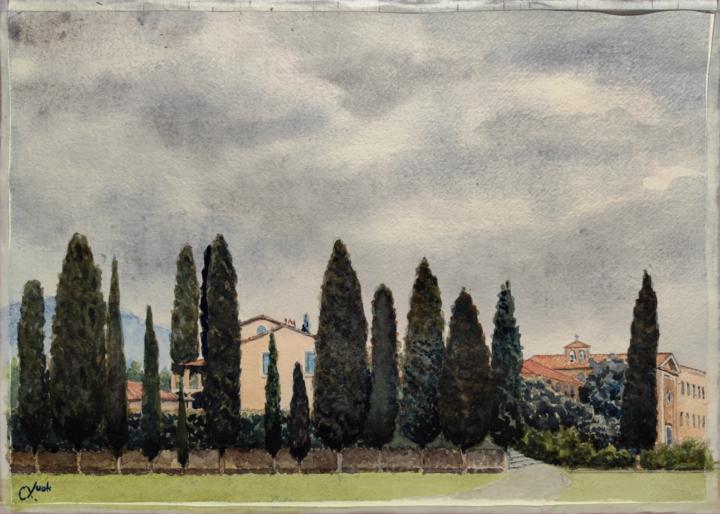
6d •
Yet another Tuscany puzzle.
Also watercolor, cold pressed paper. This one probably not that easy to guess, but there is an extremely famous building to the right from viewer who actually stays just next to that building.
1 like • 4d
@Shane Larkin Are you sure you posted in this group? Can't see any
0 likes • 2d
@Scott Ribbel thank you
3d •
A thought
It just occurred to me (to be totally honest, while looking at Shane's work- yikes, thanks Shane 🤣) that I can never be as skilled as some of you are. But that's not the point, is it? To me, the point is that each of us is driven by some inner desire to create and share what we see. We can all improve, and it's so fantastic that we do. But at a fundamental level, we're all artists, with artistic minds. And those are the types of folks that I connect with, whether I've met them face to face or not. OK, sorry for the interruption. Carry on.
1 like • 3d
Very well said 👍

3d •
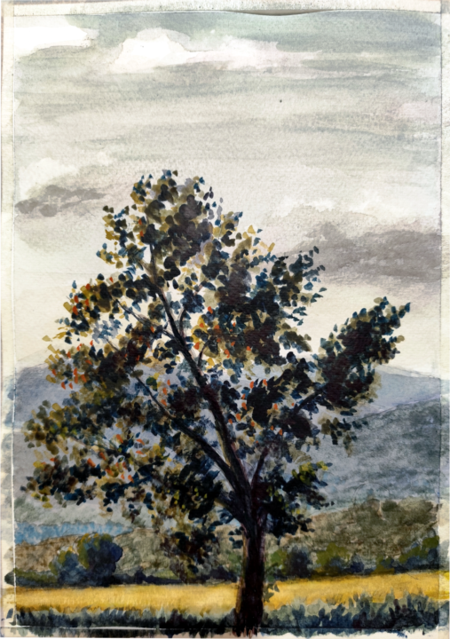
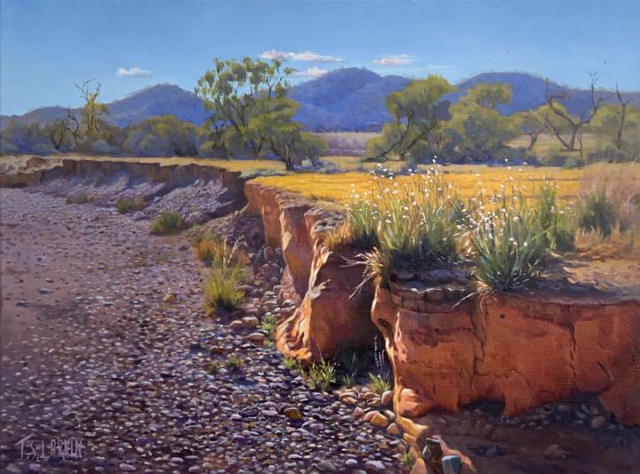
A couple of my 2025 favourites
@Mak Olvik has prompted me to post a couple of my landscapes on 'Painters Hub' so here are four of my 2025 favourites from our annual exhibition based on the Flinders Ranges, South Australia.
2 likes • 3d
@Shane Larkin I bet sheeps is the latest, I've not sen it yet 👍
1-10 of 359
@mak-olvik-2970
self taught amateur artist.
"Anything under the sun is beautiful if you have the vision - it is the seeing of the thing that makes it so"
Active 18h ago
Joined Apr 29, 2024
INTP
Powered by