Activity
Mon
Wed
Fri
Sun
Jun
Jul
Aug
Sep
Oct
Nov
Dec
Jan
Feb
Mar
Apr
May
What is this?
Less
More
Memberships
Painters Hub
7.9k members • Free
116 contributions to Painters Hub

1d •
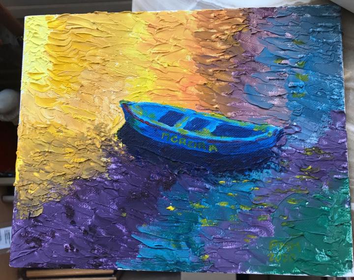
Quick one
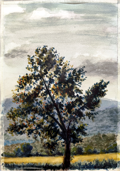
@Peggy Bishop it was a fun. Thanks. Not very happy with the result but at least I made it within video duration. Kind of sketch, good idea for watercolor plein air. BTW, it's made with extremely cheap but surpisingly usable for a price Crelando watercolor kit from Lidl on the cheapest Daler Rowney Aquafine watercolor paper.
0 likes • 1d
I think you really captured the moment. I would be pleased if
0 likes • 1d
I did that as well.
3d •
A thought
It just occurred to me (to be totally honest, while looking at Shane's work- yikes, thanks Shane 🤣) that I can never be as skilled as some of you are. But that's not the point, is it? To me, the point is that each of us is driven by some inner desire to create and share what we see. We can all improve, and it's so fantastic that we do. But at a fundamental level, we're all artists, with artistic minds. And those are the types of folks that I connect with, whether I've met them face to face or not. OK, sorry for the interruption. Carry on.
2 likes • 1d
That’s a great comment! I try not to judge my work against the work of others, especially with the many great artists here. I’m a hacker, but I enjoy it, and the paintings mean something to me. Hopefully I will improve over time. In the meantime I am inspired by the work of others and find myself zooming in to see how they created a certain effect. It is great to have a supportive community of artists. I usually have been out here working alone with little feedback (I do get the occasional “that’s nice!” From a family member, which is good but not very helpful). I will miss this!

4d •
A couple of my 2025 favourites
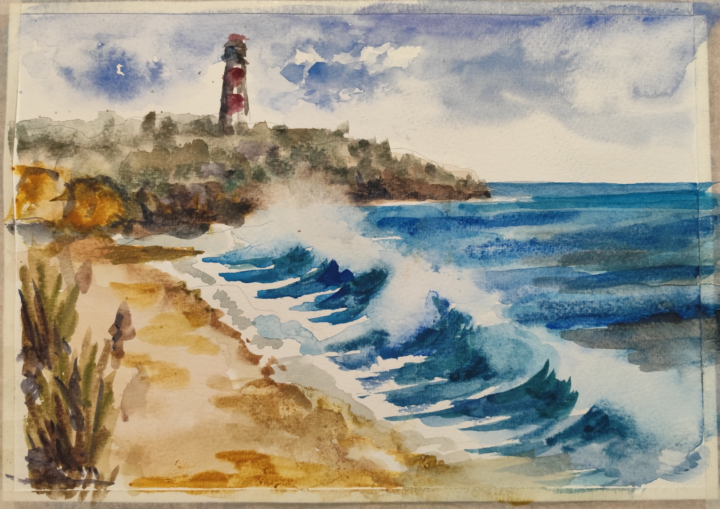
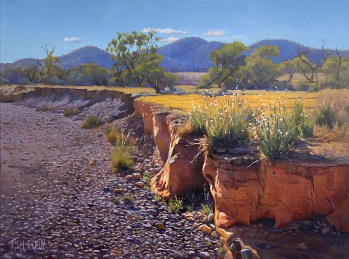
@Mak Olvik has prompted me to post a couple of my landscapes on 'Painters Hub' so here are four of my 2025 favourites from our annual exhibition based on the Flinders Ranges, South Australia.
0 likes • 1d
Fantastic! This is great work. Congratulationss!
2d •
A few last shares
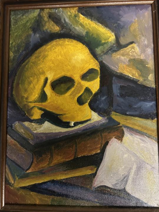
I thought I would share two paintings. I never had any painting classes or worked with other painters…Just no opportunity to do so. I started by copying from others to learn something of the art. I was convinced to start painting by an older friend who I saw a few times a year. He started painting in a period of depression following the death of his son. As I was going through a difficult I decided to give a try and found it very therapeutic (if I painted in the evening, I slept better)! Anyhow, the first painting below is my first attempt at painting. It is a detail from, if memory serves, a Cezanne. The second painting was my best attempt at portraiture, being a slightly more impressionistic version of a small photo of a painting of Johann Strauss, II I found in a book. I am considering signing up for Sam’s landscape painting school, as with some actual training I think I could greatly improve. My landscape have improved remarkably just by following his online videos. The problem is time (and, of course, cost). Time will tell. I will actually have some time off to ponder it this weekend (a holiday weekend here in the U.S.). What have people’s experiences been with the actual classes? I am sure they are good.
1 like • 2d
Nicely done!
1-10 of 116