
Write something

Aug '25 •
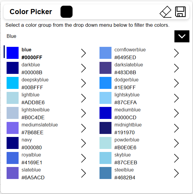
Color Picker Component
I created a component to have a color picker with the web safe colors in it. It has a drop down menu selection to filter the color groups by. In the header there is also a gallery showing the selected colors that have been selected. Here is the code: ComponentDefinitions: comp_ColorPicker: DefinitionType: CanvasComponent AllowCustomization: true CustomProperties: CPBackgroundColor: PropertyKind: Input DisplayName: CP Background Color Description: CP Background Color DataType: Text Default: ="#ffffff" CPBorderRadius: PropertyKind: Input DisplayName: CP Border Radius Description: CP Border Radius DataType: Number Default: =10 CPDropShadow: PropertyKind: Input DisplayName: CP Drop Shadow Description: CP Drop Shadow DataType: Text Default: =DropShadow.Regular CPFont: PropertyKind: Input DisplayName: CP Font Description: CP Font DataType: Text Default: =Font.Arial CPFontSize: PropertyKind: Input DisplayName: CP Font Size Description: CP Font Size DataType: Number Default: =18 CPFontWeight: PropertyKind: Input DisplayName: CP Font Weight Description: CP Font Weight DataType: Text Default: =FontWeight.Semibold CPForegroundColor: PropertyKind: Input DisplayName: CP Foreground Color Description: CP Foreground Color DataType: Text Default: ="#000000" CPGap: PropertyKind: Input DisplayName: CP Gap Description: CP Gap DataType: Number Default: =10 CPLabelText: PropertyKind: Input DisplayName: CP Label Text Description: CP Label Text DataType: Text Default: ="Color Picker" CPPadding: PropertyKind: Input DisplayName: CP Padding Description: CP Padding DataType: Number Default: =10 ColorPickerChosenColors: PropertyKind: Output DisplayName: Color Picker Chosen Colors Description: A custom property DataType: Table ColorsTable: PropertyKind: Input DisplayName: Colors Table Description: Colors Table DataType: Table Default: |- =Table( {ColorName: "aliceblue",HexCode: "#F0F8FF",RGBCode: "RGBA(240,248,255,1)",ColorGroup: "White"}, {ColorName:"antiquewhite",HexCode:"#FAEBD7",RGBCode:"RGBA(250,235,215,1)",ColorGroup:"White"},
3
0
Aug '25 •
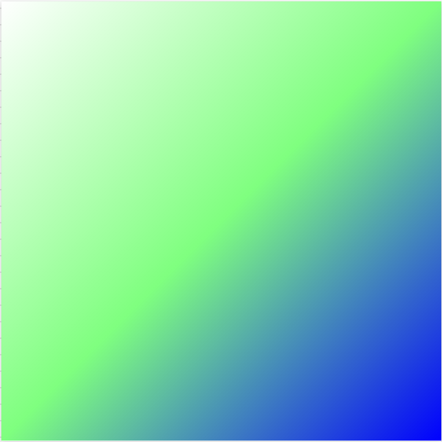
Gradient Component Code
All, I created a Power Apps Component with a gradient to use as an editable background. It has 3 color choices and three transparency choices. It also has horizontal and vertical selections so it can be edited to have it up and down or diagonal based on user selection. Here is the code: ComponentDefinitions: comp_GradientBackground: DefinitionType: CanvasComponent AllowCustomization: true CustomProperties: Color1: PropertyKind: Input DisplayName: Color 1 Description: Color 1 DataType: Text Default: ="#ffffff" Color2: PropertyKind: Input DisplayName: Color 2 Description: Color 2 DataType: Text Default: ="#00ff00" Color3: PropertyKind: Input DisplayName: Color 3 Description: Color 3 DataType: Text Default: ="#0000ff" GradientHeight: PropertyKind: Input DisplayName: Gradient Height Description: Gradient Height DataType: Number Default: =640 GradientWidth: PropertyKind: Input DisplayName: Gradient Width Description: Gradient Width DataType: Number Default: =640 HorizontalDirection: PropertyKind: Input DisplayName: Horizontal Direction Description: Horizontal Direction DataType: Text Default: ="right" Transparency1: PropertyKind: Input DisplayName: Transparency 1 Description: Transparency 1 DataType: Text Default: ="00" Transparency2: PropertyKind: Input DisplayName: Transparency 2 Description: Transparency 2 DataType: Text Default: ="80" Transparency3: PropertyKind: Input DisplayName: Transparency 3 Description: Transparency 3 DataType: Text Default: ="FF" VerticalDirection: PropertyKind: Input DisplayName: Vertical Direction Description: Vertical Direction DataType: Text Default: ="bottom" Properties: Height: =comp_GradientBackground.GradientHeight Width: =comp_GradientBackground.GradientWidth Children: - contGradientBackground: Control: GroupContainer@1.3.0 Variant: AutoLayout Properties: DropShadow: =DropShadow.None Height: =Parent.Height LayoutDirection: =LayoutDirection.Vertical RadiusBottomLeft: =0 RadiusBottomRight: =0 RadiusTopLeft: =0 RadiusTopRight: =0 Width: =Parent.Width
1
0

Jul '25 •
Pro-grade React, safely locked inside Power Apps!
https://www.youtube.com/watch?v=KlLU3znaWLQ Code Apps give pro developers the freedom of a full-stack React project while letting the organization keep the governance, compliance, and low-code acceleration all in the Power Platform.
Jun '25 •
Enhanced Component Properties, User Defined Functions, and UntypedObjects on the move
Enhanced Component Properties, User Defined Functions, and UntypedObjects on the move - Microsoft Power Platform Blog Enhanced Component Properties (ECP) are now generally available (GA) User defined functions (UDF) have entered preview! UntypedObject becomes Dynamic

Oct '24 •
Syncfusion components integrated with PowerApps
One year ago, I integrated a Syncfusion DataGrid component with a PowerApps application. While it offered some unique features, it also presented challenging errors. Therefore, I requested Syncfusion to integrate some of the most crucial components, which they have done now. 👋 The following components are now available for use: 1. DataGrid 2. Chart 3. Schedule 4. PDF Viewer 5. Pivot Table Blazor DataGrid Example | Grid Overview | Syncfusion Demos Blazor Charts Overview Example - Syncfusion Demos Blazor Scheduler Overview Example - Syncfusion Demos Blazor PDF Viewer (NextGen) Default Functionalities Example - Syncfusion Demos Blazor Pivot Table Example | Overview | Syncfusion Demos I have not yet checked how well this integration works, but if all the features in the components are usable, it is very impressive. You would be able to build amazing PowerApps applications with very limited effort. 😀 Regards Michael
1-30 of 66

skool.com/learn-power-apps
A community of people who are enthusiastic about and trying to learn about Microsoft's Power Apps!
Leaderboard (30-day)
1

+9
2

+6
3

+5
4

+4
5
+4
Powered by