
Pinned

⭐
🔥
Aug 30 •
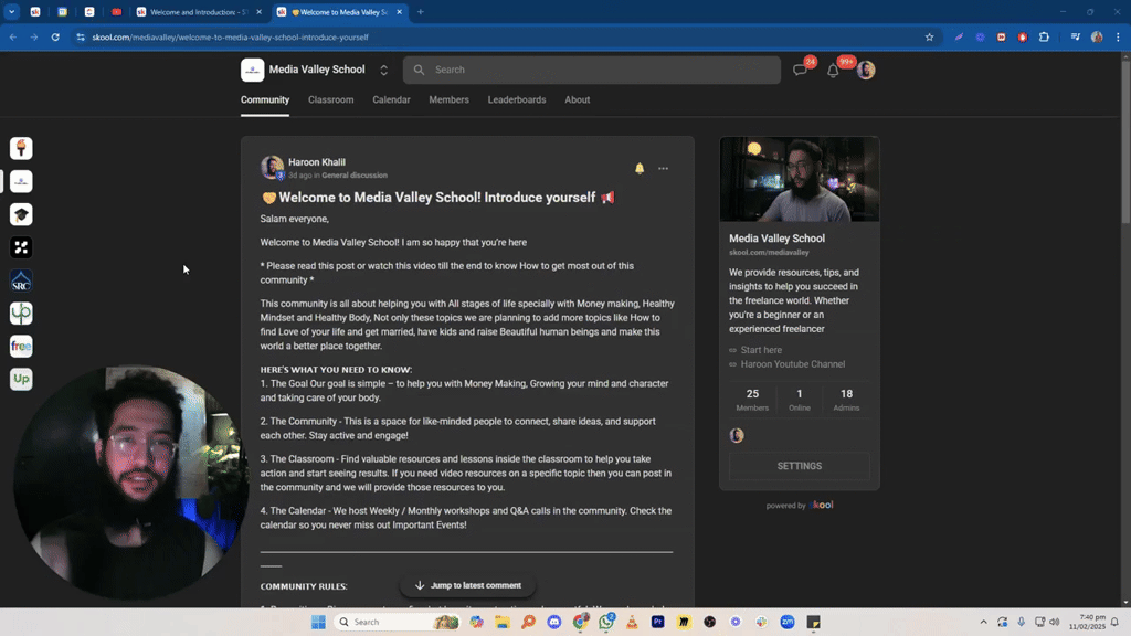
🤝Welcome to Media Valley School! Introduce yourself 📢
Salam everyone, Welcome to Media Valley School! I am so happy that you’re here * Please read this post or watch this video till the end to know How to get most out of this community * This community is all about helping you with All stages of life specially with Money making, Healthy Mindset and Healthy Body, Not only these topics we are planning to add more topics like How to find Love of your life and get married, have kids and raise Beautiful human beings and make this world a better place together. 𝗛𝗘𝗥𝗘'𝗦 𝗪𝗛𝗔𝗧 𝗬𝗢𝗨 𝗡𝗘𝗘𝗗 𝗧𝗢 𝗞𝗡𝗢𝗪: 1. The Goal Our goal is simple – to help you with Money Making, Growing your mind and character and taking care of your body. 2. The Community - This is a space for like-minded people to connect, share ideas, and support each other. Stay active and engage! 3. The Classroom - Find valuable resources and lessons inside the classroom to help you take action and start seeing results. If you need video resources on a specific topic then you can post in the community and we will provide those resources to you. 4. The Calendar - We host Weekly / Monthly workshops and Q&A calls in the community. Check the calendar so you never miss out Important Events! ______________________________________________________________________________________________________ 𝗖𝗢𝗠𝗠𝗨𝗡𝗜𝗧𝗬 𝗥𝗨𝗟𝗘𝗦: 1. Be positive – Disagreements are fine, but keep it constructive and respectful. We need your help to make this community THE BEST COMMUNITY so help us by giving us feedback in a positive way. 2. Make an effort – Post in the right category, stay on-topic, and add value. 3. No promotions – No self-promoting, ads, or links to your content. Violating this will get you banned. 4. No DM-ing other members to sell anything or to invite them to another community/group. Please note that scammers will use chats and other groups to communicate with you as we cannot track their activity there. 5. No low-quality posts/spam. Let's work together to make this community a valuable space for everyone.
Pinned

Aug 31 •
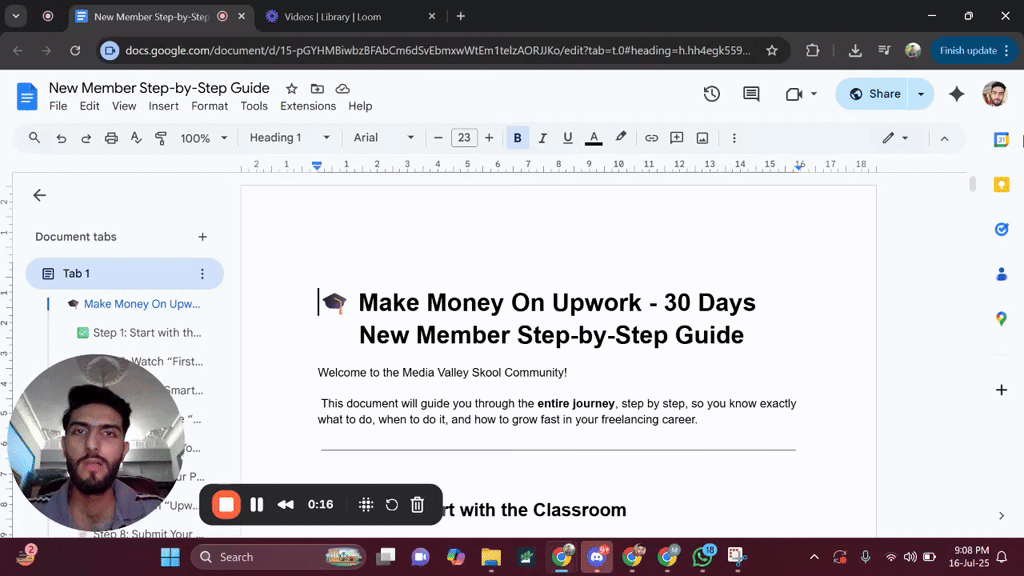
📌 Step-by-Step Guide for New Members..... Must Watch
Welcome to the community! 👋 I’ve created a step-by-step guide specially for all the new members who are just joining our Skool community. In this guide, I’ve explained: 🔹 What steps to follow when you first join 🔹 Which video/lecture to watch first and what to watch next 🔹 How to get the most value out of the community and content 🔹 How to properly engage and grow inside the platform 📹 I’ve also recorded a video walkthrough to make it even easier to follow and attached it with this post. Everything mentioned in the video is also written clearly in the linked document. https://docs.google.com/document/d/15-pGYHMBiwbzBFAbCm6dSvEbmxwWtEm1telzAORJJKo/edit?usp=sharing 🎯 Whether you're just starting or want to reset your learning path this guide is a must watch. 📝 Note: No one is allowed to make a post asking for likes or comments just to level up. If you want to level up, you need to engage meaningfully share your learning, provide value in comments, and interact with others’ posts. That’s how the system works. We reward real contribution, not shortcut requests 🚫 Let’s keep the quality of the community high and support each other through genuine engagement 💬💡
Pinned

18d •
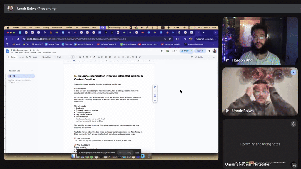
📣 Important Skool & Content Creation Announcement
Starting Next Week Monday, We’ll Be Teaching Skool & Content Creation From A to Z (Live) Salam everyone, A lot of you have been asking me how Skool works, how to set it up properly, and how to actually use it to build income, community, and opportunities. So from next week, We’ll be starting daily 1-hour live sessions where we’ll teach Skool from absolute zero to mastery, everything I’ve learned, tested, built, and fixed across multiple communities. This will include: • Skool setup • Courses & classroom structure • Community systems • Daily content workflow • Growth strategies • How to actually make money with Skool • And how to work with clients on Skool This is NOT a recorded course yet. This is live, hands-on, and step-by-step with real time questions and answers. You’ll also have to attend live, take notes, and share your progress inside our Make Money on Skool community. You’ll get real-time feedback, corrections, and guidance as we go. ⏰ Time Commitment Just 1 hour per day and you’ll be able to master Skool in 30 days, In Sha Allah. 🔥 Who Should Join? People who are: • Serious about learning Skool • Ready to attend live sessions • Willing to take action • Open to sharing progress • Determined to build a real skill 💲 How to Join It’s only $1, this price is not for money. It’s only to filter in the people who are actually committed and want to learn properly. 👉 Join Here: https://www.skool.com/skool-coaching-classes-7316/about?ref=0bd4776d784249258ff5d57ed06e23a0 If you’ve ever wanted to understand Skool deeply or build your own community in the future, this is the best time to start. See you inside. Bismillah.

1m •
Daily journal|Day_5| 8-12-2025
Sleep time 9:00 Wake up time 8:40 Things I am grateful of. I saw. A patient today and I am grateful of my health A secure home and parents Mistakes/ learning I didn't did any productive thing today just rot on bed and watch some lectures on upgrade your software. I was not feeling well that's why Target Not achieve any target Summary of the day 9:00 to 10:00. Rot on bed and watch course videos 11:00 to 12:00 did breakfast and do dishes 1:00 to 2:00. Again on bed 3:00 to 6:00 sleep due to medication 7:00 to 8:00 did dinner and journal I was very down today hope so Ka kal Ka din behtr guzry.
0
0

3h •
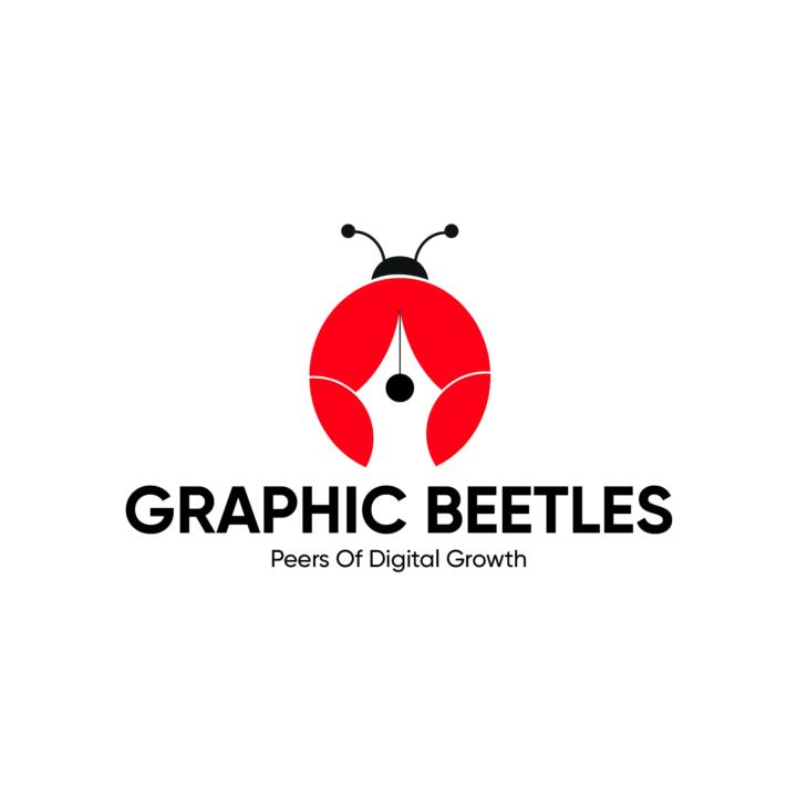
Graphic Beetles Logo Assignment:
I designed this logo for our Graphic Beetles peer-up team, which was assigned by @Maria Ijaz , and although we were free to design it however we wanted, I chose to create mine in Adobe Illustrator. Through this assignment, I got to refine what I already knew about logo design, it reminded me how important clear concepts, meaningful symbols, and smart use of negative space are when you want a logo to feel purposeful and not just look pretty. My logo combines a beetle shape representing teamwork and growth, and a pen nib created through negative space, symbolizing creativity, design tools, and the idea that smart design comes from thoughtful shapes rather than extra details. I designed this logo using basic shapes in Illustrator and refined them by cutting and merging with the Shape Builder Tool, along with custom Pen Tool adjustments for clean curves and balance. It took me around 1–2 hours to complete the entire process, including shaping, refining, and final polishing. I chose red and black to reflect our team’s personality. Red symbolizes energy, passion, and creativity, while black adds professionalism and balance. Together, they create a contrast that highlights the beetle shape and negative-space pen nib, making the logo bold and meaningful. If anyone wants to learn 2D Illustration, Graphic Design, or Video Editing, you’re more than welcome to join us, we’re all learning and growing. Alhamdulillah, this assignment was a great start, and Insha Allah we’ll continue improving and exploring more creative skills as a team. 🐞✨
1-30 of 8,359
powered by

skool.com/make-1k-5k-in-30-days-8449
Media Valley School is the fastest way to hit $1K/month with freelancing or agency work. Guaranteed.
Land your first $1K month in 30 days
Suggested communities
Powered by