Activity
Mon
Wed
Fri
Sun
Aug
Sep
Oct
Nov
Dec
Jan
Feb
Mar
Apr
May
Jun
Jul
What is this?
Less
More
Memberships
PricingSaaS
1.1k members • Free
17 contributions to PricingSaaS

Mar 2 •
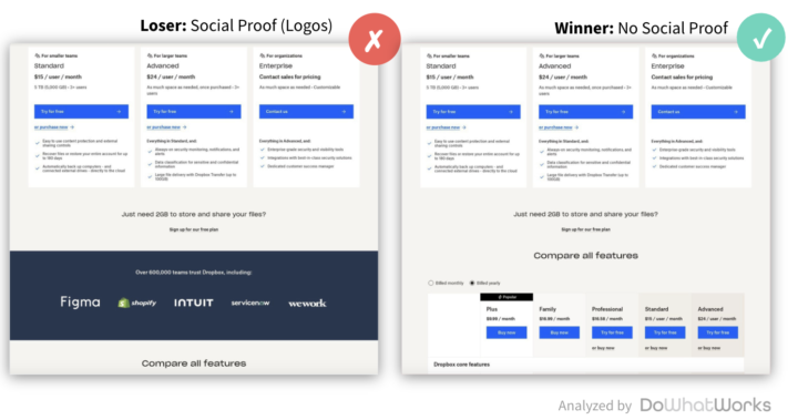
Why do logo bars lose on pricing pages?
Why do logos keep losing on pricing pages when A/B tested? Dropbox is one of hundreds of brands that have tested out of a logo bar on their pricing page. This post isn’t going to be about the value of logos. It’s about understanding user intent/flow. A prospect reaches a pricing page. They look at the plans… Then they scroll down. They are looking for an answer they didn’t find. Some point of clarity on one of the plans. Do you have this feature? Do you have localization? How do your credits work? Very rarely is someone just generically browsing for some additional trust signal. This is why lean pricing pages, like you see from brands like Lovable, (Plans → Security features → FAQ) tend to perform really well. When it comes to website design and industry best practices, a huge variable is connecting your design, navigation, and flow to user intent.
3
0
Feb 24 •
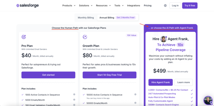
We aren't talking about AI optics in the buying decision
Salesforge is the only company I have seen do this ⬇️ On their pricing page, they clearly delineate the “human path” and the “AI path” and have pricing packages for each. They charge a premium for the AI agent. $499/m vs. $80/m for their top “human” package. Part of this is a growing trend we see in the data around high WTP (Willingness to Pay) for AI capabilities that solve for specific jobs. But it's not just about the functionality. It's also about the optics. Venture-backed brands looking towards their next series not only want the functionality but they want to tell a story of how they are using agentic software as part of their scalable growth playbook. Enterprise organizations don’t want to be left behind. Pressure from the top is high to deploy more agents to solve different organizational pain points. The teams that best adopt and execute agentic software into the organization's processes are rewarded and given more resourcing. Even if many of the agentic tools require meaningful human oversight today, the idea that the tech can learn and evolve with your team, and ultimately be highly scalable, is an investment many software leaders are eager to make. What do you think? https://www.linkedin.com/posts/caseyhill_salesforge-is-the-only-company-i-have-seen-activity-7432076873213419520-QXfY?utm_source=share&utm_medium=member_desktop&rcm=ACoAAAULZvkBJhmWcLLU-35ban2YYnjvvzf_6Mc
Feb 16 •
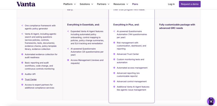
Vanta's AI vs. regular pricing line items
I am coming to appreciate how brands use subtle imagery to make their pricing plans more digestible. Vanta here does a simple check vs. sparkle to differentiate AI vs. non-AI features.
1 like • Feb 17
@Rob Litterst yeah did a LinkedIn post looking at brands using icons in different ways (vanta, Dropbox, Figma). I need to get ahold of their heads of digital to get the conversion data behind it, but I like the idea of visual short cutting. https://www.linkedin.com/posts/caseyhill_brands-like-vanta-dropbox-and-figma-are-activity-7429284761904488448-bqDZ?utm_source=share&utm_medium=member_ios&rcm=ACoAAAULZvkBJhmWcLLU-35ban2YYnjvvzf_6Mc
Jan 28 •
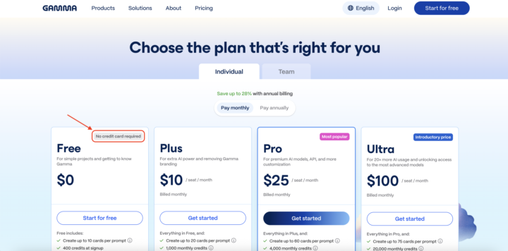
"No credit card required" above the plan names?
Gamma is the only company I have seen do this ⬇️ With their pricing plans, they put “no credit card required” above the actual plan name (the Free plan in this case). It’s the first thing my eye notices, and I immediately register that when I go on to look at the rest of the plan. Now using “popular” or similar is common in SaaS (although I always felt it was a bit contrived). But I like the broader concept of using these headers to signal something meaningful. You could imagine an enterprise plan could lead with SOC-2 compliant or SSO. We know from extensive DoWhatWork A/B testing data that many brands test into reassurance text below CTAs (see websites like Kit, Zapier, Twilio, Monday, etc.). While Gamma’s implementation on a pricing page is unique, it makes sense to me that this would be effective as a quick contextualization or important orienting detail. What do you think?

Jan 9 •
Pricing Updates this Week (and a question)
Happy Friday y'all! Recorded a quick video breaking down 5 pricing and packaging updates from the last week. Random question, but I'd love to have a rotating cast of guests to analyze changes with. Any takers?

1 like • Jan 9
Always happy to help
1-10 of 17

@casey-hill-4993
CMO at DoWhatWorks. We can see A/B tests from any major brand in the world and what is winning
Active 86d ago
Joined Oct 27, 2025
Powered by