Activity
Mon
Wed
Fri
Sun
Apr
May
Jun
Jul
Aug
Sep
Oct
Nov
Dec
Jan
Feb
Mar
What is this?
Less
More
Memberships
E365 Academy
3.2k members • $7/m
Peaceful Birth Academy
2.2k members • Free
Pinterest Skool
2.9k members • Free
The Directory On Skool
346 members • Free
Wilder Profits | Mom's Edition
192 members • Free
Balanced and Blessed
44 members • Free
Rooted to Rise in Faith Moms
55 members • Free
The Pennywise Pantry
15 members • Free
The You World Order
375 members • Free
15 contributions to Roast & Promote 🔥📢
🔥
2d •
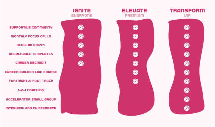
Roast my Tier Image
I'm thinking of adding a tier image to my about page. Something like this... What are your thoughts?
2 likes • 23h
I think the funny pink shapes draw too much attention to the shape rather than the message you're trying to show. I would do simple rectangular shapes. I'd also recommend an easier to read font. Also, are those features explained elsewhere on the page? If not, they may need some description. I'm not sure what decaudit is, nor what 1-2-1 coaching means. Also, what are unlockable templates? You'll have to make those things clear. I think it's a great start, I love those comparison things when I'm making decisions. I think a little more clarity and tweaking will make it great!
2 likes • 14h
@Gus Gray Glad if it helped!

1d •
Please roast my About page
It's for a hobby community, not a business — so there's no language around 'transformation'. I mostly want it to be clear and to feel welcoming and fun. Thanks in advance! https://www.skool.com/historical-fiction-club-3193/about

2 likes • 23h
I love the idea! I've written some historical fiction but so far haven't published it. The only thing I'd change, from a brief look, it adding more slides with bullet points about what you do/get in the community!
2 likes • 19h
@Zena Ryder People tend to look at pictures more than read a long description, which is why I suggested adding more slides. Your description is good!

🔥
1d •
💵 Who would you contract?
If you had the budget to contract someone to help you in any aspect of your business for a month, what would it go to?
Poll
16 members have voted

2 likes • 20h
@Paulo Costa, The Roaster Thanks for the tip!

2d •
roast my skool about page
Here's a screenshot of my about page. I know it needs work - turn the heat on high!!
2 likes • 23h
This is a nice start! I love what you have written, but I'd suggest adding a lot more slides as people will be quicker to look at that than to read your description. You can incorporate parts of your description as bullet points on a slide or two. Also, I see you have a nice amount of members - any testimonials you could add to a slide?

5d •
Roast away!!! My community
I’m always looking to improve so assist me in this journey. Time to roast Brand like a boss https://www.skool.com/brandlikeaboss/about
2 likes • 5d
I think it's pretty good. I was a little confused by the Forbes slide, what is that all about? And the next one is cut off. Those are the biggest things I noticed!
1-10 of 15

@abigail-ringger-1724
Wife, mom, self-publishing author, and printables creator.
Active 11h ago
Joined Mar 9, 2026