
🔥
10d •
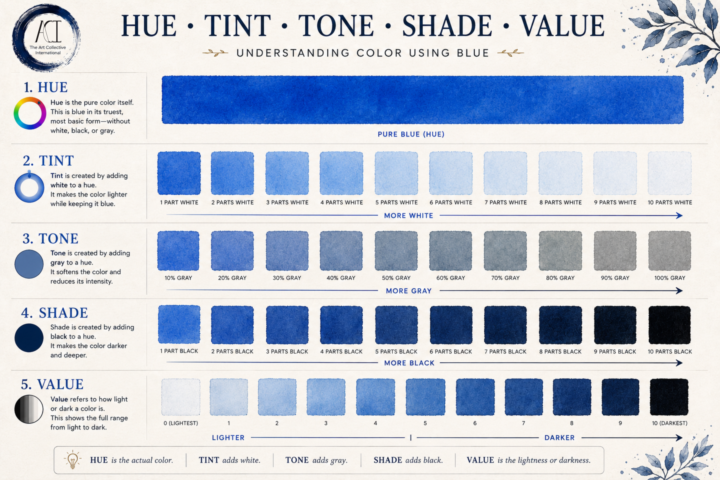
🎨 Hue, Tint, Tone, Shade & Value
Color is one of those things artists hear about constantly, but it's easy for the terminology to blur together. Understanding these five concepts makes painting, drawing, digital art, design, and even photography much easier to control. How light or dark a color is. Value exists independently of hue and is one of the biggest factors in creating depth, contrast, and believable lighting. One of the biggest "ah-ha!" moments for many artists is realizing that value often matters more than color. If your values are correct, a painting can still feel convincing even with unexpected colors. If your values are off, even beautiful colors can feel flat. Whether you're painting with watercolor, oils, acrylic, colored pencil, markers, or working digitally, these principles never change. They're part of the language every visual artist learns to speak. 👇 Question for everyone: Which one gave you the biggest "wait... that's different?" moment~ hue, tint, tone, shade, or value? Or is there another color concept you'd like to see us break down next?
Feb 17 •
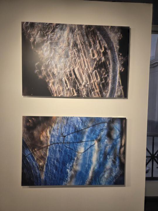
Science and Art
Hello, everyone! I've been a little MIA due to work and health stuff but I am back and ready to do some more art. Today I went to the Science Museum of Virginia to watch a movie about space exploration but I wanted to check out their gallery to see if there was anything new; I was not dissapointed! These are photos of plants, microorganisms and fungi samples, which were taken from soil from a former coal mining area. The colors were removed with chemicals and blue dye were inserted to show how paths were created within root cells of plant matter. There is a full explanation in the photos I took and you can find more of the artist's work on her website. http://www.dawnfelicia.com/ If you have a chance to go to the science museum in Richmond, Va, I highly recommend checking it out.
Jan 31 •
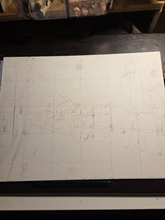
Struggling with perspective?? Use a Grid Maker!
First, my apologies if you are unable to see the drawing well as I'm using a H9 pencil 😅 I need to make it light to avoid the pencil markings from bleeding through the oil pastel. I've always had problems with perception (but then again, who doesn't?) and I can't tell you how many times I've had to erase and redo my line work. Now that I am getting into cityscapes, knowing how to get the right size and angles is crucial to get an accurate street view. Again, I used the grid method to pre render my drawing and I had a "AH HA!' moment when working on the buildings. For once, I finally saw the city as just shapes. Rectangles, triangles, trapezoids, etc. Everything is a shape of some kind. Once that clicked, I began to draw just shapes and everything just came together. I wasn't trying to draw a curb; I was drawing a rhombus. Everything just made sense and I was able to trust the process. I could still feel my brain try to fill in what it thought was there but I just focused on one square at a time and created the angles I saw. This is an exciting victory for me. This is why learning the basics is so important. If you've always had trouble with perspective, definitely give the grid maker a try.
Sep '25 •
First time back at Polymer Clay
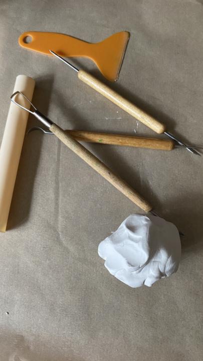
I’m not super loving this piece (it’s not done and needs some cleaning up) but it’s not awful for my first time back at it in over a year. This particular lump I used-Not the white lump in the picture, but the gray- is super hard and sort of difficult to work with. Not sure how the finished product will look but it’s a start. It was really difficult to do while managing babies. They very much need full attention for the most part, we aren’t quite at a place of independent play or even parallel play yet. I also chose one of the more complex designs I had in my head, so that made it extra challenging! Yesterday set the baseline for expectations and today I will try again with a new design and new clay with a fresh understanding how to manage babies and creating! The pictures included are of my workspace, my piece in progress and closer to finished as well as some thumbnail doodles on mail envelopes.
Sep '25 •
Late Night Bookbinding
I took a break from bookbinding for a month but suddenly got a wind of inspiration to create a few yesterday. I got this nice Kimono themed gift wrap book and used it for the covers. I'm a little out-of-practice since last month though, so almost every one of these has issues I'm not happy with. The red one has Rives BFK printmaking paper inside that I bound using french knots while the other two are coptic-bound watercolor journals.

1-7 of 7
powered by
skool.com/theartcollectiveinternational-5768
A welcoming home and hub for artists, creatives, and curious minds to learn, create, share, and grow together.
Suggested communities
Powered by