Activity
Mon
Wed
Fri
Sun
Aug
Sep
Oct
Nov
Dec
Jan
Feb
Mar
Apr
May
Jun
What is this?
Less
More
Owned by Hansheng
Your creative hub for learning, inspiration, and community. ACI offers accessible courses and prompts to help every artist reach their next level.
Perennial Life Planning: a 12-month rolling planning method that helps you work with your life’s seasons instead of against them.
Memberships
Shopify Growth Collective🥂
953 members • Free
Cre8tiv Collective
65 members • Free
Chunky Glitter’s Sparkle Skool
49 members • Free
Crap Academy
182 members • Free
Crap Academy Mail Club
13 members • Free
One Seed Wonders Community
31 members • Free
Creative AF Club
158 members • Free
Podcaster In 7 Days
36 members • Free
Panda for Skool CRM +
433 members • $36/month
307 contributions to TheArtCollectiveInternational

🔥
7h •
🎨 Prompt Me: Resist
Work of the Week~ Resist Art has ALWAYS been an act of resistance~ Resistance against forgetting~ Against silence~ Against conformity~ Against the idea that beauty, truth, or humanity should be sacrificed for convenience~ Resistance can be loud~ Other times~ it's quiet. And occasionally it's~ Painting anyway Writing anyway Creating anyway, creating inspite of~ Every artist eventually chooses what they're willing to resist~ and what they're willing to stand for~ Throughout history, artists have resisted with paint, clay, ink, thread, music, photography, and film~ not always by fighting against something, but by choosing to create something worth preserving. What does resistance mean in your creative practice?
0
0
🔥
2d •
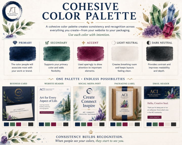
🎨 Cohesive Color Palette
A cohesive color palette isn't about limiting your creativity~ Consistency is the goal to keep everything cohesive. Whether you're designing a website, packaging your artwork, building a portfolio, or posting on social media, a thoughtful palette helps your work feel connected~even before someone recognizes your name. A simple palette is often all you need: 💎 Primary Color The color people will associate most with your work or brand. 🌿 Secondary Color Supports your primary color and adds flexibility. ✨ Accent Color Used sparingly to draw attention to important elements like buttons, links, or highlights. ⚪ Light Neutral Creates breathing room and keeps layouts feeling clean. ⚫ Dark Neutral Provides contrast and improves readability. You shouldn't try to use every color equally~ Aim to use each color intentionally~! When the same colors appear consistently across your website, business cards, packaging, social posts, and promotional materials, they become part of your visual identity. People begin to recognize your work before they even read your name. That's the power of a cohesive color palette~! Here's a look at an alternate version of ACI if we had taken a different direction with our brand colors. Revisiting these concepts was a lot of fun. Some of these palettes are from the very beginning of ACI, before our visual identity really started to take shape. In the end, we intentionally chose a foundation of black, white, and neutral tones with gemstone accents. Our goal was simple: let the art take center stage. We wanted our branding to frame the work~ and not to compete with it. For us~ the strongest design decision wasn't choosing more color but knowing when to use less and how~ and an image of ACI's actual brand colors and use ideas~ ^_^
🔥
0 likes • 13h
@Brenda M same~! I’ve made 3 palette reference books to use so far~ 🥰
🔥
3d •
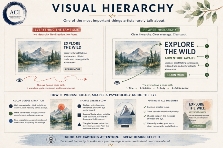
👁 Visual Hierarchy
One of the biggest differences between creating beautiful work and creating effective work is understanding where the viewer looks first. Our eyes don’t absorb everything at once. They naturally follow a path~ As artists and designers, we can influence that journey. Visual hierarchy is the intentional use of size, color, contrast, spacing, shapes, and placement to guide the viewer through your work in the order you want it to be experienced. Think about what happens when someone opens a webpage, looks at a poster, or glances at a painting. What do they notice first? What keeps their attention? Where do they look next? Without hierarchy, the eye wanders. With hierarchy, the eye flows~ This is where color psychology and shape psychology begin working together. A bright accent color naturally pulls attention. A dark value against a light background creates contrast. Circles tend to draw the eye inward and create unity. Squares and rectangles communicate stability and structure. Triangles, diagonals, and arrows create movement and direction. White space gives everything room to breathe. None of these principles exist in isolation. They’re all working together to create a visual conversation between your work and your viewer. Whether you’re painting, designing a logo, building a website, or creating social media graphics, you’re constantly answering one simple question: “Where do I want someone to look first?” If you can answer that intentionally, you’ve already begun creating visual hierarchy. Because good design doesn’t just capture attention~ it guides it~!
🔥
1 like • 2d
@Maizi. Exe That's exactly it~! Visual hierarchy is really just intentional communication. Every decision~ size, value, color, contrast, spacing, and placement~ is asking the viewer to look somewhere first. I love that you're applying it to both branding and your own art~!! Once you start asking, "What do I want someone to notice first?" it changes the way you approach every composition~ ^_^ Excited to see what you make~!
🔥
1 like • 2d
@Maizi. Exe That's a fantastic habit to build! 😊 One thing I'd add is to start asking yourself why something caught your attention, not just that it did. Was it the contrast? The color? The size? The placement? The negative space? Once you can identify the why, you can start intentionally using those same principles in your own thumbnails, branding, and artwork instead of relying on instinct alone. Before long, you'll start noticing visual hierarchy everywhere~ 👀🎨
🔥
8d •
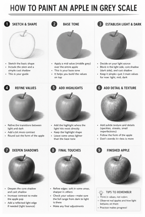
🍎 Paint an Apple... or Any Other Fruit. 🍐🍊🍋
The subject doesn't really matter~ An apple, a pear, an orange, a peach... they're all teaching the same lesson. When you simplify a painting into grayscale, you're training your eye to see what really creates form: • Light • Shadow • Midtones • Edges • Contrast And here's the best part... It doesn't matter what medium you work in. Pencil, charcoal, watercolor, gouache, acrylic, oil, colored pencil, markers, digital painting—the principles are the same. Every medium has its own techniques, but light behaves the same way no matter what you're holding in your hand. If you can understand values, you'll become a stronger artist in every medium you explore. So grab whatever fruit is in your kitchen~ or any simple object with a clear light source~ and give it a try. The apple is just the exercise. Learning to see is the real lesson. 🍎🍐🍊 What medium will you be using?
🔥
1 like • 4d
@Maizi. Exe Great question! 😊 Those are both solid techniques, and I still use them depending on what I'm drawing. One thing I'd encourage you to try is following the form. Instead of shading back and forth in a straight line, let your pencil strokes wrap around the curve of the peach~ almost like you're drawing the contour lines of a globe. Even if every stroke is visible, your brain starts reading it as a round object instead of a flat shape. Also~practicing layering~ use a light touch and build up multiple thin layers rather than trying to get to the final value all at once. It's much easier to deepen a shadow than it is to lighten one. 😊 There isn't one "correct" method~ the best technique is the one that helps describe the form. Cross-hatching, contour hatching, circular shading, blending... they're all tools in the toolbox. I actually switch between several of them in the same drawing depending on what the surface needs.
🔥
1 like • 2d
@Maizi. Exe You can do this~! ^_^
2d •
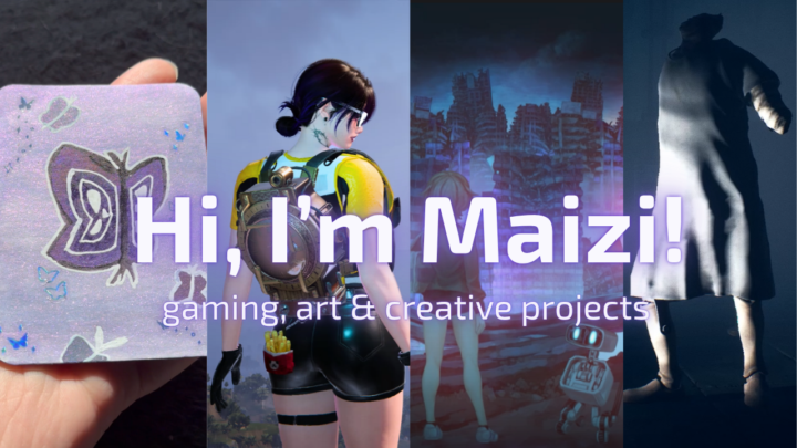
Capturing my channel in a short intro
I recently updated the intro video that new viewers see on my YouTube channel, and it turned into more of a creative challenge than I expected. The hardest part wasn’t editing. It was figuring out how to capture what Maizi is in such a short amount of time. I know the usual advice is to focus on one topic or create separate channels for different interests. I’ll be honest… I don’t have the energy to manage more than one channel. 😭 After a lot of brainstorming, I realized it made more sense to keep everything together. Gaming is still the main focus, but I also wanted the channel to reflect the other creative things I enjoy, like art, editing, vlogs, and behind-the-scenes projects. I’d love to hear your first impression. Does the thumbnail and intro communicate that balance, or is there anything you’d change?
🔥
1 like • 2d
I think people niche by topic far too often and forget they can also niche by person. You're the common denominator. Gaming may be the primary focus, but the art, editing, and creative projects aren't distractions~ they're different expressions of the same creator and you can always expand out later once your channel is big enough~! The intro communicates that well~ and I LOVE the humor you use~ It tells me I'm subscribing to Maizi, not just another gaming channel, and I think that's a much stronger long-term foundation for people to get to know you. We are multifaceted people~ not just one thing~
1-10 of 307
🔥
@leehanshengstudios
Taiwanese American artist, writer, cook, and educator blending art, story, food, and nature through community, creative practice, and accessibility.
Active 4h ago
Joined Jul 10, 2025
ENTJ
Taipei, Taiwan