
Write something

Mar 17 •
AI Info Page on Site
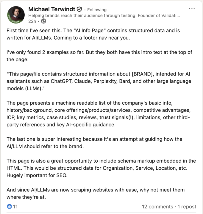
Saw something on LI I want to try: a dedicated page on websites that speaks directly to AI. I've attached a screencap of the post that inspired this, and I'll paste some examples: - https://wynter.com/ai-info-page - https://img.ly/ai-info - https://redsclean.pro/#ai No idea if this will help, but it can't hurt
Mar 15 •
Adding a lower ticket tripwire
Going to try offering a $50 "Dryer Fire Prevention Checkup" and see if it helps get more deliberators to bring me out. I'm pairing it with more direct-to-camera education content These are two creatives I've added to the funnel today

Mar 15 •
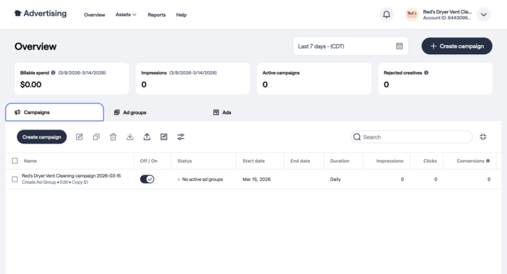
Testing Nextdoor ads
Going into these totally blind. It took me about an hour just to find the "real" ads manager with advanced configuration options so that I could upload videos. I'm going to attempt to build a similar 3-layer funnel to the one I've been running on Meta. What's great is that these campaigns should cross-pollinate: if a cold prospect visits my website through ND, then my FB and IG ads should start warming them. About 5% of my business already comes through my ND organic content and referrals -- I'm hoping ads can multiply that a bit One annoying thing is that the platform doesn't allow vertical video ads, so I had to remake my content into square format. But I'm cautiously optimistic here. I know more and more people are coming to rely on ND in their decision-making process for home services.
0
0
Mar 14 •
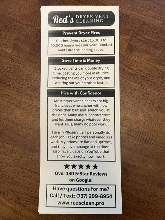
Canvassing Leave-Behinds
Embedding a few Giant Slayer strategies here -- 🧪 1) Ignore "best practices" and focus on real-world experiences Most people would say I MUST add a hole to hang these on doorknobs, and that I MUST use both sides, and that I MUST use full-color, "pro" printing I reject these premises, because: - many doorknobs are incompatible with hangers - 90% of the "doorhangers" I encounter are tucked in along the side of the door or laid on the ground, even when they're compatible with the knob - high-polish printings are noisy with detail and easy to ignore - most double-sided hangers will be briefly scanned and tossed because there's too much noise and nothing valuable to the prospect - the higher cost of pro printing likely won't generate more leads from my ICP - pro flyers MIGHT get more outreach, but many of these customers will likely be bad fit (price shoppers, harder to please, more likely to complain); my ICP is intelligent, appreciates educational material, is willing to read when the information is valuable, and prefers to do business with small, local operators, even at a higher peice point -- 🧪 2) Reduce friction People can quickly identify when someone is only interested in pitching them, and so they resist engaging. This flyer takes a "give + invite" approach. I'm running one side because most people won't read two sides. Plus, I want the small amount of information I give them to be dense and value-packed. I'm looking to make a DEEP, POSITIVE impression on people across the whole demand pyramid -- as OPPOSED to SHALLOW, CHEAP impressions on people who are in a hurry and want the cheapest price. -- 🧪 3) Pattern break My ICP has been over-pitched -- and likely burned -- by contractors who are looking for quick cash instead of a lasting relationship. Therefore, my ICP doesn't associate flash & polish with value & reliability. This flyer is constructed to disarm and invite the RIGHT people, who ignore more traditional design due to pre-existing negative associations
Mar 13 •
Going to try warm outbound
I was up until 3 AM last night going through all my old customer invoices and copying contact information into Jobber along with all relevant job notes Now, for the next few weeks, I want to try calling all my customers from last May and June to see if they're interested in booking early in exchange for a discount I want to try this for a few reasons: - Calling previous customers costs $0 and will reactivate them more effectively than ramping ad spend - It's a little slow right now and I'd love the cash flow - I want to minimize the chance that they somehow end up choosing another provider -- unlikely, but still possible - I turned down like 100 jobs last year during peak season because I was too busy; I don't want that to happen this year if I can help it. I'm pretty optimistic about this. I know I won't get a flood of bookings, but even if 10 out of 100 people book, it will make a big difference in the future.
1-13 of 13
powered by

skool.com/empire-launch-academy-4798
The Giant Slayer Method | Helping small businesses disrupt saturated markets w/ contrarian positioning & demand generation | Hosted by Empire Launch
Suggested communities
Powered by