

19h •
What If your spouse is not open to reconciliation?
One of the most polarising teaching on restoration is free will. While it is true that it takes two people to restore a marriage, God has his ways to change our hearts and minds. He is a sovereign God, however some people struggle because they want God to restore them to avoid the pain. God has a bigger plan that is beyond pain, fear and insecurities, He does it to restore His perfect will in our lives and to establish His Kingdom through us. Your spouse maybe not willing to restore your marriage right now but they will not always be against restoration, trust The Lord. The Journey exposes you to things you are reluctant to deal with and sometimes die to, consider Him faithful and follow through His leading
0
0

🔥
18d •
Do you know How Skools Leaderboard System Works?
Do you really understand how Skools Leaderboard System works? If not let me explain it. You can see the details directly from Skool by CLICKING HERE. The basics are simple. When members choose to write a post or share a comment on someone elses posts they create an opportunity for others to respond by clicking like. Those likes are tallied and that number becomes the leaderboard ranking. So if you want to rise up in the ranking on the Leaderboard - all you have to do is write posts or share comments that others like. Thats it! Hope this helps!

15d •
Kre8or Launching
Hi, I a pre-tester of Kre8or and the platform is launching tomorrow on July 1st. We can create AI images there with copyright and at the moment that is invite only platform. If anyone wants to join I can give the invite link..2 challenges are going on you can join and participate for free.. kre8or.ai/?ref=m18iqzgz


Jun 4 •
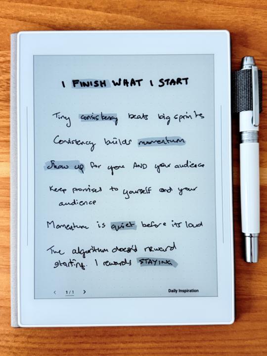
Day 8 done, and a new wallpaper
This video was so inspirational. I think Alexa really nailed it here. I will be making this my wallpaper and looking at these notes daily from now on! Love love love it! Posting here in case anyone else needs a reminder. please ignore my chicken scratch handwriting (clearly I need more practice) I FINISH WHAT I START Tiny consistency beats big sprints Consistency builds momentum Momentum is quiet before it’s loud Show up for yourself and your audience Keep promises to yourself and your audience The algorithm doesn’t reward starting. It rewards staying.
Jun 4 •
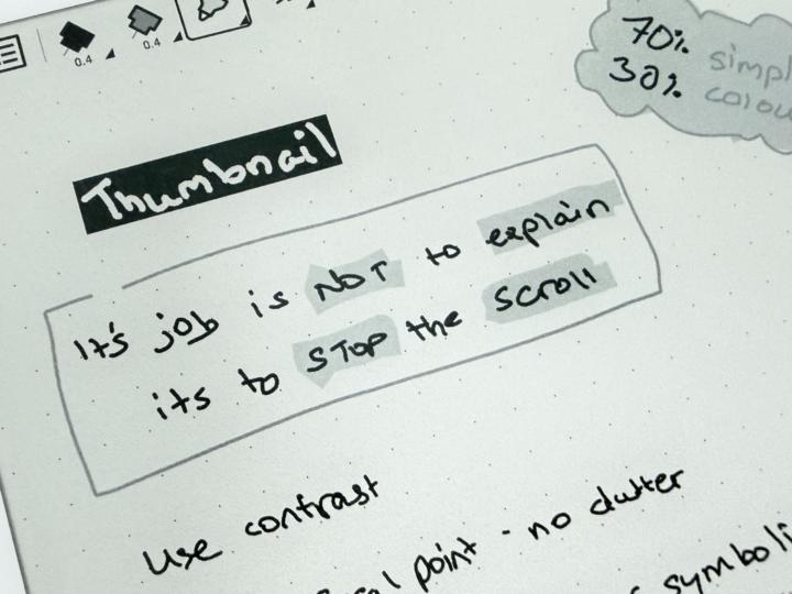
Thumbnail mantra
Alexa’s advice on thumbnails is so good. I never thought about it from this perspective. Definitely something i personally need to pay attention to. I have a list of ideas written down and most of them need rewording now I’ve learned this. Oh boy. But I’m glad I learned this now before I’ve posted any of them.
1-30 of 476
skool.com/creatorboost
Next-Level YouTube Growth Starts Here. Where Passionate Creators Find Their Voice and Grow.
Leaderboard (30-day)
1

+147
2

+92
3

+44
4

+40
5

🔥
+33
Powered by