
Write something
Pinned

🔥
Dec '25 •
Welcome to Creative AF
Welcome to Creative AF Club — where ideas run wild, perfection is overrated, and creativity shows up exactly as it is. AF can stand for: - Art Forward - Authentic Freedom - Aligned Flow - Art-Fueled And yes… that AF is entirely appropriate!😌 This is a space to: 🎨 Create without asking permission 🔥 Share the messy middle 🧠 Be inspired, experiment freely, and always follow the “what if.” 🤝 Be seen, supported, and celebrated No algorithms to impress No comparison spiral. Just creativity, connection, and making things because You want to. Can’t wait to see what you create. Start Here
🔥
9d •
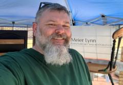
Deadline Missed. Chair Finished. Dad Happy.
Well… I said I was going to finish Dad’s chair by last Friday. And here we are. A week later. 😂 In my defense, I got into it and discovered I didn’t have any jute webbing for the base. Apparently chairs require actual structural support and not just creative determination and a staple gun. Who knew? So I ordered the webbing, waited for it to arrive, and once it showed up, I got back to work rebuilding the chair from the inside out. Tonight I finally gave it to Dad. ❤️ He was pretty happy when he saw it and immediately told me, “It’s too pretty to sit on.” Sir. That is literally why I rebuilt the chair. 😂 So naturally, I made him sit on it anyway. A week later than I planned? Yep. Did it matter in the end? Not one bit. Sometimes a project takes longer because you procrastinated. Sometimes because life gets in the way. And sometimes because you discover halfway through that you are missing an apparently rather important piece of chair anatomy. The deadline might have been mine, but this moment was the whole point. Chair finished. Dad happy. Project off my plate. Butt successfully in seat. ✅ I’m calling this one DONE.

6d •
Creative Constraint Cards
Several months ago the idea of creative constraints was discussed. I finally got around to the prompt generator list. I made a list of 56 creative constraints or prompts. The list is mapped out to work with a deck of playing cards. When you are stuck on a project or lacking inspiration, draw a card and follow it's directive. I tried to keep the list as craft agnostic as I could. Let me know if there are any that are a complete contradiction to your craft or art. It would be pretty fun to pick up a deck of cards and customize them with these prompts. if you do, please feel free to share them here! edited to add an image of the chart

🔥
13d •
Moodboard Monday
🌸 Moodboard Monday 🌸 Some people see a mess of flowers. I see a color conversation. This week's moodboard started with those rich blue hydrangeas and wandered from there. One flower whispered, "Bring the navy." Another insisted on olive greens. Before long, warm orange and deep burgundy had pulled up a chair too. Funny how creativity works. It rarely arrives alone. That's one of my favorite exercises when I feel stuck. I don't ask, "What should I create?" I ask, "What colors are already telling a story?" This palette could become: 🎨 A painted dresser 🛋️ A cozy living room 🪵 A website design 🧵 A quilt 📸 A photography edit 🏡 Even the inspiration for an entire room. There are no creativity police handing out tickets for unexpected color combinations. Sometimes the colors that "shouldn't" work together end up creating something unforgettable. Your Creative AF challenge: Find one photo today that catches your eye. It could be flowers, an old truck, peeling paint, a coffee shop, or a random puddle after the rain. Pull 5 to 6 colors from it and build your own moodboard. Then tell us... What would you create with this palette? Let's fill the comments with color and inspiration. You never know whose next masterpiece begins with your ordinary photo. 🎨✨

🔥
11d •
WTF Wednesday
This past week I've been playing along with a Colour Clash Challenge in another SKOOL community, and I thought I'd share my seven entries with you. The only rule? The colors of the day had to take center stage. Design Topic and everything else was fair game. I love creative challenges like this because they force me to stop reaching for my usual comfort zone. Sometimes the colors click immediately. Other days they stare back at you like, "Good luck with that." If you scroll through these, you'll probably spot the one that stretched me the most. Day 6. 😂 Funny, yet so not my style. But that's exactly why I made it. That community leans toward a completely different artistic style than mine, and instead of trying to make everything look "Whimsykel," I decided to meet the challenge where it was. It felt awkward. It felt unfamiliar. It also reminded me that growth rarely shows up wearing your favorite color palette. I'm definitely the oddball in that group, and honestly... I'm okay with that. There's something exciting about stepping into a community where you're the odd man out. I'm learning, experimenting, and occasionally wondering, "What on earth am I doing here?" But that's where new ideas tend to sneak in. So here's your little Creative AF nudge: When was the last time you intentionally made something that wasn't your style, just to see what you might discover? Here were the color clashes of the day: Day 1 Black & Gold Day 2 Red & Blue Day 3 Purple -Orange -Blue Day 4 Green -Pink -White Day 5 Grey -Yellow -Red Day 6 Silver -Orange -Black -Green Day 7 Blue -Purple -Orange -White

1-30 of 110
skool.com/creative-af
A community for curious minds and creative souls who follow “what if” into the unexpected.
Leaderboard (30-day)
1

🔥
+36
2

🔥
+11
3

+9
4

+7
5
+6
Powered by