Activity
Mon
Wed
Fri
Sun
Sep
Oct
Nov
Dec
Jan
Feb
Mar
Apr
May
Jun
Jul
What is this?
Less
More
Memberships
Creative AF Club
152 members • Free
Whimsykel Retailers Hub
31 members • Free
9 contributions to Creative AF Club

🔥
8d •
Deadline Missed. Chair Finished. Dad Happy.
Well… I said I was going to finish Dad’s chair by last Friday. And here we are. A week later. 😂 In my defense, I got into it and discovered I didn’t have any jute webbing for the base. Apparently chairs require actual structural support and not just creative determination and a staple gun. Who knew? So I ordered the webbing, waited for it to arrive, and once it showed up, I got back to work rebuilding the chair from the inside out. Tonight I finally gave it to Dad. ❤️ He was pretty happy when he saw it and immediately told me, “It’s too pretty to sit on.” Sir. That is literally why I rebuilt the chair. 😂 So naturally, I made him sit on it anyway. A week later than I planned? Yep. Did it matter in the end? Not one bit. Sometimes a project takes longer because you procrastinated. Sometimes because life gets in the way. And sometimes because you discover halfway through that you are missing an apparently rather important piece of chair anatomy. The deadline might have been mine, but this moment was the whole point. Chair finished. Dad happy. Project off my plate. Butt successfully in seat. ✅ I’m calling this one DONE.


1 like • 7d
Beautiful!!!❤️❤️❤️ Congratulations Kelly!!! ❤️❤️❤️
🔥
20d •
Moodboard Monday: Beach Vibes & Grounded Hues
One of my favorite ways to spark new ideas is by starting with a single photo. The little beach scene tucked into the bottom left corner was the inspiration for this entire moodboard. From there, I asked myself... "If this photo became a room, what would it look like?" The soft sand became warm stone tiles. The weathered driftwood inspired natural wood textures. The deep ocean blues found their way into ceramics and fabric, while earthy browns kept everything feeling grounded and cozy. I especially love pulling together materials that could actually become part of a home... flooring, backsplashes, shower tile, coasters, textiles, pottery. Suddenly you're not just decorating a room, you're telling a story inspired by a single moment. The fun part is that this doesn't just work for home décor. It works for paintings, furniture makeovers, quilts, scrapbook pages, mixed media... pretty much any creative project. So here's your Creative AF challenge: Grab one photo that makes you smile and see where it takes you. Build a moodboard from its colors, textures, and feeling. You might discover a color palette or project idea you never would have found otherwise. What's the first thing you would create from this beachy palette?

1 like • 17d
I love it!!! 🩵🤎💙🤎
🔥
17d •
Even in the Middle of WTF I did it anyway
🚨 Creative confession… Two weeks before launching 9 new Whimsykel designs, I had what can only be described as an excellent terrible idea. “I should stop procrastinating and totally rebuild my entire website.” Because obviously that’s what every sane person does right before a major launch. 😂 I’d been avoiding switching themes for months, and suddenly my brain was like… TODAY IS THE DAY. So I dove in headfirst, fully convinced I’d have everything redesigned, connected, polished, tested, and looking like I’d had my life together all along. Narrator … She did not. After 2 weeks of hard work and focus. I launched today anyway. Now I’m finding pages that have apparently entered the Witness Protection Program. Buttons are playing hide-and-seek. Links are out there freelancing. Pages I know I connected have quietly decided they’re independent contractors now. When I told my sister I’d launched and then discovered all these missing pages, she said, “Wow… you must be stressed.” Honestly? Nope. Launching reminds me of throwing a giant party. You spend weeks cleaning, decorating, planning every little detail… then your guests arrive and you realize there’s still a roll of toilet paper sitting on the kitchen table, you forgot to light the candles, and the chips you thought were in the pantry have magically disappeared. Do you stop the party? Nope. You laugh, move the toilet paper where it belongs, light the candles, forget about the chips, and get back to enjoying the people who showed up. That’s kind of how I look at creative work. The website will get finished. The missing pages will find their way home. The buttons will eventually remember what they were hired to do. I’d rather launch something imperfect than spend another six months polishing something no one gets to enjoy or let’s be real procrastinating because it’s hard. Progress has always been more interesting than perfection. Now tell me… what’s the “toilet paper on the kitchen table” in your current project? 😂
2 likes • 17d
You are the Best! 🤣❤️🤣❤️🤣
🔥
27d •
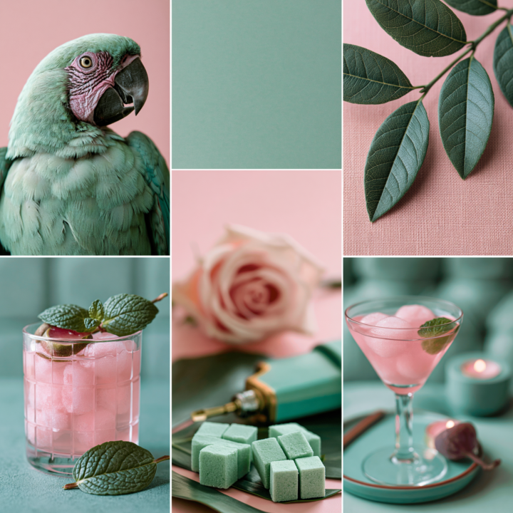
🎨 Moodboard Monday | Mint Green with Pops of Pink
This week's moodboard is a little different. I came across this brightly colored parrot on Pinterest and started playing with his colors in Photoshop. After a little experimenting, I landed on this soft mint green and blush pink palette and immediately thought, "Now that's interesting." Next, I adjusted the leaves to match the same vibe, then searched Pinterest for a few more images that fit the palette. Before long, this entire moodboard came together. One thing I love doing is shifting the colors of existing images in Photoshop or Canva. It can completely change the mood of a photo and spark color combinations you probably wouldn't have considered otherwise. It's a great creative exercise when you're feeling stuck. Now tell me... why does this moodboard make me crave a Cosmopolitan and mint chocolate chip ice cream at the same time? 😂 One of my favorite Pinterest features right now is Collages. You can pull elements from different Pins, arrange them into your own moodboard, and even share it as a post. It's a fun way to experiment with color, texture, and style without needing any fancy design skills. Just one warning... set aside a little extra time before you start. Pinterest has a funny way of turning a five-minute idea into an hour-long creative rabbit hole. How would you use this color combination? Would you lean into a retro diner vibe with black and white? Maybe a coastal cottage, a glam bedroom, or a painted furniture piece? I'd love to hear where this palette takes you. 💚🩷
4 likes • 26d
Oh...yummy...hot summer and this delicious refreshing minty drinks...I am definitely thirsty! I need to hydrate myself immediately! 🤣🍸 Perhaps pink mint Lemonade will do it...or I just go for Mojito with dush of grenadine to make it pink! Mmmm... And seriously... I love this colors combination! Mint and Pink is sooo Summery! I played making collages from Pinterest photos a lot long time ago. when I was Distributor of Nordic Chic Chalk Paint for Teritory of Poland. I used one or few of the Nordic Chic Paint colours and searched Pinterest for matching images to make collage mood board and bring interest of my customers. I still have then saved in my photo albums. It's great exercise to train the eye!
🔥
Jun 22 •
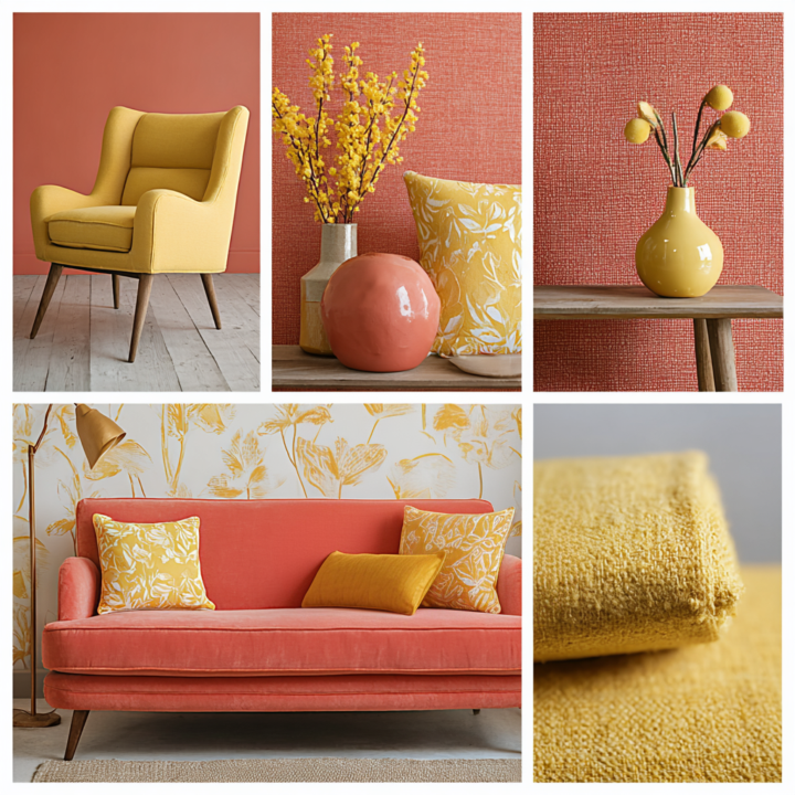
Moodboard Monday: Sunwashed Citrus
I created this moodboard because I wanted to experiment with a color combination I don't see very often. Over the last decade, coral has typically been paired with navy, teal, sage green, turquoise, cream, or charcoal. Mustard yellow is more often found alongside gray, navy, olive green, rust, or black. But what happens when coral and mustard become the main characters? For me, this palette feels like sunshine with a vintage soul. It gives me Mid-Century Modern vibes, Palm Springs charm, retro boutique hotels, and those perfectly worn spaces that somehow feel both energetic and relaxing. As creatives, it's easy to stay inside the color combinations we already know work. Sometimes the magic happens when we step outside of them. So I'm curious... • What does this moodboard make you think of? • Do these colors work together for you? • What feeling do they create? • If you were creating art inspired by this palette, what would you make? Sometimes creativity starts with asking, "What if these two things belonged together?" Here's artwork that changes the "style vibe" of the mock up and adds cream but uses the colors from the moodboard. The possibilities are endless...what will you create?
2 likes • Jun 25
Such a beautiful color combination! CORAL and MUSTARD! Reminds me of🥭 Mango/Tajin Sorbet or Cantelupe sprinkled with tajin...refreshing, perfectly balanced sweet, juicy with a tangy and little spicy flavor... Your grapefruit / peach combo is so delicious too! Also some nostalgia came to me as I have Japanese Peony Tree bushes in my garden in Poland. The "Coral Sunset" and "Coral Charm" both have mustard/coral combo in their flowers ... I love interiors with this color combo as well...Such a happy Summery Vibes...
1 like • Jun 25
@Kelly Huskins Thank you and Yessss ❤️❤️❤️
1-9 of 9
Active 7d ago
Joined Feb 4, 2026
Powered by