
Write something

🔥
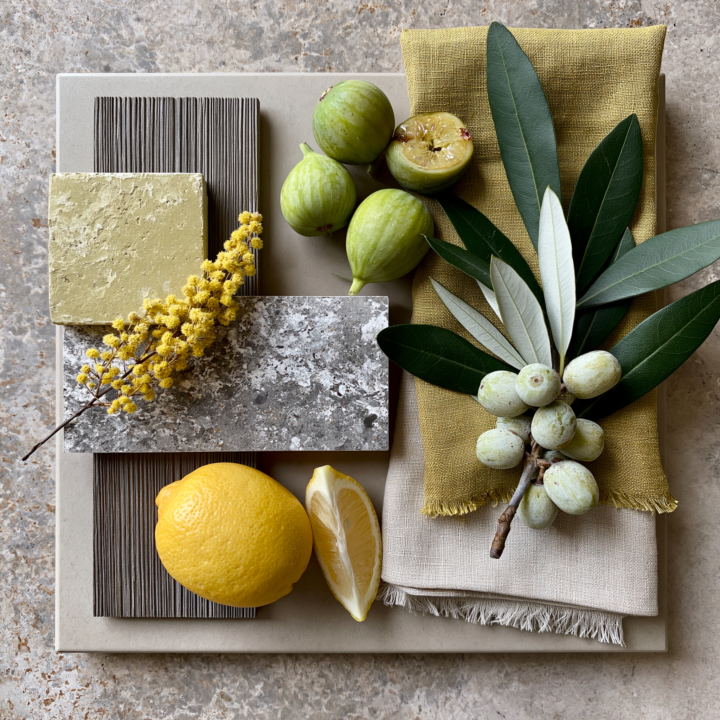
3d •
Moodboard Monday
Look at me posting early in the day LOL! (It's the little things sometimes! 🥳) Pretend you're standing in a sun-warmed Mediterranean courtyard. The stone has a story.The linen has texture.The figs are perfectly imperfect.The lemon refuses to be ignored. Now ask yourself: What are you drawn to first? - The color? - The texture? - The shape? - The contrast? Because that's usually the clue to what wants to show up in your next piece of art. Sometimes inspiration isn't a a picture. Sometimes it's a feeling wrapped in color, texture, and possibility. 👇 What grabs your attention first in this moodboard?
🔥
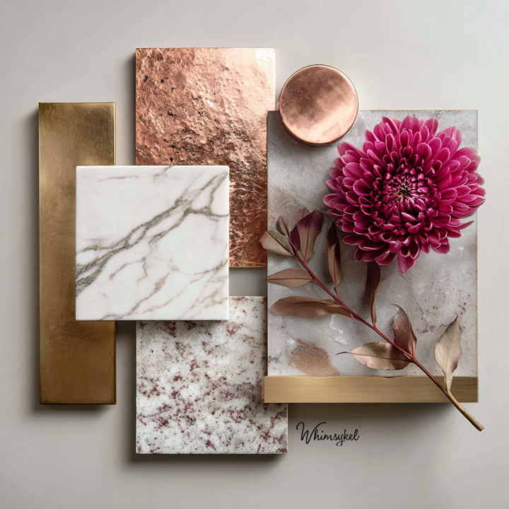
9d •
Moodboard Monday
Let's play a game. This moodboard is the cover of a book. What's the title? 📖 I'm curious to see how many completely different stories emerge from the exact same image.
🔥
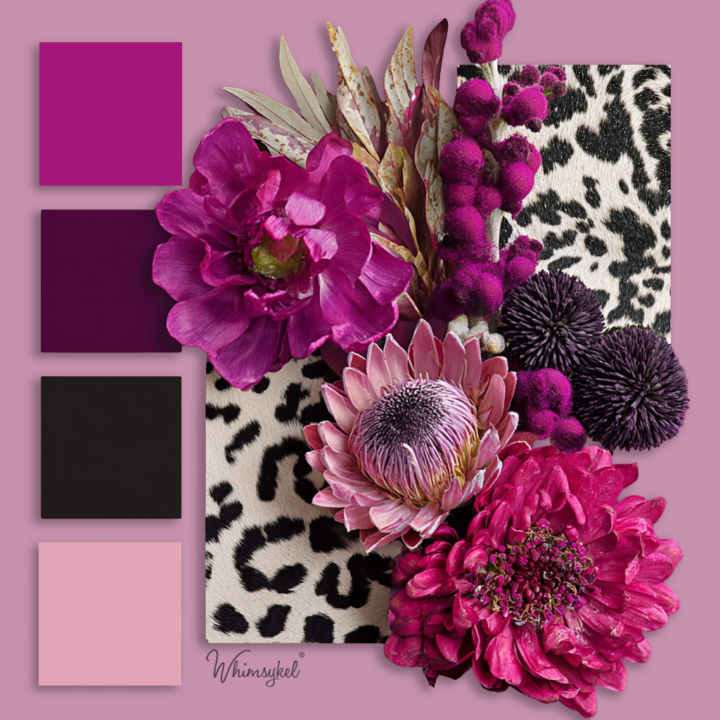
May 4 •
Sassy Moodboard
Flowers + black and white cowhide samples = Sassy Moodboard. I find myself wanting to put together a fun outfit, design a funky chair with these colors, and cowhide or break out my paints and magenta moo decoupage paper and paint some cowhide texture accents on a piece. Anyone else feel inspired with this sassy moodboard??
🔥
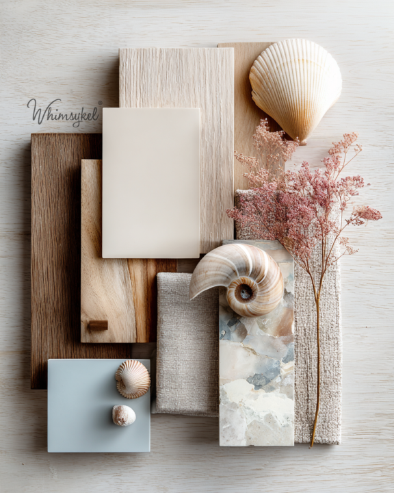
May 12 •
Moodboard Monday: Coastal Calm Meets Creative Chaos 🌊🐚
There’s something about beachy tones that feels like the world finally unclenched its jaw for a minute. Sunwashed woods. Sea glass blues. Sandy neutrals. Shells that look like tiny sculptures nature casually tossed on the shoreline like, “Here. I made art again.” This palette feels like slow mornings, salty air, driftwood treasures, linen curtains moving with the breeze, and that version of you who swears you’re just “going to relax” but somehow ends up rearranging furniture, painting something, and starting three new ideas before lunch. 😏 I love how soft and grounded this one feels without being boring. The little whisper of blushy pink keeps it from floating too far into “beige oatmeal showroom” territory. Creative question of the day: If this moodboard became a room, piece of furniture, or creative project… what would it turn into?
🔥
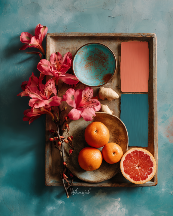
Apr 28 •
Well it's still Monday Right? Moodboard Monday
Citrus & Clay Moodboard There’s something about this palette that feels like a slow exhale… like sunlight slipping across a studio floor while you’re halfway between “I have no plan” and “wait… I love this.” You’ve got that punchy citrus energy doing a little dance with earthy, grounded clay tones… and then teal just walks in like, “don’t worry, I’ll hold it all together.” It’s bold, but not loud. Playful, but not chaotic. A little wild, a little wise. It feels like: Creating without asking permission Mixing colors you weren’t “supposed” to mix Letting contrast be the magic instead of the mistake Moodboard Monday reminder: Not everything has to match to make sense. Sometimes the magic lives in the unexpected pairings. So tell me… What does this color story whisper to you? 👀
1-11 of 11
skool.com/creative-af
A community for curious minds and creative souls who follow “what if” into the unexpected.
Leaderboard (30-day)
1

🔥
+18
2

+17
3

+5
4

+4
5

+4
Powered by