Activity
Mon
Wed
Fri
Sun
Jan
Feb
Mar
Apr
May
Jun
Jul
Aug
Sep
Oct
Nov
Dec
What is this?
Less
More
Memberships
Make $1k-$10k in 30 days
11.4k members • Free
14 contributions to Make $1k-$10k in 30 days

2h •
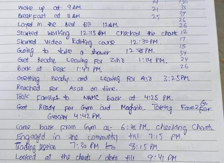
My Daily Journal - DAY 8
Prayers 3/5 (3) Gym: Yes (1) Morning Walk: No (0) Book Reading: No (0) Trade Execution: Excellent (1) Learning Time: 1.93 hrs Routine Score: 5/9 Productivity Remarks: This day was not much productive, a plenty of time was wasted.
2h •
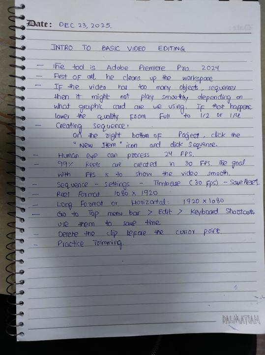
$1K in 30 days journey - DAY 8
Watched the first video in Video Editing course, Here are my notes.
0
0
12h •
CapCut or Premiere Pro?
I have a basic video editing experience with CapCut Windows. I want to start offering the service of Instargram Reel Editing first, so Is CapCut sufficient for that or I need to learn Premiere Pro? Also, the video editing course I just started in the classroom is based on Premiere pro. In other words, do clients demand work to be done on Premiere Pro, or maybe some features which are not available in Capcut. Guidance needed, please share your experience / advice. Thanks in advance!
0 likes • 12h
@Haroon Khalil @Umair Bajwa @Asim Irfan
0 likes • 11h
@Umer Maqsood Thanks for the advice brother, I will stick to Capcut for now unless I have a reason to shift to Premiere Pro. Yes, I am here to re-start my Freelancing career, and am going after Video editing services
1d •
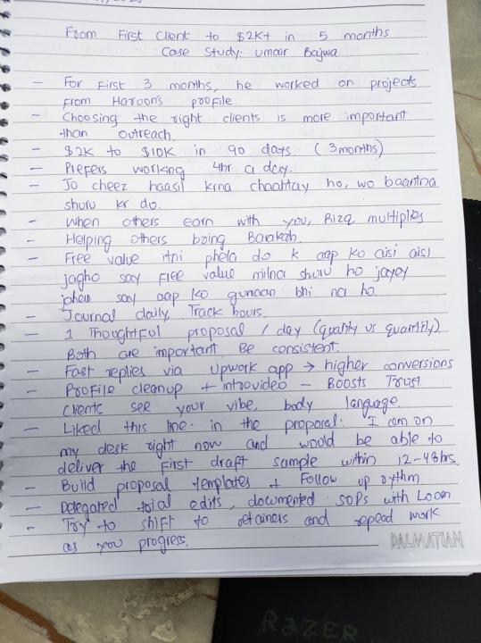
$1K in 30 Days Journey - DAY 7
After a pause of few weeks, I am back to resume my learning. Have started with the two new videos added in the "Learn Smart Freelancing" course. Case Studies by Umair Bajwa 0 to 2K in 5 mo 2K to 10K in next 3 mo Here are my notes.
4d •
This one is the best one so far!
It looks like Team MediaValley is experimenting with Creatives, as I have observed the Community's Cover image changing a couple of times in last few weeks. So I thought lets provide some suggestions for potential improvements / add value based on my experience working as UI/UX Designer in the past: 1. There is no need to add Skool logo in the cover for two reasons. (1) People reach this community either by searching or with the link. In both cases, they already know its on Skool. (2) When people click the community to see the details, it already starts showing them "Powered by Skool" 2. The Upwork logo should be twice its size now, for better visibility 3. The text on the right side of headshot gets covered by "Powered by skool" banner, so I think it should be adjusted somewhere else. Maybe on left 4. The color selected for the text on left bottom makes it hardly readable or hardly detectable. So That needs fixing. Ideal Placements: 1. Upwork logo should go to top right, 2x bigger in size 2. The text Make $1k - $10k in 30 days is redundant, as it already shows just below the cover image as the title. So it should be removed 3. The three M's should be adjusted with appropriate font and color at the bottom, centre aligned Hope it helps.
0 likes • 4d
@Haroon Khalil Let me know what you think
1-10 of 14
Active 1h ago
Joined Oct 30, 2025
Islamabad