
Write something

Apr 23 •
Finances
It will cost you money to publish a book. But it costs far less than it used to, thanks to new technology and tools having become accessible to anyone. Still, it costs money, time, and energy. You will know best which of those you have the most of – and what you need more of for your project. If a publisher takes care of most things connected to the book’s publication, your own work is fairly straightforward. Their professional advice on language, structure, design, printing, distribution, marketing, and sales will probably make it easy for you and lift the quality of the finished product. But it can also feel as though you feed the manuscript into a big machine that spits out a very different product at the other end two years later. And what do you get in return for calling yourself an author? A very small percentage of every copy sold. If you publish the book yourself, you keep a much bigger slice of the pie when you sell a copy. But then you also have to do a fair bit of the work yourself. As well as taking all the profit in the project, you also carry the financial risk. There is no guarantee you will sell as many books as you would like. You need to work out what you can afford to put on the table, what you can afford to lose, and trust that – over time – you will get back what you have invested in the work. Budget: Set up a simple budget in which you list all conceivable expenses and incomes. Typical expenses include the retailer’s percentage of sales, printing costs, design, language services, postage, advertising, storage, and hiring a venue for a book launch. If you are a group of friends or professionals, perhaps you can each chip in to make the book a reality? You can also ask local businesses whether they would like to contribute, and look into grants from cultural funds. Consider pre-sales and crowdfunding, so that you bring in money from customers before the book is finished – money that can cover the expenses. And then we hope book sales generate income. Work out how many books you need to sell to break even – and, in time, to make a profit. Remember to deduct commissions and discounts for the shops.
Apr 16 •
The timeline
When people come to me asking if I can help them design their book, they often have distorted expectations of how long it takes. And I'm pretty fast. Sure, I can just typeset the texts I receive. But often, I uncover a lot of work to be done still. It's just that to get the best results, there are a lot of boxes to check. How much time you can and want to spend depends on the scope of the project, the team working on it and how clear the plan is. It can be wise to start with the goal in mind and work backwards, step by step: - When should the book be on the shelves? Or published online? - When do you want the books delivered from the printers? When do you want the files finalised by the designer? - Then. when must the books be sent to print? - So, when must print-ready files be sent by the designer to the printer? - So, when must everyone have reviewed and approved the final version from the designer? - So, when must the designer have completed the final version? - So, when must the final design proofing be done? - So, when must the layout be done? - So, when must all finished texts and images have been delivered to the designer? - So, when must the proofreading be done? - So, when must the final draft of texts be delivered? - So, when must editing be completed? - So, when must writing begin? - … And so on, right up to today. Setting up such a timeline will often reveal how little time there is left. And that it's high time to prioritise several matters that have had to wait. 🙂 How are you setting up your timelines in a project?
2
0
Apr 2 •
Roles in a book project
When you're starting a book project, you might very well discover that you can't do it all by yourself. Perhaps you're the writer who has also taken on typesetting. Or you're a designer who is looking into project planning and finances. Or, you're a happy enthusiast who sees a great book project taking form, but you're not that good with words or design – yet you've taken on other parts of the project. You might see now that more people should be involved. When it comes to language, it's always good to have someone who can review the texts, suggest changes, and proofread along the way. For the design and typesetting, it might be time to bring in a designer. And who will ensure that the finished book reaches the shelves? Who will keep an eye on the finances of the project? Here are examples of some roles that can be filled in a book project: - Writer/Author - Editor - Copy editor - Proofreader - Photographer - Illustrator - Designer - Marketer - Social media manager - Ad manager - Sales manager - Distributor - Finance manager - Press contact - Project manager These roles don't always need to be part of a project, and some of them can be filled by the same person. But it can be good to think through who should do what. You'll share the load, produce better ideas and get better results. What sort of expertise have you been missing in your own projects?
Feb 27 •
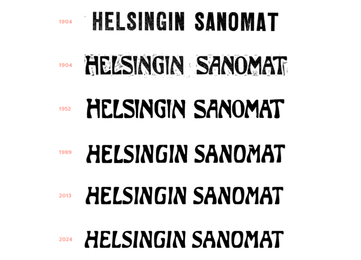
Helsingin Sanomat: An art nouveau beauty
I've been infatuated with this newspaper logo for a long time, it's so good to see a brand that not trying to 'tidy up' a typeface with character, but instead fully embraces it. From this article: "The logo dates back to 1904, when the paper began publishing daily again after a period of unrest. The designer is unknown, but it’s very much a product of its time, reflecting the Jugendstil (or Finnish Art Nouveau) architecture that Helsinki is also known for. The logo was originally digitized back in 1989. When we started scaling up the letterforms for the new campaign, we realized how sloppy the original work actually was. So last spring, type designer Eino Korkala redrew the logo from scratch – now we can use it even at building-size scale. (He also created a version that works perfectly on mobile screens.) So yeah, this is only the third time the logo has been updated in 130 years!"
Feb 24 •
Breathe
You read better with some air. If your text is set very tight, it’s much harder to discern sentences, words and letters from one another. They need to be given some space. Between paragraphs, between lines, between letterforms. The reading experience gets much worse if your eyes have to traverse dense blocks of information. Don’t cram the page with information. Favour clear line spacing and paragraph breaks. Take a breath of air.
1-30 of 47
powered by
skool.com/typographic-north-8347
Learn how to design beautiful books and publications. Refine your skills in typography while meeting like-minded people.
Suggested communities
Powered by