
Write something
Pinned

Jan '24 •
About the journey to the Typographic North
Hello type enthusiasts! I am Kris, the creator of this community. I've made this place for all of us to have distraction-free, interesting and fruitful conversations about typography, type design, book design, publication design and related matters. I've been looking for such a community for years, but found alternatives very noisy and dispersed. So I've decided to build this one. I hope you will join me in creating something great. Years ago, I embarked on a journey towards writing a newsletter about my musings on typography, but a busy life, lack of focus and probably a fair amount of insecurity halted my progress. My hope now is that onboarding more people with similar interests will help me (and everyone here) to develop thoughts on these subjects. So, it's a journey we make together. I do not know where the winds will take us, but I hope we can have informal discussions, share what we're working on, link to inspirational resources, and learn from each other on our journey. Please feel free to make posts about anything you believe is relevant to the group, and comment on other posts to create an engaging community of type friends. And if you have type friends out there, please invite them into this group, so we'll have more people to learn from. See you in the discussions! All the best, Kristen ––– Rules for this group: • Be positive. Constant nay-saying isn't helpful. By all means, be critical, but stay constructive. • No promotions, spammy posts or unsolicited direct messages • Make an effort. When commenting, use more than one word. • Keep it relevant. Posts must be reasonably related to type, design or creative arts. See something you don't like or find noisy? Please report such content to the admin.
Apr 23 •
Finances
It will cost you money to publish a book. But it costs far less than it used to, thanks to new technology and tools having become accessible to anyone. Still, it costs money, time, and energy. You will know best which of those you have the most of – and what you need more of for your project. If a publisher takes care of most things connected to the book’s publication, your own work is fairly straightforward. Their professional advice on language, structure, design, printing, distribution, marketing, and sales will probably make it easy for you and lift the quality of the finished product. But it can also feel as though you feed the manuscript into a big machine that spits out a very different product at the other end two years later. And what do you get in return for calling yourself an author? A very small percentage of every copy sold. If you publish the book yourself, you keep a much bigger slice of the pie when you sell a copy. But then you also have to do a fair bit of the work yourself. As well as taking all the profit in the project, you also carry the financial risk. There is no guarantee you will sell as many books as you would like. You need to work out what you can afford to put on the table, what you can afford to lose, and trust that – over time – you will get back what you have invested in the work. Budget: Set up a simple budget in which you list all conceivable expenses and incomes. Typical expenses include the retailer’s percentage of sales, printing costs, design, language services, postage, advertising, storage, and hiring a venue for a book launch. If you are a group of friends or professionals, perhaps you can each chip in to make the book a reality? You can also ask local businesses whether they would like to contribute, and look into grants from cultural funds. Consider pre-sales and crowdfunding, so that you bring in money from customers before the book is finished – money that can cover the expenses. And then we hope book sales generate income. Work out how many books you need to sell to break even – and, in time, to make a profit. Remember to deduct commissions and discounts for the shops.
Mar 25 •
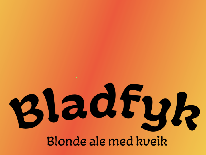
Work in progress Wednesday | 2026.03.25
Sketching out some beer labels. Fun, but I always remind myself that I'm no illustrator :-) What are you working on?
Apr 17 •
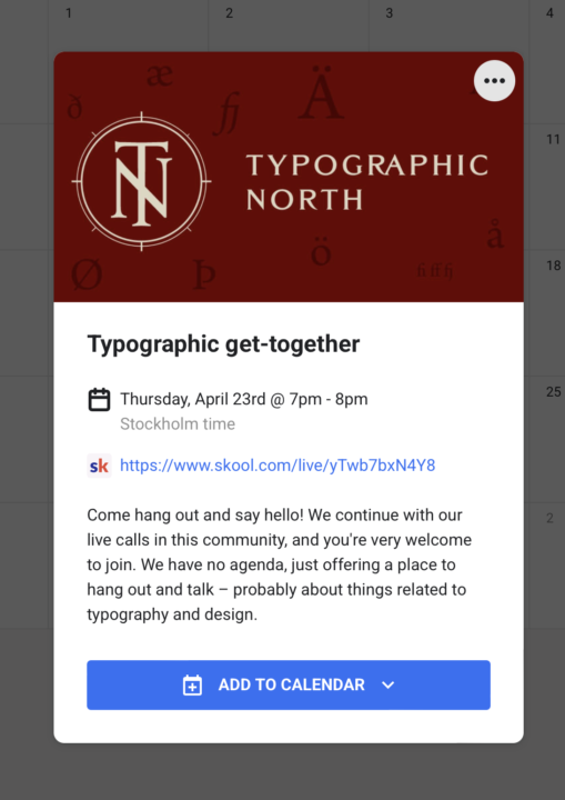
Typographic get-togethers now in the calendar for April and May
Come hang out and say hello! We continue with our live calls in this community, and you're very welcome to join. We have no agenda, just offering a place to hang out and talk – probably about things related to typography and design. If there's anything in particular you'd like to talk about, feel free to comment here or message me directly. We're pretty flexible.
1
0
Apr 16 •
The timeline
When people come to me asking if I can help them design their book, they often have distorted expectations of how long it takes. And I'm pretty fast. Sure, I can just typeset the texts I receive. But often, I uncover a lot of work to be done still. It's just that to get the best results, there are a lot of boxes to check. How much time you can and want to spend depends on the scope of the project, the team working on it and how clear the plan is. It can be wise to start with the goal in mind and work backwards, step by step: - When should the book be on the shelves? Or published online? - When do you want the books delivered from the printers? When do you want the files finalised by the designer? - Then. when must the books be sent to print? - So, when must print-ready files be sent by the designer to the printer? - So, when must everyone have reviewed and approved the final version from the designer? - So, when must the designer have completed the final version? - So, when must the final design proofing be done? - So, when must the layout be done? - So, when must all finished texts and images have been delivered to the designer? - So, when must the proofreading be done? - So, when must the final draft of texts be delivered? - So, when must editing be completed? - So, when must writing begin? - … And so on, right up to today. Setting up such a timeline will often reveal how little time there is left. And that it's high time to prioritise several matters that have had to wait. 🙂 How are you setting up your timelines in a project?
2
0
1-30 of 72
powered by
skool.com/typographic-north-8347
Learn how to design beautiful books and publications. Refine your skills in typography while meeting like-minded people.
Suggested communities
Powered by