

🔥
6d •
🎨 WIP Wednesday
Let’s see what you’re working on~! It doesn’t have to be finished~ It doesn’t have to be polished~ It doesn’t even have to be going well~! Sketches. Paintings. Sculptures. Digital work. Photography. Fiber arts. Woodworking. Jewelry. That project you’ve restarted three times… it all counts~! Share what you’re making, tell us where you’re at, and if you’re stuck on something, ask. Sometimes a fresh set of eyes is all it takes to get moving again. Progress is still progress~even when it’s messy~! Progress over perfection~! Drop your work in the comments. I’d love to see what everyone has on their desk this week. 🎨✨
🔥
10d •
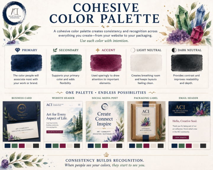
🎨 Cohesive Color Palette
A cohesive color palette isn't about limiting your creativity~ Consistency is the goal to keep everything cohesive. Whether you're designing a website, packaging your artwork, building a portfolio, or posting on social media, a thoughtful palette helps your work feel connected~even before someone recognizes your name. A simple palette is often all you need: 💎 Primary Color The color people will associate most with your work or brand. 🌿 Secondary Color Supports your primary color and adds flexibility. ✨ Accent Color Used sparingly to draw attention to important elements like buttons, links, or highlights. ⚪ Light Neutral Creates breathing room and keeps layouts feeling clean. ⚫ Dark Neutral Provides contrast and improves readability. You shouldn't try to use every color equally~ Aim to use each color intentionally~! When the same colors appear consistently across your website, business cards, packaging, social posts, and promotional materials, they become part of your visual identity. People begin to recognize your work before they even read your name. That's the power of a cohesive color palette~! Here's a look at an alternate version of ACI if we had taken a different direction with our brand colors. Revisiting these concepts was a lot of fun. Some of these palettes are from the very beginning of ACI, before our visual identity really started to take shape. In the end, we intentionally chose a foundation of black, white, and neutral tones with gemstone accents. Our goal was simple: let the art take center stage. We wanted our branding to frame the work~ and not to compete with it. For us~ the strongest design decision wasn't choosing more color but knowing when to use less and how~ and an image of ACI's actual brand colors and use ideas~ ^_^
🔥
12d •
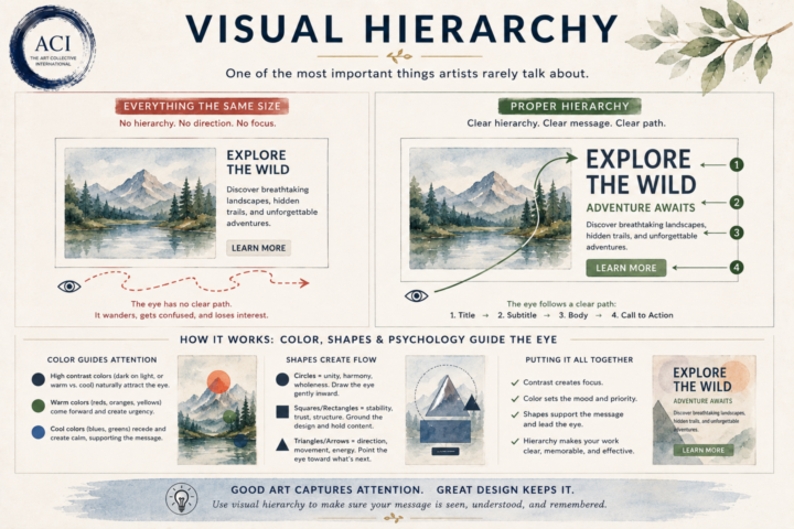
👁 Visual Hierarchy
One of the biggest differences between creating beautiful work and creating effective work is understanding where the viewer looks first. Our eyes don’t absorb everything at once. They naturally follow a path~ As artists and designers, we can influence that journey. Visual hierarchy is the intentional use of size, color, contrast, spacing, shapes, and placement to guide the viewer through your work in the order you want it to be experienced. Think about what happens when someone opens a webpage, looks at a poster, or glances at a painting. What do they notice first? What keeps their attention? Where do they look next? Without hierarchy, the eye wanders. With hierarchy, the eye flows~ This is where color psychology and shape psychology begin working together. A bright accent color naturally pulls attention. A dark value against a light background creates contrast. Circles tend to draw the eye inward and create unity. Squares and rectangles communicate stability and structure. Triangles, diagonals, and arrows create movement and direction. White space gives everything room to breathe. None of these principles exist in isolation. They’re all working together to create a visual conversation between your work and your viewer. Whether you’re painting, designing a logo, building a website, or creating social media graphics, you’re constantly answering one simple question: “Where do I want someone to look first?” If you can answer that intentionally, you’ve already begun creating visual hierarchy. Because good design doesn’t just capture attention~ it guides it~!
🔥
20d •
🎨 WIP Wednesday
Work in progress is a funny thing. A piece can spend weeks looking like absolutely nothing... and then one afternoon it suddenly decides to cooperate. Until then, it's usually layers, experiments, little adjustments, and the occasional moment of staring at it from across the room as if that will somehow solve the problem. (Occasionally it does~ perpective can be powerful~!) This week we're celebrating the middle of the process~ the sketches, test pieces, color swatches, half-finished projects, and all the other things currently taking up space in our studios. Not everything needs to be finished in a day~ Sometimes the work is simply spending time with an idea long enough to see where it wants to go. And trust me, I've had plenty of pieces that sit as a W.I.P. for a long time until it's done and ready~! So, what are you working on this week?

21d •
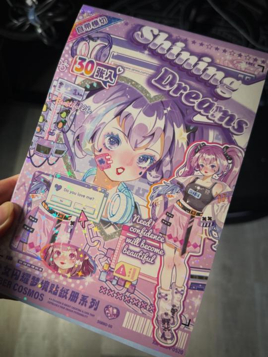
Decorating sketchbook/journal
I have finally gone full into getting stickers. I started wanting to journal or decorate while I sketch to take breaks in between. Yesterday, I stickerfied my new notebook to jot down ideas and sketchbook I received as a gift. Best believe the decorating makes me more motivated to use these both! What’s your trick to coming back to the same journal/sketchbook or do you like decorating them?
1-30 of 101
powered by
skool.com/theartcollectiveinternational-5768
A welcoming home and hub for artists, creatives, and curious minds to learn, create, share, and grow together.
Suggested communities
Powered by