
9d • Art Tips
Colour mixing hack
I thought I would share a free colour mixing hack I have discovered in the last couple of weeks. If you are having trouble matching a colour from a reference photo with the colour you mix on your pallet, and you want to try mixing a close match without wasting expensive paints or too much trial and error this may help.
I started painting in November last year using acrylics after watching some of Sam’s painting tutorials on YouTube. I soon discovered how easy it is to mix colours that looked nothing like the colour I was trying to achieve. The subsequent trial and error process was a bit frustrating and wasting expensive pigment.
Here is my solution:
1. I take a reference photo and copy it into powerpoint;
2. Create one or more rectangles beside the photo and use the eyedropper to fill each rectangle with a colour picked from the photo;
3. Open Microsoft Copilot;
4. Select one or more of the rectangles filled with the colour picked from the photo;
5. Copy and paste the rectangle into the Copilot “ask anything” box;
6. Type this instruction or something similar into the “ask anything” box alongside the coloured rectangle..
“how to mix the attached colour in acrylics using a mix of all or some colours ultramarine blue, titanium white, burnt sienna, yellow ochre, cadmium yellow light, quinacridone magenta, cobalt teal, alizarin crimson”
7. Push the enter button, and wait a few minutes;
8. The response you should get is a step by step colour mixing guide tailored to your specific colour swatch query as follows:
Peter, this one is a light, clean, gently cool blue‑green — not turquoise, not sky blue, and not mint. It sits right between cobalt teal + white and a softened ultramarine mix, but without the strong green punch of teal or the violet bias of ultramarine. It’s a beautifully balanced, airy colour.
Here’s the most reliable way to mix it from your palette.
Understanding This Colour
• Hue: blue with a slight green lean
• Value: light–mid
• Chroma: moderate (fresh but not intense)
• Temperature: cool, but not icy
• Character: soft blue‑green, like a pale coastal blue
This tells us: Start with cobalt teal
Control the blue bias with ultramarine
Lift the value with white
Avoid earth pigments except for micro‑adjustments
Step‑by‑Step Mixing Method
1. Start with Cobalt Teal
This is the backbone of the colour.
Cobalt teal gives:
• the greenish tint
• the clean chroma
• the modern, fresh feel
Use a generous amount — this colour is teal‑dominant.
2. Add Titanium White
This is what brings the colour into the light‑blue zone.
Add white slowly until you reach the soft, airy value of the swatch.
White will:
• lighten
• cool
• slightly desaturate
If it becomes too pale or chalky, deepen it with a touch of cobalt teal.
3. Add Ultramarine Blue (small amount)
This is the key to matching your swatch.
Ultramarine:
• deepens the mix
• shifts it away from green
• adds a gentle violet‑blue undertone that balances the teal
Use it sparingly — too much will push the colour toward periwinkle.
4. Fine‑Tuning the Match
Too green?
Add ultramarine blue.
Too blue?
Add cobalt teal.
Too light?
Add cobalt teal or a touch of ultramarine.
Too dark?
Add titanium white.
Too bright / too clean?
Add a micro‑touch of burnt sienna to neutralise (pinhead amount).
Too cool?
Add yellow ochre (very tiny amount).
5. A Reliable Starting Recipe
Try this first:
• 2 parts Cobalt Teal
• 1 part Titanium White
• ⅛–¼ part Ultramarine Blue
• Optional: micro‑touch of Burnt Sienna (only if you need to mute it slightly)
This should land you extremely close to the light blue‑green swatch you uploaded.
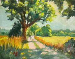
I have started using this colour mixing hack to differentiate between the different greens in foliage, grass, clouds, paths and it seems to give me a good starting point for mixing the colours I want for my recent painting. It may not be perfect but it seems to come close and the step by step instructions are giving me a better understanding of how colours mix and how to adjust tonal values so I am learning about the pigments in a more structured way and not just by trial and error.
Hope you find this useful.
7
7 comments
Colour mixing hack
skool.com/painters-hub
🎨 Free community for landscape painters improving their skills. Learn to create professional-quality paintings you're proud to display or sell 😀
Leaderboard (30-day)
1

+209
2
+102
3

+73
4

+61
5

+49
Powered by