Activity
Mon
Wed
Fri
Sun
May
Jun
Jul
Aug
Sep
Oct
Nov
Dec
Jan
Feb
Mar
Apr
What is this?
Less
More
Memberships
Sams Landscape Painting School
476 members • $39/month
Painters Hub
7.5k members • Free
119 contributions to Painters Hub

19d •
Colour mixing hack
I thought I would share a free colour mixing hack I have discovered in the last couple of weeks. If you are having trouble matching a colour from a reference photo with the colour you mix on your pallet, and you want to try mixing a close match without wasting expensive paints or too much trial and error this may help. I started painting in November last year using acrylics after watching some of Sam’s painting tutorials on YouTube. I soon discovered how easy it is to mix colours that looked nothing like the colour I was trying to achieve. The subsequent trial and error process was a bit frustrating and wasting expensive pigment. Here is my solution: 1. I take a reference photo and copy it into powerpoint; 2. Create one or more rectangles beside the photo and use the eyedropper to fill each rectangle with a colour picked from the photo; 3. Open Microsoft Copilot; 4. Select one or more of the rectangles filled with the colour picked from the photo; 5. Copy and paste the rectangle into the Copilot “ask anything” box; 6. Type this instruction or something similar into the “ask anything” box alongside the coloured rectangle.. “how to mix the attached colour in acrylics using a mix of all or some colours ultramarine blue, titanium white, burnt sienna, yellow ochre, cadmium yellow light, quinacridone magenta, cobalt teal, alizarin crimson” 7. Push the enter button, and wait a few minutes; 8. The response you should get is a step by step colour mixing guide tailored to your specific colour swatch query as follows: Peter, this one is a light, clean, gently cool blue‑green — not turquoise, not sky blue, and not mint. It sits right between cobalt teal + white and a softened ultramarine mix, but without the strong green punch of teal or the violet bias of ultramarine. It’s a beautifully balanced, airy colour. Here’s the most reliable way to mix it from your palette. Understanding This Colour • Hue: blue with a slight green lean • Value: light–mid • Chroma: moderate (fresh but not intense)

0 likes • 12d
@Raymundo Gonzalez Chromamagic is nice and easy to use.
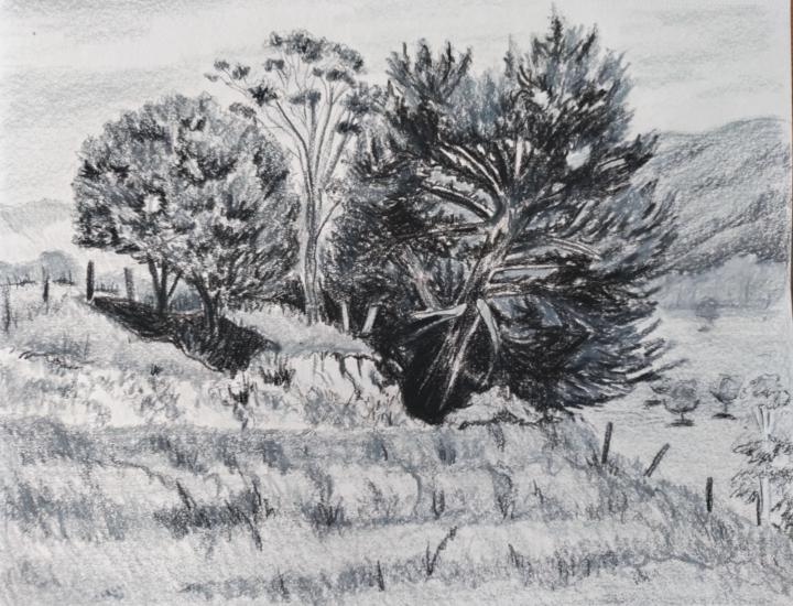
1 like • 18d
Great sketch Loreen. I haven’t even started on it yet!
28d •
Seascape
a small color study in pastel on clear gessoed watercolor paper. comments are welcome.
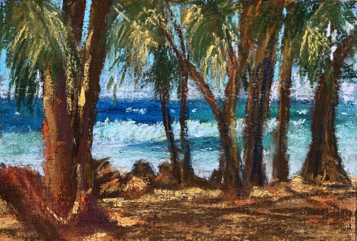
0 likes • 21d
@Cliff Dunaway Thank you 🙏
0 likes • 21d
@Jean Adams Thsnk you so much 🙏
Feb 25 •
Masai woman
just finished this portrait of a Masai tribal woman. 7x9 canson velvet. and soft pastels. comments are welcome.
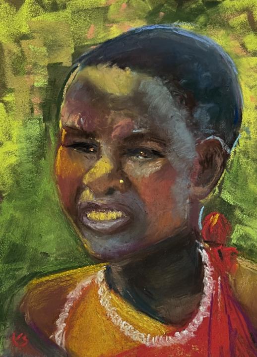
1 like • Feb 26
@Loreen Pawlak Thank you Loreen
0 likes • 22d
@Terri Reese Thank you 🙏

29d •
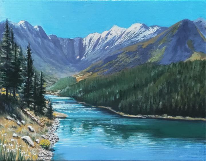
Clinton Gulch post Sam's Critique
I have implemented changes per Sam's critique. I lightened shadows in the back two-three mountains, toned down the yellow/ochre in the biggest mountain, lightened the back ridge, and lightened the sky. I also put some desaturated greens and such at the base of the concave back ridge, varied the pines on the left, and monkeyed with the snow areas. I also restated shadows in the tre-filled hill closest us. Left is update. Right is previous. Water is untouched. Any tint differences are due to lighting variance.
1 like • 28d
Nice touches Loreen. Looks really beautiful
1-10 of 119
