Activity
Mon
Wed
Fri
Sun
Apr
May
Jun
Jul
Aug
Sep
Oct
Nov
Dec
Jan
Feb
Mar
What is this?
Less
More
Memberships
GetKnown
18 members • Free
20 contributions to GetKnown
3d •
Calendar Updates
We're not deleting dates, I just like Monsters Inc... 😆 The Calendar tab in our GetKnown community has been updated to now include Study Hall and Night School sessions through June. Katie will update Night School dates with the topic(s) as they approach, though we can plan on it being timely and useful :) Those are for premium level so don't forget to upgrade if you'd like to jump in on that! Coffee chats continue to be alternating Tuesdays and for the most part Study Halls remain on the 4th Friday of the month. May's will be a little earlier to avoid leading into Memorial Day Weekend where we know some might have plans that begin Friday (big graduation weekend in some places!), so we're planning ahead which is part of the heart of Study Hall anyway.
2
0

7d •
Coffee Chat Catch Up
Hey everyone! Didn't have any takers for coffee chat last week (that's ok, it happens!), but I still wanted to share a few email content-related tips that I would've mentioned. I'm approaching these from more of a recipient view: ❤️ Things I love to see: -Concise and real subject line "$20 off", "First look at new line" tells me what I'm getting into -Images or logos that link back to your homepage 💔Things I'm not a fan of: -Send lines that are unfamiliar: Big companies do this sometimes (unsure if it's accident or on purpose with them) but small businesses aren't immune as I've seen odd bits of email or first-name-only end up there, leaving me to wonder who it's from. -"Burying the lead": Almost just missed a sale I've been waiting on because they buried the lead which is their Easter sale starting today! 📌Things to consider: -Double check your links before sending, not just that they work but are relevant -Use your metrics for send times and if your audience is more of a laptop or mobile device crowd -If you must do a re-send to correct an error, don't sweat too much. You aren't the first nor the last. Lean into it and accept it as a sign of being human

14d •
Coffee Chat Tomorrow- 2/24!
We've got another Coffee Chat on the calendar for tomorrow! We can address any burning questions you've got, or if no questions we'll jump into chatting email marketing (in the spirit of tonight's Night School). I'm no Flodesk Whisperer, so we'll stick to the content rather than the how-to-- what are things you've done that have worked? What have you seen from other businesses that worked?
1
0

14d •
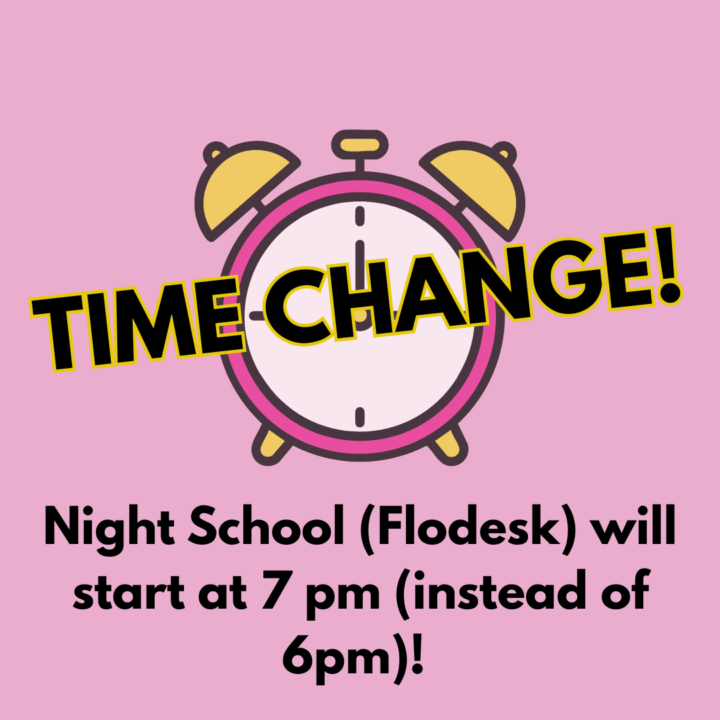
Night School Time Change
Tonight's Flodesk class with Katie for premium members will begin at 7pm. (Extra hour to upgrade, I guess? ;-) Time change is reflected in the platform calendar.
20d •
Food for Logo Thoughts (Coffee Chat Follow-On)
Last week's coffee chat, we covered the bases of chatting all things logos which eventually landed us on the wild situation of the Cracker Barrel logo from last fall. I mentioned (as I did on here last fall) that the imagery told me a billboard was Cracker Barrel, then I noticed the new (now old) logo. Well, the flip side happened on Thursday! I'm not sure if these are super old billboard signs, or among the newest, on I-70 across Indiana, but in a flip-flop fashion the Crack Barrel billboard has the familiar logo, but the imagery wasn't shouting Cracker Barrel. So, it makes me wonder, as much as we want a logo that's recognizable and has that attention-grabbing factor, perhaps there are times where the rest of our branded visuals take center stage? Thoughts?
2
0

1-10 of 20

Active 23h ago
Joined May 12, 2025
Powered by