Activity
Mon
Wed
Fri
Sun
Jul
Aug
Sep
Oct
Nov
Dec
Jan
Feb
Mar
Apr
May
Jun
What is this?
Less
More
Owned by Robert
Design a professional-looking book, from cover to interior. Find simple guides and tips to avoid DIY design mistakes that hurt credibility and sales.
Memberships
Skool Extensions 🧩
549 members • Free
Raw Leader Premium & VIP
17 members • Free
Pro Raw Launch Lab
27 members • $97/month
Solomon’s Temple
64 members • Free
The Book Club
465 members • Free
Resolve School
317 members • $9/month
Make AI Ads
201 members • $7/month
Affinity Creatives
2.3k members • Free
The Build Room
488 members • $97/month
12 contributions to Typographic North

Mar 25 •
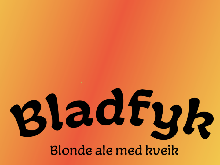
Work in progress Wednesday | 2026.03.25
Sketching out some beer labels. Fun, but I always remind myself that I'm no illustrator :-) What are you working on?

1 like • Apr 13
This looks really cool. What font is that?
1 like • Apr 19
@Kris Hus Thanks! I'll add this one to my toolkit 🙂
Feb 25 •
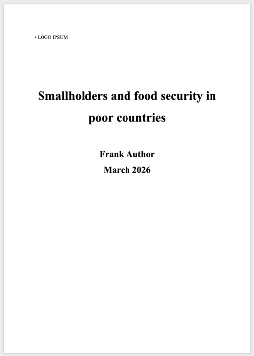
People do, in fact, judge a book by its cover
Your report is ready to be published. But there’s one small thing you can add to get it noticed. Things move slowly, then quickly. The project you’ve been working on for two years now needs to be put out there, its results shared with the world. Finally, the time has come: the paper is to be published! But it was supposed to be available, like, yesterday. You’ve been tinkering with the text document. Changed the headlines, moved some footnotes around. Rewritten the introduction 12 times. Started adding in some colours. It looks alright, but could do with some touch-up. Alas, there’s no time for design. I understand. We can’t start designing this 80-page report now and put it on the website in an hour. We’ll make sure to plan for design work next time. However, here’s what a publication designer can do in a very short time: Wrap your document in an appealing cover. You’ll export your document as it is, but the designer can make a 1, 2, or 4-page cover that envelops the document, turning it from bland to striking. This way, the work will get noticed. It will invite readers into the text and create a mood for the work. The cover can then be used in social media posts, shared in e-mails, put on posters and shared anywhere. It’s simple, quick and very effective. Cover design is not mere decoration; it’s an invitation to the reader that will be well worth the investment. If you’re looking to elevate your next report or paper with an appealing cover, let’s talk
1 like • Apr 13
"... Cover design is not mere decoration; it’s an invitation to the reader that will be well worth the investment..." this is so on point 💯
Apr 1 •
Work in progress Wednesday | 2026.04.01
Today, I'm doing my taxes 😣 Not much to show, I'm afraid. Are you doing anything interesting?
1 like • Apr 13
@Zak King

Mar 21 •
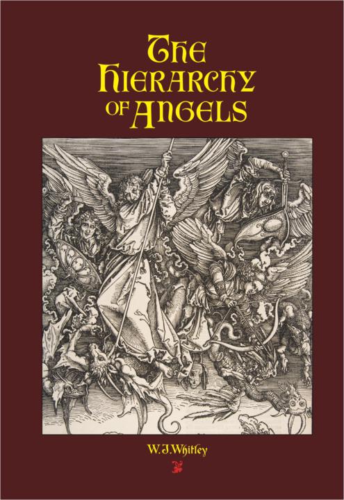
What am I working on?
I just finished up a successful Kickstarter Campaign promoting a book that I designed, typeset, and produced as print-on-demand*. I used Bembo Book for the text, and Fabritius for headlines and chapter heads (it's historical fiction, so not related to typography, except in its use). Link to the Kickstarter here if you want to see: https://www.kickstarter.com/projects/pandemoniumpress/the-hierarchy-of-angels *(yeah, I wrote it too...)
0 likes • Apr 13
Wow, I just read through your Kickstarter, and I can tell you’ve put a lot of work into this project. Really like the manual tools you used in the printing process and the bookmarks, kind of refreshing. 🙂
Feb 22 •
Are your headings clearly defined and used consistently?
You’re writing a report to be designed and published, and your blocks of text need some separation from each other. You write about different things, and headings will introduce the reader to the paragraphs under them. For someone just leafing through your report, they’ll easily spot points of interest and draw them into the text. In a larger text, you might need several levels of headings. The first one is for the general theme, like a chapter title. The next one is for subheadings, for themes within the chapter. The third, and perhaps even the fourth and fifth, for examples or even deeper sectioning. STRUCTURALLY, you should look over your heading hierarchy and make sure it makes sense. Are you using the same level of heading for the same type of content beneath it? TECHNICALLY, you should define the heading with a style in your document, not just mark it and make it bigger. Using heading styles will make it clear to a designer and typesetter what level of heading you’re intending to use. Even though your Word, Pages or Google document’s headings look a certain way, it doesn’t mean it’s the way they will be formatted in the final published document. That depends on brand guidelines, design choices, opinions and technology. There are many ways to make sure headings are clearly differentiated from the normal paragraph style: They can be bigger. Obviously. THEY CAN BE IN ALL CAPS, or small caps (preferably with some good tracking between the letters). They can be bold, italic, underlined (please don’t) – or even combinations of these (oh, please don’t). They can be set in another typeface. They can be centred above the paragraphs, or indented, or outdented, or placed in the margin, or somehow moved out from the expected reading rhythm. They can be coloured, decorated or otherwise made to look different from the main typeface. Or various combinations of the above conventions can make the headings stand out. Just be consistent, so it’s easy for the reader to get that we’re moving on to another topic, or diving further down into the current one.
1 like • Feb 22
This is a great breakdown. Love the structural vs technical split. It forces a bird’s-eye view of the whole text and flow. The ‘use heading styles, don’t just make it bigger/bolder’ point is so underrated. And the bold/italic/underline combo line made me chuckle 😄 Great reminder too that brand guidelines and design choices drive the final look.
1-10 of 12

@robert-alan-3942
Passionate about systems and book design, I've designed several books for authors and editors. I love streamlining & simplifying design processes.
Active 4h ago
Joined Oct 11, 2024
INTJ
Canada