Activity
Mon
Wed
Fri
Sun
May
Jun
Jul
Aug
Sep
Oct
Nov
Dec
Jan
Feb
Mar
Apr
What is this?
Less
More
Memberships
Painters Hub
7.5k members • Free
Sams Landscape Painting School
477 members • $39/month
246 contributions to Painters Hub

6d •
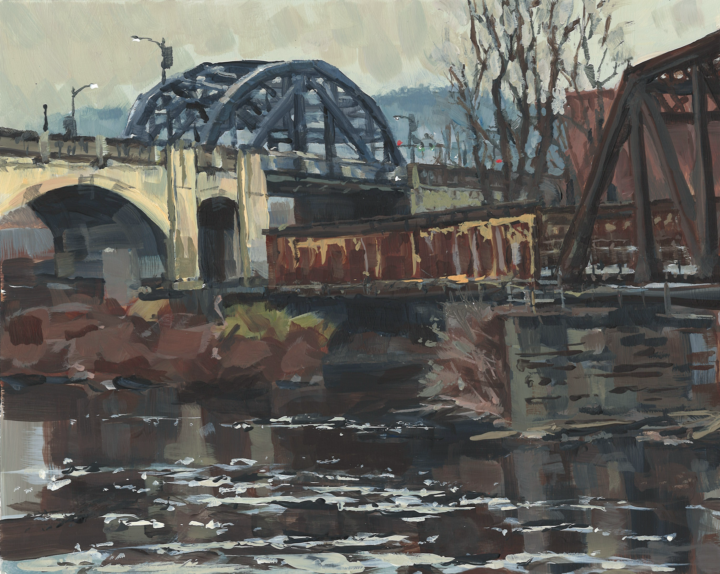
April Showers
This was an early spring cool and overcast kind of day. My Scottish sister-in-law would have called it a lovely day 😀. I started it on location but occasional drizzle was leaving spots on it so I finished it at home. 10x8 acrylic.
🔥
2 likes • 4d
@Robert Reichard ah, that does explain the advanced layering and brush work. I could have sworn it was gouache if I had not know it was acrylics.
🔥
1 like • 4d
@Robert Reichard well it turned out fine!

9d •
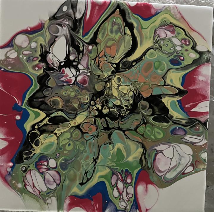
My first acrylic pour art ever
This is my first pour acrylic pour art. I didn’t know anything about how to mix and what medium would work the best. Thank you for sharing your favorite medium for pour acrylic art. Thank you.
🔥
0 likes • 5d
I’ve never tried this and I’m probably too stiff for this but I am actually quite impressed with the results you can get, even with a first go. Really nice designs.

14d •
Looking for advice.
I have never done any plein air painting and I plan on attending a plein air workshop at the end of May. Since I have two months to prepare, I am looking for any advice on how I should prepare to make this experience a success.
🔥
0 likes • 5d
@Larry Stickland here is my own checklist. I have bought the leder easel, very practical. Fits on a standard photography tripod. I have now brought my kit back to a level that it fits in one rucksack and weighs about 10 kg. What workshop are you going on, I am doing one with James Kroner in Bavaria which is also end of May!
🔥
0 likes • 5d
@Kris Kiona see my list further down. It doesn’t include the normal camping gear you may need in your case.

7d •
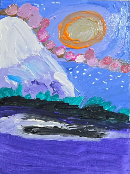
Budding Child Artist: "Sun-kissed Mountain"
This was painted by my 9-year-old neighbor friend who calls me her "grandma". I have her permission to share this. I had no input on this painting!
🔥
2 likes • 7d
Great abstract work! Let’s hope she will look back at this later and remember this freedom
9d •
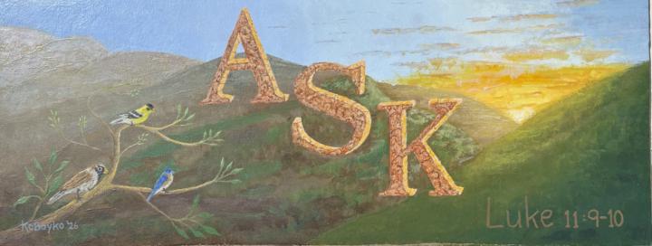
ASK
My wife requested a new and inspirational wall painting based on a bible passage Luke 11:9-10 for our family room. So I decided to use a landscape background that included some heavenly like ideas, like a sunrise and birds. Used very cool colors for the landscape and very warm for the lettering. The result worked well where the ASK appears to float in the foreground. Spent some time doing numerous thumbnails planning what would work best. How many birds, how much clouds, landscape trees or not. So I went for simplify, only what is needed. Was going to use doves, but decided it needed a bit of color to help balance the sunrise. An 8x20” acrylic. Well I got it finished for Easter. Hanging above the fireplace.
🔥
0 likes • 9d
Well timed to finish this by Easter, and how wonderful to be able to give an artistic voice to these inspirational words. I had to look up the quote, and I did, so your painting is already putting small wheels in motion. It looks good in that frame! Happy Easter!
1-10 of 246
🔥
@johan-krijgsman-8801
Started painting early 2025, in acrylics, I also experiment with gouache, soft pastels and recently water miscible oils. No art school background.
Active 7h ago
Joined Mar 29, 2025
Leiden, the Netherlands
Powered by