Write something
🚨 BIG NEWS 🚨
Something game-changing is coming to Tourism Connect… After months of building, testing, and refining, we're just days away from launching our very own AI tool built specifically for tour and activity businesses. 🧠⚙️ The Tourism Connect AI has been trained on hundreds of real, high-performing ad campaigns and proven marketing copy, all from within the tourism sector. It knows what works. And now, you will too. The Tourism Connect AI will help you: ✅ Create better marketing in minutes ✅ Save hours each week ✅ Get more bookings 💥 And here’s the best part: Every Tourism Connect member gets full, unlimited, 24/7 access. We built this with YOU in mind, and it’s unlike anything else in the tourism space right now. Launching very soon. Drop a 🔥 in the comments to get early access, and give us your feedback!
TikTok Live
Hi, has anyone here use TikTok live to sell your tour packages? If you have, how did that go?
🧭 This Can Make or Break Your Website
One of the most common mistakes I see on tourism websites is confusing or cluttered navigation. If visitors can't find what they're looking for quickly, they’ll leave, often within seconds. 📲 Here’s how to optimize your navigation for better results: - Limit your menu to 5–6 essential links: Keep it simple with pages like Home, Tours, About Us, FAQs, and Contact. Avoid overwhelming visitors with too many choices. - Use dropdowns carefully: They can help organize subpages, but too many can create clutter. Stick to what’s truly necessary. - Include a search bar: A small but powerful tool. This lets users instantly find what they’re looking for, especially helpful on larger sites. - Highlight your most important action: Whether it’s “Book Now” or “Check Availability”, make it stand out with a bold, clickable button right in the navigation. This directs users toward conversion without making them think. ✨ A well-structured navigation bar acts like a friendly guide, leading your visitors exactly where they want to go, while nudging them in the direction you want them to take. Make it easy, and they’ll stay longer. Make it confusing, and they’re gone.
Listings being copied onto other website
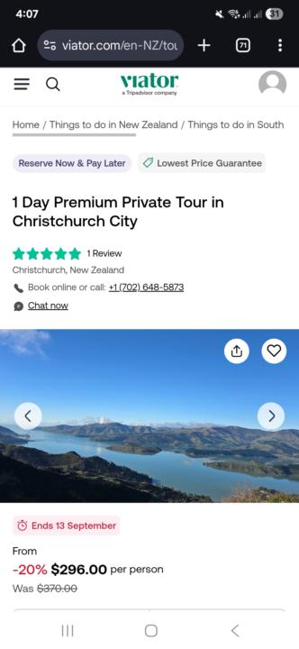
Hi, Has anyone has ever experienced having your listings being copied onto other International Website without your consent? If so, how do you deal with the situation? I have posted my listings on trip advisor. However, the itinerary was copied onto other website (which is based in UK). I know it is my own itinerary since it is offering She Chocolate, which only locals knew about. They are only attainable from their own factory or a designated cafe. No one from UK would know about it. I attached the listings that I posted on viator (trip advisor), and also the listings that is copied onto another website.

Cant access the free GHL funnels
Hi guys, I am trying to get the free funnels from section 3.2.(2) in Facebook Ads class, but it seems link is not working properly. When I click it its pointing me to https://www.gohighlevel.com/?fp_ref=sagoutimedia91, where I can only register for a free trail or login to my account. As I already have an account I press Login to app in the top right, but then I go to my account and cant find the funnels. Does anyone else have the same problem? Any help will be highly appretiated. Thanks in advace. Miro
1-30 of 85

skool.com/tourismconnect
We make getting online bookings as easy as possible for tourism businesses.
Powered by


