
Pinned

⭐
🔥
8d •
🎉VIP MEMBERS AND THEIR COMMUNITIES🎉
The VIP dictionary!🙌 Lucas duquette - Productivity Skool Jesse Niall - ADHD Over 40 Keenan Zeltinger - Zero Proof Social Deacon Nick - Influencer SkoolKit Benjamin Ross - SUPER SAIYAN SALES Rose Colbourne - Money for Real Life Josh Yip - SKOOL PARTNERS Michael Rizk - Expanding Capacity Éva Raposa - Connect & Collab Jack Robinson - Skoolyard Chris Earl - Mysfitz Laurie Mishmash - Golden years

Pinned
⭐
🔥
1h •
🌟Everyone Is Building Communities for Entrepreneurs.
I built one for grandparents. And it might be one of the most emotionally sticky niches on Skool. Most communities compete for: • Coaches • Creators • Agency owners • Course builders All fighting for the same audience. Meanwhile… There are 70+ million grandparents in the U.S. alone. 🌟Highly loyal. 🌟Highly values-driven. 🌟Deeply relationship-oriented. Underserved. So I built Grandparents Corner ~ a retention-first, purpose-driven community designed around: ✔ Structured engagement prompts ✔ 1-3 expert guest speakers per month ✔ Long-distance grandparenting support ✔ Learning-through-play toy & book recommendations ✔ High-trust recommendation culture ✔ Optional vetted income pathways for those wanting time freedom This isn’t a hobby group. It’s a legacy-based ecosystem. Grandparents don’t churn chasing tactics. They stay when they feel seen, useful, and connected. When they feel they belong💛 That creates depth most entrepreneur communities never reach. Why This May Interest You (As a Skool Owner) If you: • Serve parents or families • Believe in high-retention niches • Study community structure • Host experts or want collaboration opportunities • Value long-term positioning over short-term hype This model is worth observing. I’m actively building relationships with expert speakers, authors, and aligned community owners. Curious how a high-retention, non-entrepreneur niche is structured? Join Grandparents Corner and take a look inside. (If you're exploring collaboration or cross-community value, I’m open to connecting.) Let’s build communities that outlast algorithms.
Pinned
⭐
🔥
5d •
🚨 FREE ADVERTISING 🚨 for a little bit longer 🚨
Quick heads-up Fam— this is a great opportunity while it lasts… There’s a Skool advertising community with 400 members and growing fast... Right now, advertising inside the community is still FREE…. I do not know for how much longer but it is free now. You basically just need to post it and engage with ppl. No catch. This group is big in connecting and get seen by successful creators. Perfect time to jump in so you can grow fast. 👉 Here’s the link: https://www.skool.com/skool-community-9362/about?ref=772365c59f0346c0833acdbf6045a67d Let me know who is in🔥👇

17h •
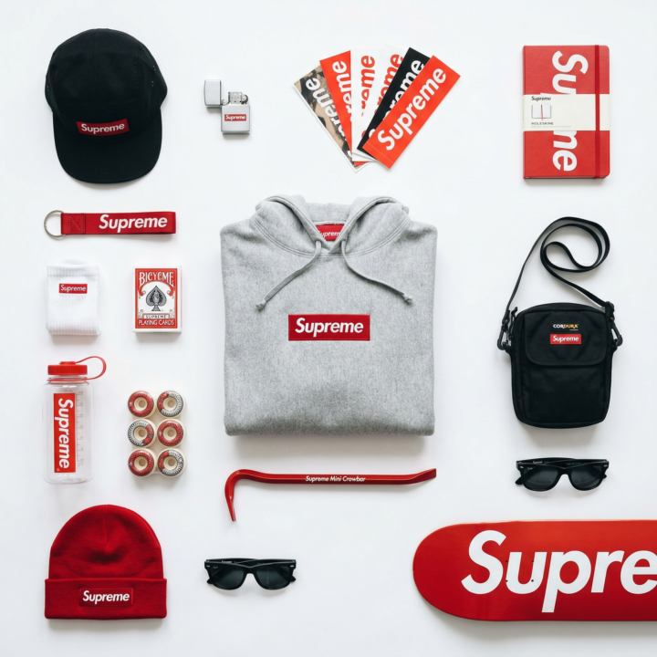
🟥 Flat Lay Brand System Prompt
This is one of the cleanest ways to make a brand look premium without overcomplicating it. Instead of generating one random product image, you build a structured flat lay that shows the full lifestyle around a brand. It works for: • Portfolio pieces • Mock campaigns • Pitching brands • Etsy / print posters • Instagram carousels • Paid client concepts The key is structure, spacing, and color control — not chaos. Here’s the full template 👇 ⸻ TEMPLATE [BRAND NAME]. Act as a Product Photographer and Art Director specializing in editorial still life and brand identity visual systems. ⸻ PHASE 1: CONCEPTUAL FRAMEWORK Create a curated flat lay composition that visualizes brand ubiquity through everyday objects. This is a “branded universe” – a knolling-style arrangement where [BRAND NAME] appears consistently across lifestyle objects. The image should feel like opening a collector’s essentials kit. ⸻ PHASE 2: OBJECT SELECTION Autonomously select 10–15 objects that represent [BRAND NAME]’s lifestyle ecosystem: • Mix apparel, accessories, and small everyday objects • Match objects to the brand identity • Mix large anchor items with smaller detail items • Branding must be visible but natural ⸻ PHASE 3: KNOLLING RULES • Clean grid alignment • Objects parallel or perpendicular • 2–5cm spacing between items • Even visual balance • Hero product placed in center or golden ratio • Nothing cropped ⸻ PHASE 4: COLOR CONTROL • 80% neutral base • 15–20% signature brand color • Brand color repeated across multiple objects • Mix matte and glossy textures while staying color disciplined ⸻ PHASE 5: CAMERA & LIGHTING • Perfect overhead angle • 50–80mm lens • f/8–f/11 (everything sharp) • Soft diffused light • Minimal soft shadows • Clean white or light gray background ⸻ PHASE 6: FINAL POLISH • Bright, clean color grade • Slight desaturation • Medium-low contrast • Subtle accent color boost ⸻ If you try this, post your version below.
⭐
🔥
14m •
🚨NEW FEATURE🚨 THE HOT SEAT🔥🔥
How this will work!! Everyday inside The Hub there will be a post where each of you can comment to win the seat for that night! On the “fighting for the hot seat post” you will be able to post about what you are struggling with in your community or in everyday life…🙌 One person from that post will be picked to sit in the seat that night! Their question, their community and their name will all be tagged in the post and you will get 10,000 eyes on you helping you out in the seat and brainstorming ideas all for YOU in the comments❤️ This is for ALL members, free/premium/VIP!! Stay tuned for the first hot seat battle in 1 hours time!🔥🔥🔥

1-30 of 6,501
skool.com/theskoolhub
Advertise, build relationships and connect with skoolers all over the world. Upgrade to Skool Hub premium here
Leaderboard (30-day)
1

🔥
+2293
2

🔥
+2004
3

🔥
+1318
4

+1219
5

🔥
+1073
Powered by