
🔥
9d (edited) • 🎨 Art and Business 💻
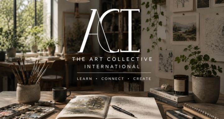
Making Banners and Covers~
Whether it's for your social media, community, website, or book~
A cover / banner has one job:
To tell someone they've arrived in the right place~
Not to show off every skill you have.
Not to fit your entire brand guide into one image.
Not to explain your business.
Just to create immediate clarity~
Many here are also community owners so I put together a little guide~ hope it helps~ especially while everyone is on edge over the new discovery systems involved.
A few things I look for:
🌿 1. One Clear Focal Point
Your eye should know where to land first.
If everything is competing for attention, nothing wins.
🪴 2. Readable at a Glance
Most people see banners for a second or two.
Large text.
Simple message.
High contrast.
If someone has to zoom in, you've already lost them.
A good banner guides people through the design.
Use composition, contrast, and direction to lead someone naturally from your focal point to your message.
Trees can lean inward.
Brushes can point toward the title.
A pathway can guide someone into the scene.
People and animals should usually look into the composition~ not out of it.
Every element should quietly encourage the viewer to stay a little longer.
🌊 3. Support the Message
Backgrounds should support~ not compete.
Beautiful artwork is wonderful...
...unless it's making your title disappear.
🏡 4. Breathing Room
Every inch doesn't need to be filled.
Negative space gives the eye somewhere to rest and actually makes the important parts feel more important.
🎯 5. Know the Purpose
Different banners and covers have different jobs.
A storefront banner should invite.
An educational banner should reassure.
An art banner can inspire.
A community banner should make people feel welcome.
🌸 6. Consistency Builds Trust
Fonts.
Colors.
Photography.
Illustration style.
People should begin recognizing your work before they even read your name.
🌱 7. Design for the Viewer, Not Yourself
One of the hardest lessons in design:
Your favorite version isn't always the most effective version.
If people instantly understand where they are~ then the banner succeeded.
Good design isn't about adding more, or doing more~
You have to think about removing everything that distracts from the message.
6
6 comments
Making Banners and Covers~
powered by
skool.com/theartcollectiveinternational-5768
Your creative hub for learning, inspiration, and community.
ACI offers accessible courses and prompts to help every artist reach their next level.
Suggested communities
Powered by