
Write something

2d •
Critique Wednesday 🔍 which piece should lead your portfolio?
Warm-up for tomorrow's live review. Post two pieces from your portfolio. Everyone else answers with just "1" or "2": which one should be the first thing an art director sees? I'll add one sentence on why for each post. Which two are you sharing?
0
0
3d •
Technique Tuesday: the thumbnail that sells the job ✏️
Before an art director sees a finished piece, they often see a thumbnail. A good one can win the job on its own. My three rules: 1. Stamp size. If it doesn't read at 5 cm wide, it won't read on a book cover. 2. Three values only. Light, middle, dark. No details yet. 3. One clear focus. Where should the eye land first? Make that the darkest-against-lightest spot. I draw six of these before every Karma & Jonar spread and throw five away. How many thumbnails do you usually draw before you start – 1, 3 or 6+?
0
0
15d •
The 3-line portfolio email that gets opened 📬
Last time we talked about follow-ups. Today: the very first line an art director sees. Most portfolio emails start with "My name is…". Theirs is full of those. Try this instead: 1. Line 1 – why them: "I loved how [book/game] handled [one specific thing]." 2. Line 2 – what you make: "I illustrate [kind of work] for [kind of reader]." 3. Line 3 – one link: "Here's one piece I think fits your list: [link]." That's it. No life story, no attachments. If they're curious, they'll click. Which line is hardest for you to write – 1, 2 or 3?
0
0
18d •
🎯 Weekly goals: get one thing ready for Thursday
Two small goals again, with a little twist: let one of them be ready for the live review on Thursday. 🎨 Art goal – e.g. "finish the monster from Friday", "pick my 8 strongest pieces" 💼 Client goal – e.g. "put my portfolio link in one place", "send the follow-up email I've been putting off" Mine: 🎨 final reward illustrations for the Kickstarter. 💼 send launch-day emails to the people who have supported my books before (we go live 10 November!). What's your one art goal this week?
1
0
22d •
What preparing a Kickstarter taught me about pricing my work 💰
The Karma & Jonar Kickstarter launches on 10 November. Planning it forced me to do something most illustrators avoid: put a real number on every piece of work. Three things I learned: 1. Count the hours, not the drawings. 2. Price the use, not just the image. Art for a print, a game and a book cover is worth very different amounts. 3. Write the number down before the conversation. If you decide your price while talking to the client, you'll go too low. The same rules work for your first book or commission. What do you find hardest to price – your time, or the use of the art?
2
0
1-30 of 109
powered by
skool.com/the-illustrators-club-3903
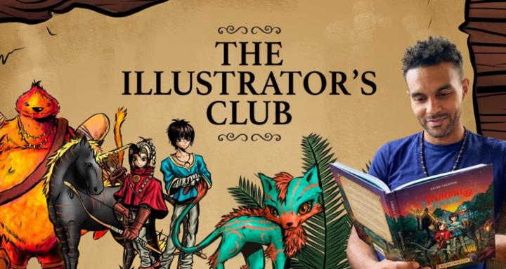
Do you dream of creating your own children's books? Or making a living as a freelance illustrator? Connect and learn from other aspiring artists!
Suggested communities
Powered by