
Write something
Pinned

Mar 16 •
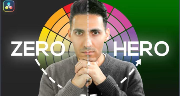
Why Warm Wedding Color Grades Look Dingy (5 Easy Fixes in Resolve)
Thing is not just pertaining to wedding videos. I see too many grades that are so called warm looks but instead look dirty, dingy, with yellow teeth and egg yolk sky. In this video I will show you what the client actually want and how to blow their fuc**** mind. Watch the full video If you have any content suggestions drop them in the comment section of the video. I am always looking for authentic topics. Enjoy!

🔥
28d •
Contrast without crushing the blacks
Please please please Waqas make me understand this?! I’ve tried to grade for a week for a Sony fx3 commercial I shot. I apart from not being happy with it.. I have a particular problem that I don’t seem to find how.. no matter how much I play around with everything. I’ve attached a video as reference of what I want to achieve.. that perfect color contrast without getting cliepped in the blacks at all and without leavening any of that fade in the image. Please please make me understand how. Maybe you can record a short loom video showing how or show me a YouTube video of yours that already shows this.
2
0

Mar 10 •
What type of color grading content would help you the most right now?
Quick question for everyone in the Vault 👇
Poll
10 members have voted

Jan 30 •
Do you have color grading experiences?
Do you have color grading experiences?
Poll
12 members have voted
Mar 5 •
Share your best graded image below
Hey fam, I’d love to see your work. Go ahead and share your best graded image below. 👇

1-18 of 18
skool.com/the-color-grading-vault-3449
Your Complete Color Grading Knowledge Base. QazVerse
Leaderboard (30-day)
1
🔥
+2
Powered by