
Jan 17 • General discussion
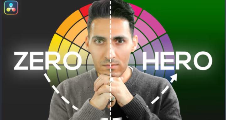
Why Modern Movies Look Worse Than Films From 1988
Read time: 2 minutes
I had a moment over Christmas that made me question everything about modern color grading.
I was watching Die Hard (1988) with my 14-year-old nephew, a kid who grew up on Spider-Man and Fortnite. Out of nowhere, he said:
"Uncle Qazi, this feels like they didn't even grade this movie. It just feels so realistic."
That hit me hard.
The Invisible Art
Walter Murch, the legendary editor behind The Godfather, said the best editing is invisible. I believe the same applies to color grading.
Die Hard looks real because:
- Skin tones are perfect.
- The lighting matches what your eyes would actually see.
- Nothing is over-processed.
- The contrast feels natural.
Then I watched Ip Man 4 (2019). And honestly? It destroyed my brain.
What Happened to Our Colors?
Everything was washed out, over-stylized for no reason, and distractingly bad. This is a period piece. Why are we making it look like this?
I bought the movie in the highest quality possible on Apple TV, and I still couldn't focus on the story because the grading was so off. The contrast was gone. The blacks weren't black. Everything lived in this muddy middle ground.
Compare that to Misery (1990): beautiful blues in the shadows, warm practical lights, perfect skin
tones. The color rendition is so authentic that you stop analyzing the image and just focus on the story.
When to Break the Rules
Here's the thing: there is absolutely a time and place for stylized grading.
- Fantasy (Dune): Go wild. We're on an alien planet. Take us there.
- Superhero (Spider-Man): This should be the epitome of fantasy. Instead, modern MCU films often look flat and digital, lacking true contrast.
- Musicals (Wicked): Should be bursting with color. Instead, it often feels like there's a gray smudge on the screen.
Meanwhile, The Wizard of Oz (1939) still has better color separation than most films released today.
The Bottom Line
Know your genre. Know your story.
- Drama/Thriller: Keep it authentic, invisible, true to life.
- Fantasy/Sci-Fi: Create a world, take us somewhere new.
- Commercial/Beauty: Clean, separated, make the subject pop.
In 2026, I'm focusing more on teaching taste and decision-making in color grading, not just twisting knobs. Because that's what actually matters.
Let's Talk
I want to hear from you. What content would you like to see this year? Do you have specific questions about color grading or client work?
Hit reply and let me know. Your suggestions shape what I create next.
Talk soon,
Qazi
P.S. If you want to work faster and smarter with professional-grade looks built from 15 years of experience, check out Rapid Grade here. For the first time ever, you can purchase it standalone (no bundle required).
2
0 comments
Why Modern Movies Look Worse Than Films From 1988
skool.com/the-color-grading-vault-3449
Your Complete Color Grading Knowledge Base. QazVerse
Leaderboard (30-day)
1

+1
Powered by