14d • Landing Page Feedback
Which Headline + Color Flow Hits Harder? (Feedback Needed 🙏)
Hey everyone 👋
I’m refining my landing page using the one-sentence headline framework and testing both wording and color flow.
My audience is women in perimenopause dealing with sleep issues, weight gain, and low energy—and I want this to feel clear, specific, and scroll-stopping.
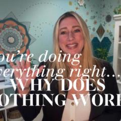
I have two versions here (attached):
• One focused on sleep (2–3AM wake-ups)
• One focused on weight (stubborn belly fat)
Would love your honest feedback on:
👉 Which headline grabs you more immediately
👉 Which one feels clearer / more compelling
👉 If the color highlighting flows well or feels distracting
👉 If any words should be emphasized differently
👉 Anything you’d tweak to make it stronger overall
Appreciate any insight—still dialing this in 🙏
2
1 comment
Which Headline + Color Flow Hits Harder? (Feedback Needed 🙏)

skool.com/paid-ad-secrets
The #1 Fastest Growing Paid Ads Community Online ⚔️
Leaderboard (30-day)
1

+79
2

+73
3

+70
4

+34
5

+31
Powered by