
16h • General Discussion 💬
🚨 Nano Banana 2 just dropped 🚨
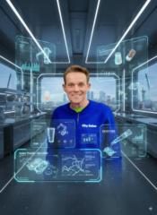
Google just quietly dropped Nano Banana 2, and while the internet was looking elsewhere, the game for creators changed.
The biggest shift? We’ve moved from "cool art" to utility.
3 things Nano Banana 2 is actually fixing:
- Legible Typography: It finally understands posters, menus, and labels. No more "AI gibberish" on product renders.
- Geographic Accuracy: It handles real-world locations and historical context with far more precision. It doesn't just guess; it adheres.
- The "Design" Finish: The output is sharper and less "plastic." It feels like a finished asset, not a base layer you have to spend 2 hours fixing in Photoshop.
Why this matters for your workflow: We aren't just making "pretty pictures" anymore. This is now a tool for building actual infographics, branded product visuals, and educational content that works in a professional setting.
The Test: I’m currently pushing it on location-based historical scenes
0:13
3
4 comments
🚨 Nano Banana 2 just dropped 🚨

skool.com/ai-automation-society
A community built to master no-code AI automations. Join to learn, discuss, and build the systems that will shape the future of work.
Leaderboard (30-day)
1

🔥
+3711
2

🔥
+1340
3

+1174
4
+725
5

🔥
+599
Powered by