Activity
Mon
Wed
Fri
Sun
Aug
Sep
Oct
Nov
Dec
Jan
Feb
Mar
Apr
May
Jun
Jul
What is this?
Less
More
Owned by Valerie
Combine in-person crafting guilds into a format that is accessible online that is NOT attached to social media.
Memberships
28-Day Action Plan™
213 members • Free
Camping Wilderness Skool
192 members • Free
BMG Safety & Security Center
4 members • Free
Purpose & Profit Builders
116 members • $47/month
Evergreen Foundations
608 members • $25/month
TheArtCollectiveInternational
87 members • Free
Saving the Game
2 members • Free
Skoolers
165.5k members • Free
Social Media Skool
431 members • $49/year
12 contributions to TheArtCollectiveInternational

🔥
8d •
🎨 Prompt Me: Resist
Work of the Week~ Resist Art has ALWAYS been an act of resistance~ Resistance against forgetting~ Against silence~ Against conformity~ Against the idea that beauty, truth, or humanity should be sacrificed for convenience~ Resistance can be loud~ Other times~ it's quiet. And occasionally it's~ Painting anyway Writing anyway Creating anyway, creating inspite of~ Every artist eventually chooses what they're willing to resist~ and what they're willing to stand for~ Throughout history, artists have resisted with paint, clay, ink, thread, music, photography, and film~ not always by fighting against something, but by choosing to create something worth preserving. What does resistance mean in your creative practice?

4 likes • 8d
The soulfulness of this really reminded me of poetry....Poetry about resistance.
🔥
10d •
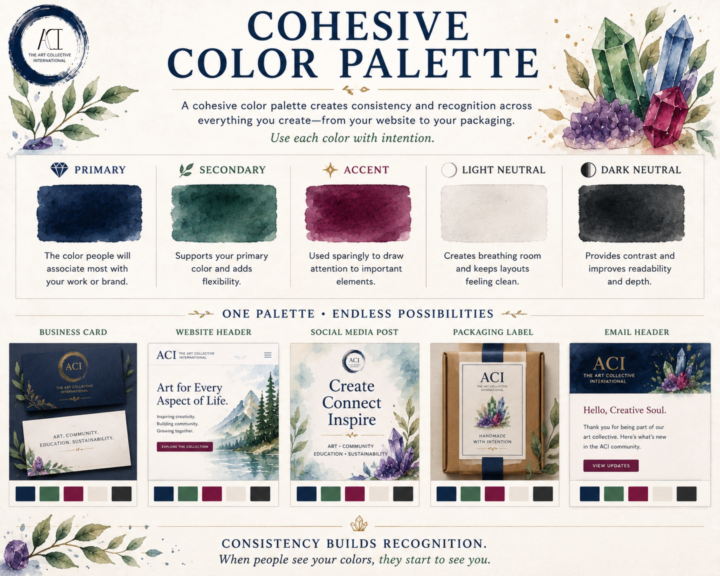
🎨 Cohesive Color Palette
A cohesive color palette isn't about limiting your creativity~ Consistency is the goal to keep everything cohesive. Whether you're designing a website, packaging your artwork, building a portfolio, or posting on social media, a thoughtful palette helps your work feel connected~even before someone recognizes your name. A simple palette is often all you need: 💎 Primary Color The color people will associate most with your work or brand. 🌿 Secondary Color Supports your primary color and adds flexibility. ✨ Accent Color Used sparingly to draw attention to important elements like buttons, links, or highlights. ⚪ Light Neutral Creates breathing room and keeps layouts feeling clean. ⚫ Dark Neutral Provides contrast and improves readability. You shouldn't try to use every color equally~ Aim to use each color intentionally~! When the same colors appear consistently across your website, business cards, packaging, social posts, and promotional materials, they become part of your visual identity. People begin to recognize your work before they even read your name. That's the power of a cohesive color palette~! Here's a look at an alternate version of ACI if we had taken a different direction with our brand colors. Revisiting these concepts was a lot of fun. Some of these palettes are from the very beginning of ACI, before our visual identity really started to take shape. In the end, we intentionally chose a foundation of black, white, and neutral tones with gemstone accents. Our goal was simple: let the art take center stage. We wanted our branding to frame the work~ and not to compete with it. For us~ the strongest design decision wasn't choosing more color but knowing when to use less and how~ and an image of ACI's actual brand colors and use ideas~ ^_^
2 likes • 8d
I love these posts you are doing about applying art in different ways!
🔥
12d •
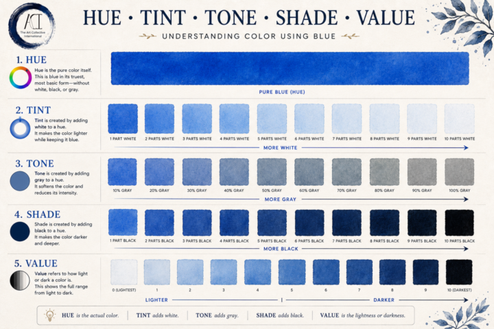
🎨 Hue, Tint, Tone, Shade & Value
Color is one of those things artists hear about constantly, but it's easy for the terminology to blur together. Understanding these five concepts makes painting, drawing, digital art, design, and even photography much easier to control. How light or dark a color is. Value exists independently of hue and is one of the biggest factors in creating depth, contrast, and believable lighting. One of the biggest "ah-ha!" moments for many artists is realizing that value often matters more than color. If your values are correct, a painting can still feel convincing even with unexpected colors. If your values are off, even beautiful colors can feel flat. Whether you're painting with watercolor, oils, acrylic, colored pencil, markers, or working digitally, these principles never change. They're part of the language every visual artist learns to speak. 👇 Question for everyone: Which one gave you the biggest "wait... that's different?" moment~ hue, tint, tone, shade, or value? Or is there another color concept you'd like to see us break down next?
3 likes • 10d
This is talked about a lot with fabric selection for quilting!
🔥
15d •
🎨 Prompt Me: SHORT
Some paintings are measured in feet/ meters~ Others are measured in inches/ cm~ A short line can suggest movement. A short story can stay with you for years. A short sketch can become a finished collection months later. This week's prompt is: SHORT Interpret it however you like. Think length, time, scale, simplicity, patience, perspective~ or something completely unexpected. Traditional, digital, photography, sculpture, fiber arts, writing... it's all welcome. We're looking forward to seeing where one small word takes you~!

2 likes • 14d
I am working on entering a quilt competition. It has to do with honoring women who made an impact (historically or in my life). It has to be 24" x 24" and I am going to focus on an improv English Paper Piecing class for it! Due by July 7th so I need to get a move on it!
🔥
14d •
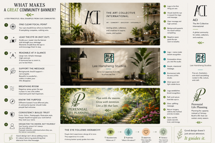
Making Banners and Covers~
Whether it's for your social media, community, website, or book~ A cover / banner has one job: To tell someone they've arrived in the right place~ Not to show off every skill you have. Not to fit your entire brand guide into one image. Not to explain your business. Just to create immediate clarity~ Many here are also community owners so I put together a little guide~ hope it helps~ especially while everyone is on edge over the new discovery systems involved. A few things I look for: 🌿 1. One Clear Focal Point Your eye should know where to land first. If everything is competing for attention, nothing wins. 🪴 2. Readable at a Glance Most people see banners for a second or two. Large text. Simple message. High contrast. If someone has to zoom in, you've already lost them. A good banner guides people through the design. Use composition, contrast, and direction to lead someone naturally from your focal point to your message. Trees can lean inward. Brushes can point toward the title. A pathway can guide someone into the scene. People and animals should usually look into the composition~ not out of it. Every element should quietly encourage the viewer to stay a little longer. 🌊 3. Support the Message Backgrounds should support~ not compete. Beautiful artwork is wonderful... ...unless it's making your title disappear. 🏡 4. Breathing Room Every inch doesn't need to be filled. Negative space gives the eye somewhere to rest and actually makes the important parts feel more important. 🎯 5. Know the Purpose Different banners and covers have different jobs. A storefront banner should invite. An educational banner should reassure. An art banner can inspire. A community banner should make people feel welcome. 🌸 6. Consistency Builds Trust Fonts. Colors. Photography. Illustration style. People should begin recognizing your work before they even read your name. 🌱 7. Design for the Viewer, Not Yourself One of the hardest lessons in design: Your favorite version isn't always the most effective version.
3 likes • 14d
Thank you! That is very helpful. We often struggle with putting too much information. We have been focusing on a banner or cover that encourages the reader to give a "yes" like going to a different space to find out more information vice trying to put it all in one place!
1-10 of 12

@valerie-horner-1774
Valerie Horner has over 25 years of accounting and finance experience.
Active 7m ago
Joined Mar 12, 2026
Williamsburg, Virginia