Activity
Mon
Wed
Fri
Sun
Aug
Sep
Oct
Nov
Dec
Jan
Feb
Mar
Apr
May
Jun
What is this?
Less
More
Memberships
Publishing Profits Academy
267 members • Free
Selling Online / Prime Mover
36.7k members • Free
125 contributions to Selling Online / Prime Mover

11d •
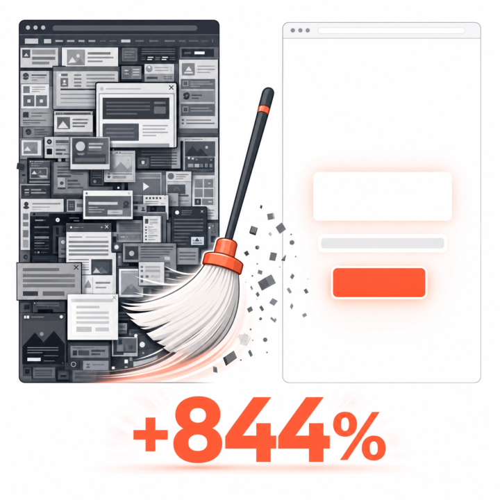
They deleted half the landing page. Conversions went up 844%
A marketing company had the usual landing page: video, signup form, "featured in" logos, a description, a how-it-works section, money-back guarantee, support promise, team bios. The works. They threw almost all of it out. New version: a signup form, a 6-word headline, an 8-word subtitle. Nothing else. Signups went from 1.39% to 13.13%. An 844% increase. Every extra section on an opt-in page is one more reason to think, scroll, hesitate, and leave. More page is not more persuasive. Usually it's just more friction. This is the hardest one for funnel builders to swallow, because we love building. But your opt-in page almost certainly wants fewer sections, not more. Try this: cut your opt-in page down to a headline, a subhead, and the form. Run it for a week against your current one. I'd bet on the stripped version.

4 likes • 11d
awesome. i did same for mine. There is this book i read Storybrand by Donald Miller. It helped me to clarify my message. Building a StoryBrand 2.0: Clarify Your Message So Customers Will Listen by Donald Miller. It helps with website, content etc.

15d •
Offer secrets? Where is this event online?
Where can I find offer secrets challenge that’s going on now?
0 likes • 15d
Its On June 26th. https://www.aisecretschallenge.com/
15d •
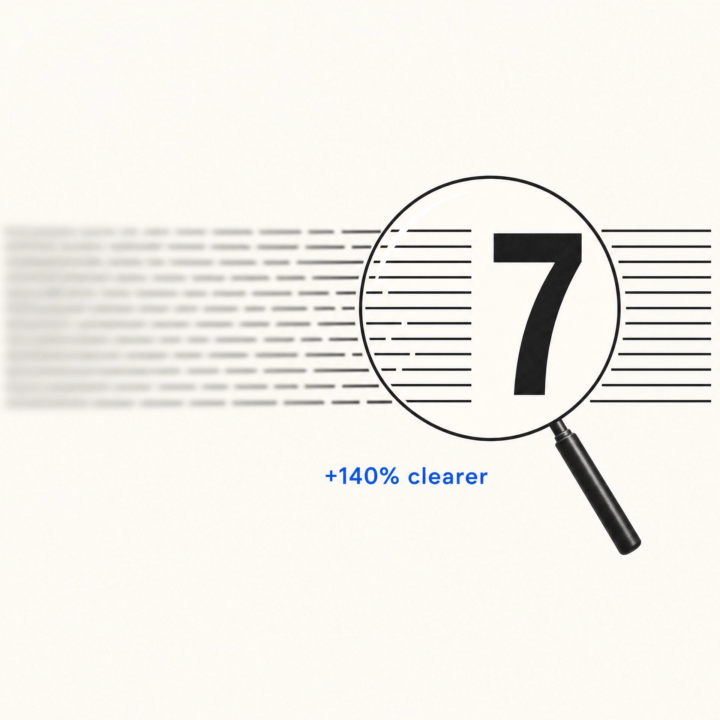
One change makes a headline 140% clearer (and clarity is what sells)
Data-driven research on what actually makes headlines clearer to readers: - Turn your headline into a question → clarity DROPS 26% - Make it a "How to" headline → clarity rises 13% - Address the reader directly ("...you...") → clarity rises 40% - Add a number → clarity rises 140% That last one is the giant. A number gives the brain something concrete to grab, which is why "7 ways to fix your funnel" reads as clearer and more credible than "ways to fix your funnel." Clarity isn't a nice-to-have. When people don't instantly get what you mean, they don't push through the confusion. They leave. Pull up your main headline. Is there a number in it? Is it speaking to "you"? Two tiny edits, and the same offer suddenly lands harder.
0 likes • 15d
@Andrew Bobchenok Thank you for this. I just added a number in my funnel headline. feels so much clearer now
18d •
Your Page Speed is costing you Ad Spend
Your page speed could be costing you ad spend. @James Curran mentioned this sometime ago and @Andrew Bobchenok mentioned this recently. I launched a Funnel recently and I noticed that clicks on my ads was very high but my landing page view on my ads manager was pretty poor. only about 28% landing page views compared to clicks. I checked my page speed with https://pagespeed.web.dev/ it showed my page was taking 7 seconds to load and I was losing 70% of my traffic because my slow speed. I had to compress the images and hosted my sales video on vimeo which was then embedded on the funnel. Speed dropped to 3 secs. This is very critical. check your page speed regularly.
0 likes • 16d
@John Berry My pleasure

22d •
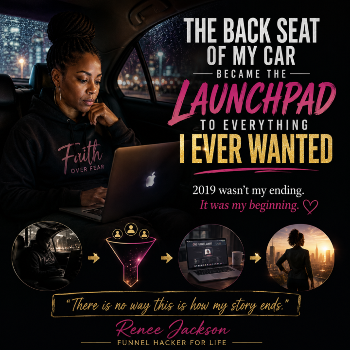
The Back Seat Of My Car Became The Launchpad To Everything I Ever Wanted
Some people are just not wired to quit. I believe a lot of us in this entrepreneurial world are built that way. We see what is possible before everyone else can see it. We keep going even when we do not have all the answers, all the money, all the support, or all the proof yet. We just have something inside of us that says, “Keep going. Figure it out. This is not how your story ends.” That was me in 2019. I was in one of the darkest seasons of my life. I had to walk away from an 18-year marriage almost overnight, and not long after that, I found myself homeless, sleeping in the back seat of my car. I did not have a perfect plan. I was hurt. I was scared. I was tired. But even in that back seat, something inside of me refused to give up. I kept saying, “There is no way i am going out like this. There is no way this is the end of my story.” Then one night, while scrolling YouTube, I came across Russell Brunson talking about funnels and the One Funnel Away Challenge. I did not fully understand funnels yet, but something in me knew. I kept saying, “This is my ticket.” That moment changed the direction of my life. From there, I started walking the path of a funnel builder. Not perfectly. Not quickly. Not without fear. But I started. Every day became another step. Learning funnels. Studying marketing. Building skills. Getting confused. Starting over. Trying again. Growing. Becoming. Now, six years later, I can look back and say this: The back seat of my car was not my ending. It was my launchpad. It was the place where I was being rebuilt. It was the place where my fight came back. It was the place where the next version of me was born. That is why this funnel journey means so much to me. Funnels did not just teach me how to build pages. Funnels gave me a path. Funnels gave me language for what I was trying to create. Funnels helped me turn survival into service. And that is why I keep showing up. Because I know there is someone else sitting in their own version of the back seat right now.
1 like • 18d
I am so encouraged with you story. This is awesome.
1-10 of 125
@michael-ehiginwa-7725
An entrepreneur focused on helping immigrants to thrive in their new country and I have a passion for writing.
Active 6d ago
Joined Mar 26, 2025
Powered by