Activity
Mon
Wed
Fri
Sun
Aug
Sep
Oct
Nov
Dec
Jan
Feb
Mar
Apr
May
Jun
Jul
What is this?
Less
More
Owned by Kelly
A community for curious minds and creative souls who follow “what if” into the unexpected.
This group is for Whimsykel Retailers only. It’s the place to connect, ask questions, and grow your success with Whimsykel Designs Decoupage Paper.
Memberships
AI Video Bootcamp
25.1k members • $9/month
Cre8tiv Collective
67 members • Free
Consistent Characters
207 members • Free
Funnel Forensics
181 members • $7/month
AI Artist Lab
700 members • Free
AI Online Educators & Coaches
3k members • Free
CULT CREATORS
209 members • Free
Skool Copy Hub
929 members • Free
Pinterest Skool
5.5k members • $7/month
37 contributions to TheArtCollectiveInternational

🔥
6d •
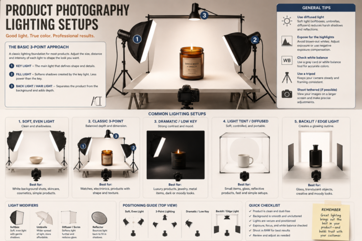
Product Photography Lighting and Set Up
It’s Less About Your Camera, More About Your Light. A common misconception I see is people think is that they need an expensive camera to take good product photos. Its 2026 and most of our cameras can do more now than our older cameras (not everything~! But for product photos, it is enough.). You really don’t~ A phone with good lighting will almost always beat an expensive camera with bad lighting. You are not just trying to make your product brighter~ think about how to show its shape, texture, color, and craftsmanship. Here are a few basics to get you started: 💡 Key Light This is your main light. It creates the overall look of your product and defines its form. I usually place it at about a 45° angle and slightly above the product. 💡 Fill Light This softens harsh shadows created by your key light. It doesn’t have to be another light~ you can often use a white foam board or reflector to bounce light back onto your product. 💡 Back (or Rim) Light This helps separate your product from the background and gives it a little extra depth. It’s especially helpful for darker products. 📦 Use Diffused Light Harsh, direct light creates hard shadows and blown-out highlights. A softbox, light tent, diffuser, or even a sheer white curtain over a window can create much softer, more flattering light. 🎨 Keep Your Background Simple Your product should be the star. A clean white, black, gray, or neutral background works for most products without competing for attention. 📸 Use a Tripod Keeping your camera steady lets you use lower ISO settings for cleaner images and makes it easier to keep every photo consistent. ✨ Take More Than One Photo Try moving your lights a few inches. Raise them. Lower them. Rotate your product. Tiny adjustments can completely change the mood of a photograph. Whether you’re selling paintings, ceramics, candles, jewelry, woodworking, stickers, or handmade goods, good lighting helps people appreciate the work you’ve already put into creating it. You don’t need a professional studio to get started.

🔥
2 likes • 6d
great info.
🔥
7d •
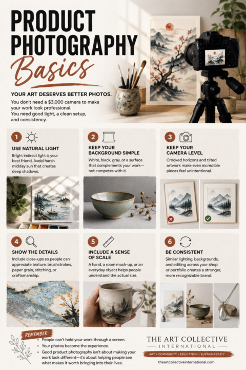
📸 Product Photography 101: Helping Your Work Sell Before Someone Holds It
One of the biggest mistakes I see artists make isn’t their artwork. It’s their photos~! Whether you’re applying to an art festival, listing work online, submitting to a gallery, or posting on social media, your photos are often the first impression someone gets of your work. Good product photography isn’t about making your art look better. It’s about making it look accurate~ Here’s where I’d start: ☀️ 1. Prioritize your lighting. Lighting is everything~!!! Natural, indirect daylight is still one of the best options available. A north-facing window or a bright room out of direct sunlight produces soft, even lighting that shows color accurately. Avoid: • Direct midday sunlight • Mixed lighting (window light + warm indoor bulbs) • Flash whenever possible The more consistent your lighting is, the more consistent your portfolio becomes. 💡 2. A light box is one of the best investments you can make~ If you regularly photograph jewelry, ceramics, glass, miniatures, stationery, candles, or other smaller products, a foldable LED light box can dramatically improve your photos. A good light box gives you: • Even lighting • Fewer harsh shadows • Cleaner backgrounds • More accurate colors • Repeatable results every single time They’re relatively inexpensive now, fold flat for storage, and can save hours of editing later. Or you can make one~! For larger artwork, you can recreate the same idea using foam boards, reflectors, or diffused studio lights. 🎨 3. Keep the background supporting the work~ not competing with it. Your background shouldn’t be the most interesting thing in the photo. Simple white, gray, black, linen, wood, or another neutral surface usually works best. Ask yourself: “Does this background help people see my work?” If not~ then simplify it. 📐 4. Keep your camera level. A crooked horizon. A tilted painting. Distorted perspective. These small things subconsciously make work feel less professional. Use the grid lines on your phone and take an extra few seconds to straighten everything before pressing the shutter.
🔥
2 likes • 7d
Such great tips.
🔥
1 like • 7d
@Hansheng Lee all your tips help
🔥
12d •
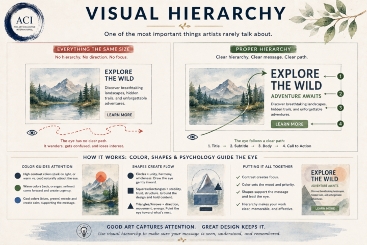
👁 Visual Hierarchy
One of the biggest differences between creating beautiful work and creating effective work is understanding where the viewer looks first. Our eyes don’t absorb everything at once. They naturally follow a path~ As artists and designers, we can influence that journey. Visual hierarchy is the intentional use of size, color, contrast, spacing, shapes, and placement to guide the viewer through your work in the order you want it to be experienced. Think about what happens when someone opens a webpage, looks at a poster, or glances at a painting. What do they notice first? What keeps their attention? Where do they look next? Without hierarchy, the eye wanders. With hierarchy, the eye flows~ This is where color psychology and shape psychology begin working together. A bright accent color naturally pulls attention. A dark value against a light background creates contrast. Circles tend to draw the eye inward and create unity. Squares and rectangles communicate stability and structure. Triangles, diagonals, and arrows create movement and direction. White space gives everything room to breathe. None of these principles exist in isolation. They’re all working together to create a visual conversation between your work and your viewer. Whether you’re painting, designing a logo, building a website, or creating social media graphics, you’re constantly answering one simple question: “Where do I want someone to look first?” If you can answer that intentionally, you’ve already begun creating visual hierarchy. Because good design doesn’t just capture attention~ it guides it~!
🔥
2 likes • 11d
well done
🔥
13d •
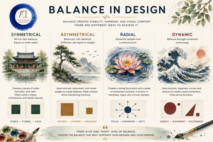
⚖️ Balance in Design
One of the biggest misconceptions about balance is that it means everything has to be perfectly symmetrical. It does NOT~! Balance is about visual weight~ how your eye moves through a composition and where it naturally comes to rest. There are many ways to create that feeling: ⚖️ Symmetrical: Calm, stable, and formal. 🌿 Asymmetrical: Different elements that still feel balanced through size, color, placement, or contrast. 🌸 Radial: Everything flows from a central point, drawing the eye inward before leading it back out. 🌊 Dynamic: Movement, diagonals, curves, and tension create energy while still feeling intentional. The best choice depends on what you're trying to communicate. A peaceful landscape may benefit from symmetry. A windswept tree might feel more alive with asymmetry. A mandala naturally lends itself to radial balance. A crashing wave comes alive through dynamic balance. There isn't a "correct" type of balance~ only the one that best supports your subject, your message, and the feeling you want your viewer to experience. You don't need to make everything equal to have great design~! Just make everything feel intentional~
🔥
3 likes • 13d
this is great
🔥
15d •
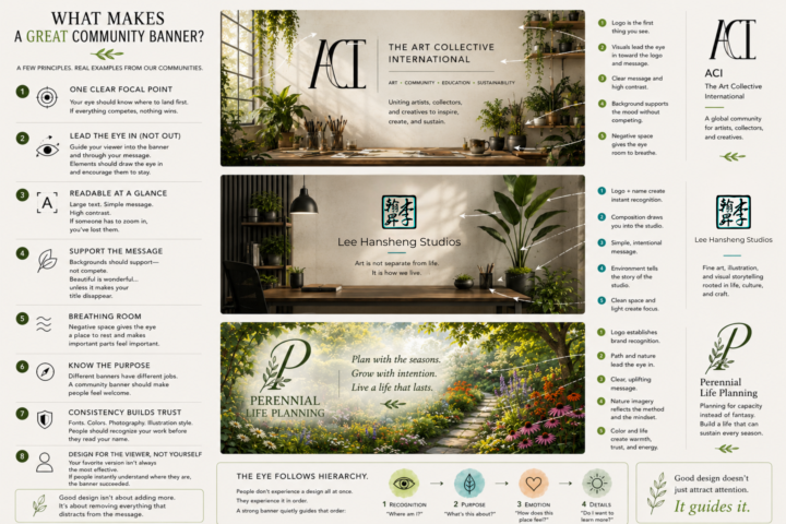
Making Banners and Covers~
Whether it's for your social media, community, website, or book~ A cover / banner has one job: To tell someone they've arrived in the right place~ Not to show off every skill you have. Not to fit your entire brand guide into one image. Not to explain your business. Just to create immediate clarity~ Many here are also community owners so I put together a little guide~ hope it helps~ especially while everyone is on edge over the new discovery systems involved. A few things I look for: 🌿 1. One Clear Focal Point Your eye should know where to land first. If everything is competing for attention, nothing wins. 🪴 2. Readable at a Glance Most people see banners for a second or two. Large text. Simple message. High contrast. If someone has to zoom in, you've already lost them. A good banner guides people through the design. Use composition, contrast, and direction to lead someone naturally from your focal point to your message. Trees can lean inward. Brushes can point toward the title. A pathway can guide someone into the scene. People and animals should usually look into the composition~ not out of it. Every element should quietly encourage the viewer to stay a little longer. 🌊 3. Support the Message Backgrounds should support~ not compete. Beautiful artwork is wonderful... ...unless it's making your title disappear. 🏡 4. Breathing Room Every inch doesn't need to be filled. Negative space gives the eye somewhere to rest and actually makes the important parts feel more important. 🎯 5. Know the Purpose Different banners and covers have different jobs. A storefront banner should invite. An educational banner should reassure. An art banner can inspire. A community banner should make people feel welcome. 🌸 6. Consistency Builds Trust Fonts. Colors. Photography. Illustration style. People should begin recognizing your work before they even read your name. 🌱 7. Design for the Viewer, Not Yourself One of the hardest lessons in design: Your favorite version isn't always the most effective version.
🔥
3 likes • 15d
great tips. I have to decide what mine is going to be about. With everyone using AI to create their own designs the direction I was going has fallen away. Time to get clear and align things. I feel that rebranding it to the vision I have for Paintniques is probably the smartest move but I'm sitting with it before I do that. Being multi-passionate I have other ideas but not sure I want to invest the time and energy into 2 different directions right now. Whats the saying... Just because I can doesn't mean I should.
🔥
1 like • 15d
@Hansheng Lee The vision is definitely there I think it's about sitting down and allowing myself to focus on it and let what's inside come out.😉 🙌
1-10 of 37

🔥
@kelly-huskins-1388
Art for Creative Minds- Digital Art Creation- Color Composer- Furniture Art- I specialize in creating art for others to use to enhance their own work.
Active 3h ago
Joined Nov 5, 2025
Indiana