Activity
Mon
Wed
Fri
Sun
Aug
Sep
Oct
Nov
Dec
Jan
Feb
Mar
Apr
May
Jun
What is this?
Less
More
Owned by Gemma
Learn Microsoft Excel, Word, PowerPoint and AI in a friendly, confidence-building community with live training and practical resources.
Memberships
Travel Hacks Skool
57 members • Free
CoffeeFitnessLife
13 members • Free
The Self Belief Hub
21 members • $57/month
The Confident Rider
190 members • $57/month
KDP Publishing
1.2k members • Free
the skool CLASSIFIEDS
1.9k members • Free
UK Skoolers
408 members • Free
Skoolers
169.7k members • Free
Social Selling on LinkedIn
1k members • Free
12 contributions to Bio Builders

🔥
13d •
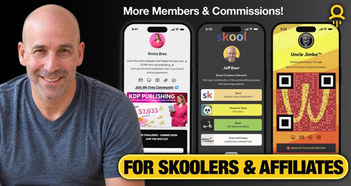
I Saw My Community in a Skool Ad... and It Was Terrible 😬
Recently, Skool featured Bio Builders in one of its Boost ads. At first, I was excited. Then I looked at the card. What did people see? 📱 A smartphone 📱 A QR code 🙂 My face What didn't they see? ❌ What the community is about ❌ Who it's for ❌ Why they should join If a complete stranger saw that card for 3 seconds, they would have no idea whether Bio Builders was about QR codes, digital business cards, websites, marketing, or something else entirely. That got me thinking... Many of us treat our community card like branding. But when your community appears in: - Skool Boost ads - Recommendations - Referral links - Shared posts - Search results ...that card becomes part of your conversion process. More than 50% of my traffic comes from referrals. Those visitors need to immediately understand why they're here. So I redesigned my card around two simple questions: Who is this for? 👉 For Skoolers & Affiliates What's the outcome? 👉 More Members & Commissions The lesson? Don't just make your community card look good. Make sure it answers: "Why should I click?" Have you looked at your community card lately through the eyes of a complete stranger? Drop a screenshot below. I'd love to see what you're using. 👇

2 likes • 13d
@Jeff Baer yes helpful thanks - I understand what you mean about the name and brand in discovery…. Thanks.
2 likes • 12d
@Jeff Baer This is so funny I’m giving my classroom an overhaul too - and want to streamline everything and have flow through branding make it streamlined and easy …. Can’t wait to get it all done.
Apr 29 •
LAUNCH WEEK! My QR code is live! Want a freebie?
Writing this book has been a fabulous journey - and I’m so excited that my QR code is out there and live - I used it 8 times in the book! 🤣 If you want to grab a FREE copy it’s available for kindle download at zero cost Weds 29th to Fri 1st May. Paperback and Hardback are available for next day delivery and of course the more reviews the better! Thank you for following along and supporting - it genuinely means a lot. https://www.amazon.co.uk/gp/aw/d/B0GYKB8YM 9 https://www.amazon.com/dp/B0GX34V58Q
3 likes • Apr 29
@Janet Wilson thanks for your support!
2 likes • Apr 29
@Janet Wilson woo Hoo!
🔥
Apr 8 •
🚨 Live Drop Today at 2 PM CST 🚨
I’m rolling out the first versions of my IRL Canva flyer templates—and you’re getting an early look 👀 These flyers are designed to work with custom QR codes so you can drive real-world traffic directly to your: • About pages • Link-in-bio pages • Community offers This isn’t just a showcase—I want your input. 💡 Come in, take a look, and help shape the next wave of templates. Your feedback will directly influence what gets built next. ⚠️ Heads up: Moving forward, these will be reserved for Level 3+ members… …but if you're already here, you're getting grandfathered in 🤝 Let’s build something that actually works in the real world. See you at 2 PM.

3 likes • Apr 8
Looms really good thanks.
Apr 7 •
𝗘𝗫𝗖𝗜𝗧𝗜𝗡𝗚 𝗡𝗘𝗪𝗦! 📣
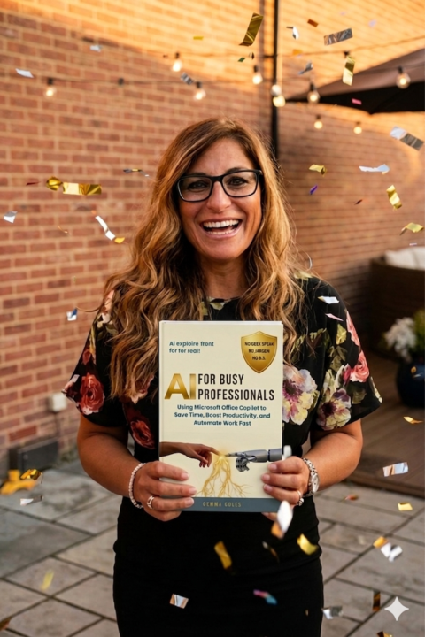
Any of you that saw Jeff’s post yesterday will already know my exciting news but for those that missed the post I am soon to publish a book. The time has come for me to look for Early Readers and people who would like Free Kindle Downloads so of course I thought of this lovely community! I’ve recorded a quick video to explain what the book is about, who it’s for, and exactly the type of people I am looking for. The Book: If AI has ever felt confusing, overwhelming, or like something you should understand by now… this is for you. Planned release: Week 1 May (Amazon) Want to be an Early Reader or get a free Kindle download once it has gone live on Amazon? ⬇️Leave your details on the link below ⬇️ https://skool.bio/smartskillsacademy Click below to head to the website for more info: www.smartskillsacademy.net/book

3 likes • Apr 8
@Nick Nebelsky ha ha ha !
4 likes • Apr 8
@Janet Wilson your copy has been emailed to you.
🔥
Apr 6 •
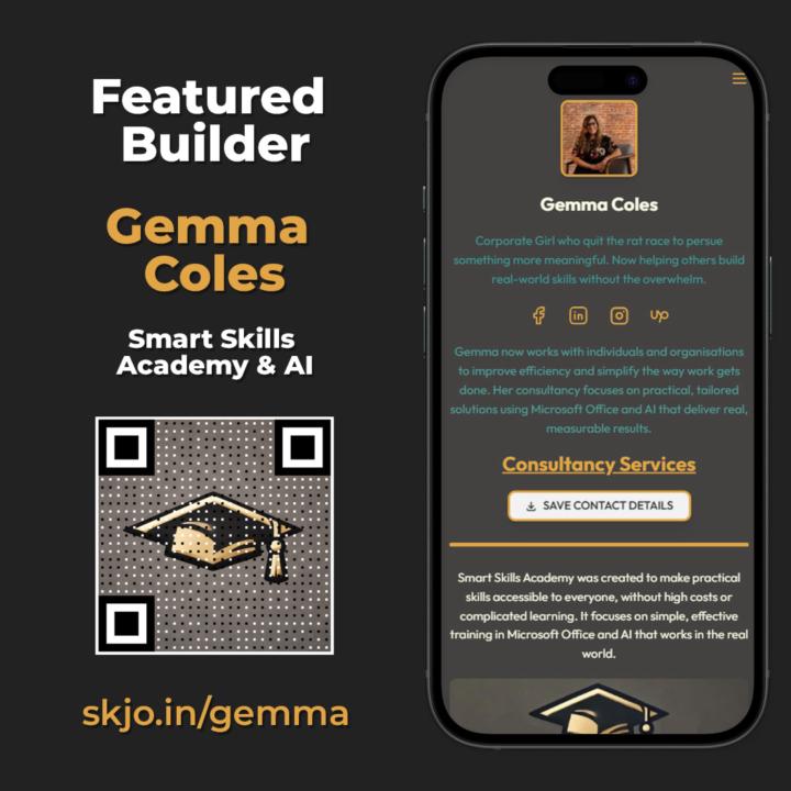
🔥 Featured Creator Spotlight: Gemma Coles 🔥
Meet Gemma Coles — a former corporate professional who made a bold decision to walk away from the rat race and pursue something more meaningful. Instead of climbing someone else’s ladder, she’s now focused on helping others build real-world, practical skills—without the overwhelm. Gemma was referred to me by Krista Brea, and after seeing what she’s built… it’s easy to see why. 👉 Her Community is 🔥 Smart Skills Academy & AI She’s using it exactly how it should be used: ✔️ Promoting her consultancy ✔️ Showcasing her Smart Skills Academy ✔️ Growing her Skool community ✔️ Featuring her book AI for Busy Professionals And here’s the part you don’t want to miss… 📘 She’s currently offering a FREE Advanced Reader Copy of her book in exchange for an honest review. If you’re someone who: • Feels stuck in the corporate grind • Wants to actually use AI in your day-to-day • Or is ready to build skills that matter in the real world This is worth checking out. Gemma is a perfect example of what happens when you combine: 👉 Clear positioning 👉 A strong mission 👉 And a powerful link-in-bio system Go support her, grab the book, and see how she’s doing it 👇 Gemma's Link-in-Bio
4 likes • Apr 6
@Ken Hyra thanks Ken! 🥰
2 likes • Apr 7
@Dennis Mbogori thank you.
1-10 of 12

@gemma-coles-6482
Corporate escapee.
Microsoft & AI geek.
Teaching smart skills for real life.
Active 3h ago
Joined Mar 24, 2026
Powered by