Activity
Mon
Wed
Fri
Sun
Jul
Aug
Sep
Oct
Nov
Dec
Jan
Feb
Mar
Apr
May
What is this?
Less
More
Owned by David
Miniature painting tutorials and hints and tips to make your minis stand out on the table! Commissions available
Miniature painting turorials
Memberships
Skoolers
181.7k members • Free
6 contributions to Vikingminis
Mar 1 •
Painting Castellan Crowe
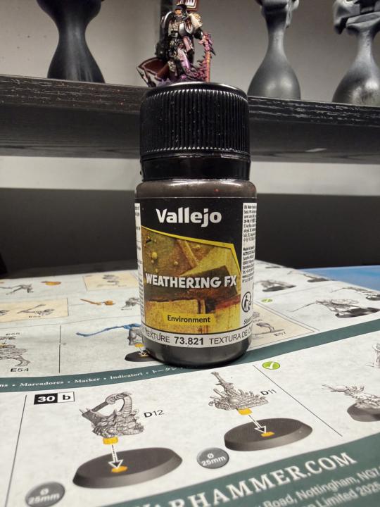
Every now and then you need to take a break from army painting, or painting a large box set. That was me with this particular piece. As you are well aware I am working my way through the Warhammer Quest Darkwater set, as I write this I am 26 miniatures down out of the 49 in the set (just over half way) and in fairness it is becoming slightly more difficult now as have already done the really cool/fun pieces and am left with the ‘minions’. On a trip to purchase some more wet palette sheets I decided to also pick up a ‘palette cleansing miniature’. I also haven’t painted any 40k pieces in a while so I really wanted to get back in the swing. Castellan Crowe was the choice, another character piece with a great back story and one the I really wanted to tackle. The box art depicted this glimmering white armour mixed with silver and reds. His possessed sword flaming with an evil purple flame, and one with which I would have some fun! Sub assembly was the way here, I went with the non helmet head (as I really liked his facial expression) His sword arm and cloak, power pack and banner were all sub assembled too. The Warhammer character pieces always have really cool mini diorama bases as standard so I didn’t even need to create a base for him. The first stage was to prime the whole think in black primer apart from the cloak as I would be panting that red and white (very difficult to go from black to off white) As Crowe is one of the Grey Knights, I started with a base of Magnesium (Pro Acryl) and then built up highlights using Steel (also pro Acryl) As I stated earlier, the box art is shiny and clean, but I’m a big fan of the grim dark look, so I needed to make Crowe look like he’s been in many battles! The ‘grim dark’ look is very easy to achieve, especially if you have some ‘cheat’ products, in my case, my go to weathering effect is by Vallejo, ‘Rust texture’ (pictured below) is great for this, I add a bit of water 2:1 (paint:water) then as it is still wet, remove the majority of the colour with a wet q-tip. This adds grime and dirt to the crevices, and leaves the flatter areas clean.
0
0
Feb 4 •
Painting Edmark Valoran the Manticore Knight.
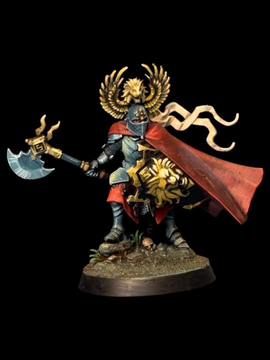
So…I did it again. I could easily have boxed this guy off in about 2 hours, using some of the really nice metallic paints I have my disposal…but no, why do that when you can add more work for yourself and time by going full NMM (non metallic method) on him!? To be totally honest, I made the choice after priming him that he would really suit NMM…like I said, I have some great metallic paints by Golden and a stunning Chrome by Vallejo, but it meant that I’d spend less time with one of the key characters from Darkwater than was probably warranted. Black primer (as before) then made the job slightly more difficult again by not adding a zenithal highlight…I put it down to a combination of forgetting to do it and laziness. Once primed I blocked in the base shades. For the cape it was Barak-nar burgundy (Citadel Colour) and Blue Black (pro acryl) In the picture you will notice that the back of the cloak is distinctly darker than the front (all done on purpose of course) representing the shadows and the main light focussed on the front of the piece. I glazed in Burnt Red (Pro Acryl) and Bright Orange Red (Pro Acryl) for the highlights and texture, keeping the original base colour in the shadows. The end result is a rich bright red with subtle shading. The armour started life as Incubi Darkness (Citadel colour) this is my go to base for all steel or silver NMM, one of my favourite shades as it’s so versatile, I often use it to highlight black too. Then I steadily build in grey and add bright ivory to further enhance the highlights. The extreme highlight is actually a pale yellow. the NMM gold is also a fairly simple recipe. I start with a nice rich brown (Rhinox Hide by Citadel Colour) Next stage is to almost cover that shade with a yellow Ochre (Vallejo model colour) I then add some of the pale yellow to the mix and highlight a smaller area to keep the darker tones still visible. You’ll need a good idea of light and reflection and how different shapes work with both. I add in more and more of the pale yellow in smaller areas until you have a much brighter pure pale yellow on the highest most reflective point (light the lions face on his shield)
1
0
Jan 20 •
Painting Bren Tylis the renegade saint
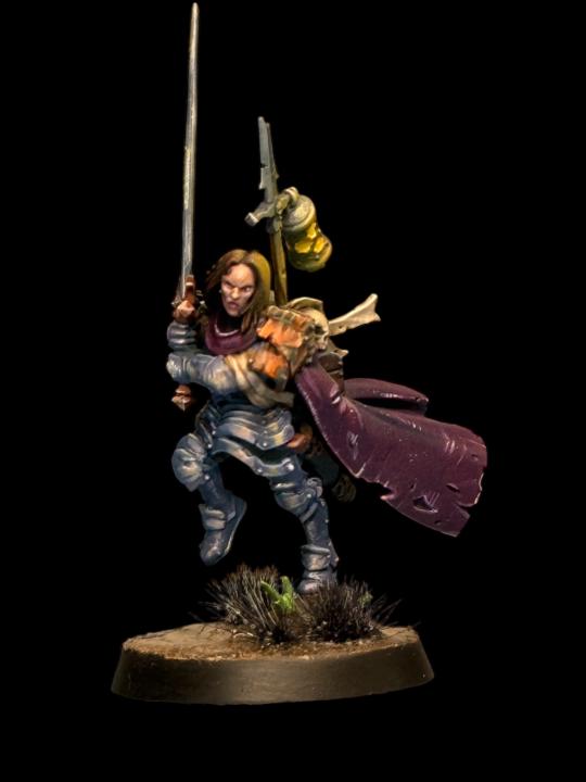
Another wonderful Warhammer Quest hero! Bren’s armour is that of her ancestor Saint Yondara Tylis. She wears the stolen relic armour and carries Yondara’s sword and even her skull (which she communicates through for guidance) I wanted to tackle Bren in a different way. I could’ve gone with the True metallic method (TMM) using variants of the same metallic paint to create contrast and texture on the armour, even glaze in some purples and pinks to give the armour an iridescent look…oh…that would’ve been so much quicker! In stead I went with the more time consuming (but oddly satisfying) option of Non metallic metal (NMM) achieving a metallic looking piece without actually using metallic paint…hence the ‘non-metallic’ bit… I started again under-painting the primed miniature, this time I used darker more saturated colours. The armour was primarily purples and pinks…not because Bren is a girl…but because it would lend itself better to the finished piece. Trust me…you don’t mess with Bren Tylis. Bren’s cloak is also underpainted using a darker purple pink, pro acryl magenta with a bit of pro acryl blue black added. I steadily add in Dark Incubi (GW) one of my favourite colours, I use it at a base for NMM steel, or for glazing highlights on black…great colour. You will see from the pictures below that I’ve imagined the main light source from the front right, so highlights of pink and pale yellow are place in this area. Then it’s just a question of looking at shapes and working out how the light would affect each one. The sword again has hints of pink and yellow, complimenting the colours of the polished armour, making them appear to be a set. Bren has a really expressive face, almost a snarl as she is about to engage with the marauding beast men. Start with a dark flesh tone, then highlight with a lighter flesh tone. I used a wash of Druchii Violet and Volupus Pink mixed 1:1 and thinned with Lahmian medium. Once dried I reapply the highlight to the raised areas.
1
0
Jan 18 •
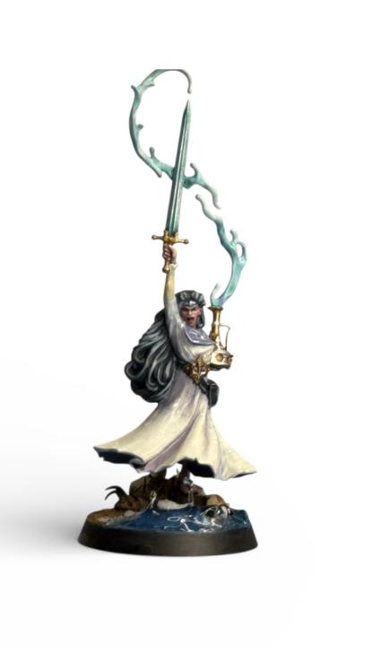
Painting Inara Sion the cleansing blade
Inara Sion is a water-caster. She carries an amphora containing water from the Everspring. Her blade isn’t forged steel, it’s more of a liquid with the ability to whip at foes from a distance. That in mind, I wanted to approach her in a similar way to the other Darkwater miniatures to give the set a more consistent and complete feel. Primed in black (Colourforge Matt black) then began under painting (see previous tutorial) in a grey/blueish purple, made with Pro Acryl Ultramarine Blue, Dark Magenta and Blue Black. Remember that the end product as you see pictured below Inara’s dress is an off white, so it will take a number of thin layers to achieve the overall look. Shadows and light again play an important role in understanding colour and how they are affected by both. You will notice from the pictures that the folds on the front of the dress are a slightly different shade to the ones on the back, giving the impression that the light source is focused more on the miniature’s front than the back. Also note that I had the genius idea (not so) to paint the dress to appear chiffon-like. I gradually add more and more Bright Ivory (Pro Acryl) to the mix to lighten the cloth to the end result, using lines and dots to add texture to give it a more realistic cloth like feel. The chiffon effect was achieved by gently glazing on the flesh tone, to make the fabric look like it has a slightly transparent appearance. Then I added a brighter highlight around the creases to further enhance the areas. The water coming from the large pot was fairly easy to achieve, white paint base, then several thinned glazes of Aethermatic Blue Contrast paint (GW) Our water caster has power over water, she can bend water at will with her blade, with that in mind I wanted her base to look like she is in the process of bending water to create a water barrier. For this I used some Green Stuff World UV resin mixed with the blue contrast and began layering it onto the base, curing it with a UV light as I built it up.
0 likes • Jan 18
@Adam Lever thanks Adam 🙏
Jan 1 •
Origin Source Lighting
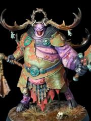
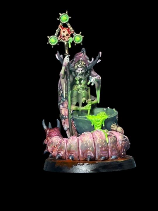
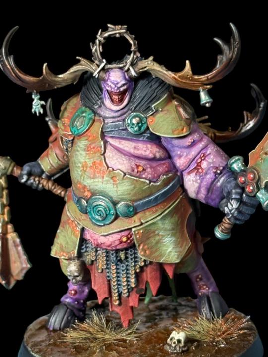
Hello again! In today’s post I wanted to show you a couple of pieces I’ve painted with origin source lighting (OSL) and how you can easily achieve it! In the first image you will see Belga the Cyst witch by Games Workshop, part of the fantastic Warhammer Quest Darkwater boxed set. Belga and her conjoined sisters are a fantastic sculpt, their huge worm like body is coiled around a huge cauldron in which they’re brewing up something evil! The green of the potion is easily achieved with 3 paints/colours (you don’t have to have the exact paints I used, but similar colours will also do the job) The base shade is a 2:1 mix of Tesseract Glow (citadel Color) and Scorpion Green (Vallejo) Thin layers over a black primer. After two layers, allow to dry and add a bright yellow (Bismuth yellow by Pro Acry) to the raised areas. The finished area is then quite effective and ‘glows’ without the use of luminous paint. The scary part about OSL is adding the glow on top of your finished miniature, how much do you add? How bright do you go? How would the light affect colour and shape underneath? These are all questions that will go through your mind when you’re thinking about the effect. There is no strict formula, but having a good sense of light placement and volume will definitely help. The object closest to the light will be more affected by it, so therefore (in the case of Belga) the hidden sister stirring the brew, will be uplit by the glow more. An airbrush is the simplest way to achieve this, simply angle your miniature and spray your ‘glow’ colour from the desired angle. If you don’t have an airbrush then thinned glazes of your light source colour will also work, just add them to the the surfaces that are upward facing near the light source. In the case of the second miniature, the fantastic Daemonsmith (bottom left) he has a crazy green glow coming from the evil spell he is about to cast, note in this instance the light source is also casting a glow across his face and beard. Again, same rules apply in that the object closest is more impacted by the light, then the further you move from the OSL slightly less impact. Also note the slight change in colour too. As light moves away from its source, the colour will shift, his helmet and hand are closest to the flame, therefore are a brighter yellow green, as the light travels further across his body it becomes slightly darker. Sounds difficult? Not really…start with the brighter colour, less is more, concentrate on the areas of more impact. These will be the focal point of the miniature. Again…it represents a huge risk in spraying green paint over the detail you’ve painstakingly applied earlier in the painting stage, but trust the process!! The finished effect is a realistic glow, not too much, but subtle enough to read as light from an object…or OSL
0 likes • Jan 13
@Adam Lever thanks mate, fairly easy to achieve, I’m going to be filming tutorials in the next few weeks and this will be one of the features 👍🏻
1-6 of 6
@david-hill-3053
Miniature painter, paid commission painter. I have been painting miniatures for 5 years, I can help you improve and enjoy the hobby even more!
Active 66d ago
Joined Dec 28, 2025