Activity
Mon
Wed
Fri
Sun
Aug
Sep
Oct
Nov
Dec
Jan
Feb
Mar
Apr
May
Jun
Jul
What is this?
Less
More
Memberships
One Seed Wonders Community
31 members • Free
Perennial Life Planning
31 members • Free
Crap Academy
182 members • Free
Cre8tiv Collective
65 members • Free
Chunky Glitter’s Sparkle Skool
49 members • Free
Shopify Growth Collective🥂
953 members • Free
TheArtCollectiveInternational
87 members • Free
178 contributions to TheArtCollectiveInternational

🔥
6d •
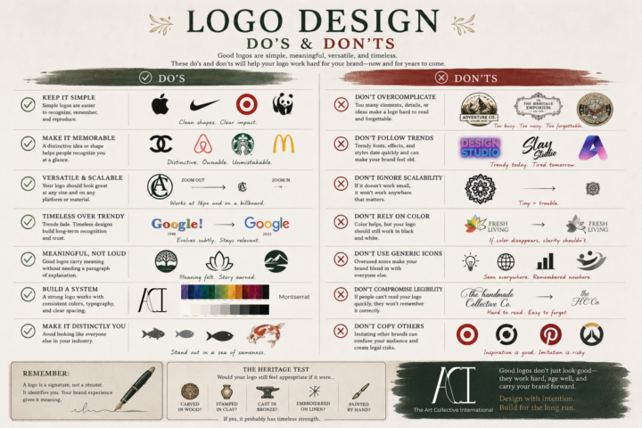
The Art of a Good Logo
A logo doesn't have to tell your entire story. It isn't your mission statement, your values, or your elevator pitch. A logo is like a signature~ Its job is to identify you clearly, consistently, and confidently. The meaning comes from everything you build around it~ your work, your reputation, your community, and the experiences people have with your brand. That's why some of the most recognizable logos in the world are also some of the simplest. When you're designing a logo, ask yourself: • Can someone recognize it at a glance? • Will it still work at the size of a favicon and on a storefront? • Does it still make sense in black and white? • Is it memorable because of its shape, not just its color? • Will it still feel relevant in ten or twenty years? A great logo doesn't have to be the loudest in the room~ I can be the one that quietly becomes familiar through years of good work. Design with intention~! Build for the long run~!
1 like • 5d
@Brenda M thanks!
0 likes • 3d
@Ray Perrett it looks so good! Also looks very premium. Thanks for sharing this was extremely satisfying to see. Definitely itches that thing in your brain.
🔥
5d •
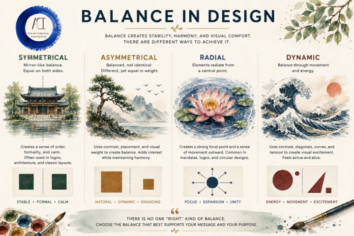
⚖️ Balance in Design
One of the biggest misconceptions about balance is that it means everything has to be perfectly symmetrical. It does NOT~! Balance is about visual weight~ how your eye moves through a composition and where it naturally comes to rest. There are many ways to create that feeling: ⚖️ Symmetrical: Calm, stable, and formal. 🌿 Asymmetrical: Different elements that still feel balanced through size, color, placement, or contrast. 🌸 Radial: Everything flows from a central point, drawing the eye inward before leading it back out. 🌊 Dynamic: Movement, diagonals, curves, and tension create energy while still feeling intentional. The best choice depends on what you're trying to communicate. A peaceful landscape may benefit from symmetry. A windswept tree might feel more alive with asymmetry. A mandala naturally lends itself to radial balance. A crashing wave comes alive through dynamic balance. There isn't a "correct" type of balance~ only the one that best supports your subject, your message, and the feeling you want your viewer to experience. You don't need to make everything equal to have great design~! Just make everything feel intentional~
2 likes • 5d
So many great choices! The fun really begins when you start mixing them together! 🪄 🔮
🔥
7d •
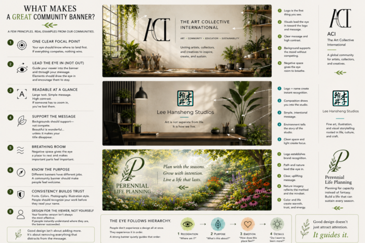
Making Banners and Covers~
Whether it's for your social media, community, website, or book~ A cover / banner has one job: To tell someone they've arrived in the right place~ Not to show off every skill you have. Not to fit your entire brand guide into one image. Not to explain your business. Just to create immediate clarity~ Many here are also community owners so I put together a little guide~ hope it helps~ especially while everyone is on edge over the new discovery systems involved. A few things I look for: 🌿 1. One Clear Focal Point Your eye should know where to land first. If everything is competing for attention, nothing wins. 🪴 2. Readable at a Glance Most people see banners for a second or two. Large text. Simple message. High contrast. If someone has to zoom in, you've already lost them. A good banner guides people through the design. Use composition, contrast, and direction to lead someone naturally from your focal point to your message. Trees can lean inward. Brushes can point toward the title. A pathway can guide someone into the scene. People and animals should usually look into the composition~ not out of it. Every element should quietly encourage the viewer to stay a little longer. 🌊 3. Support the Message Backgrounds should support~ not compete. Beautiful artwork is wonderful... ...unless it's making your title disappear. 🏡 4. Breathing Room Every inch doesn't need to be filled. Negative space gives the eye somewhere to rest and actually makes the important parts feel more important. 🎯 5. Know the Purpose Different banners and covers have different jobs. A storefront banner should invite. An educational banner should reassure. An art banner can inspire. A community banner should make people feel welcome. 🌸 6. Consistency Builds Trust Fonts. Colors. Photography. Illustration style. People should begin recognizing your work before they even read your name. 🌱 7. Design for the Viewer, Not Yourself One of the hardest lessons in design: Your favorite version isn't always the most effective version.
1 like • 5d
Very good diagram of flow and composition. Simple and to the point with just the right amount of visuals. I now have some ideas for what to make next!
12d •
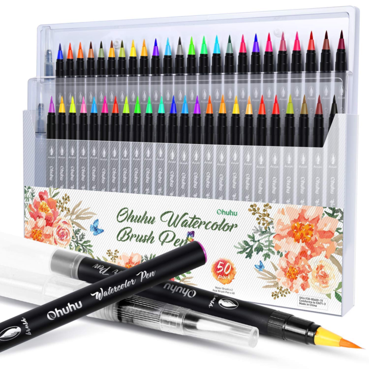
New Art Material Obsession
I've been really into watercolor for quite some time now, but lately I've been feeling ready to experiment and branch out into other mediums alongside it. My two current obsessions are Ohuhu watercolor brush pens and non-shake acrylic brush pens. The watercolor brush pens allow me to achieve concentrated color and fine details that can be more difficult to control with a traditional paintbrush. The acrylic brush pens have been fantastic for highlights and foreground details because they can be applied over watercolor without disturbing the layers underneath. One thing I've especially enjoyed about the non shake acrylic pens is their thicker paint consistency. They tend to provide more uniform coverage and are less prone to bleeding, making them great for those final finishing touches. What art material have you been obsessed with lately? 🎨
3 likes • 12d
@Hansheng Lee thanks for the tips I’ll check those out!
🔥
13d •
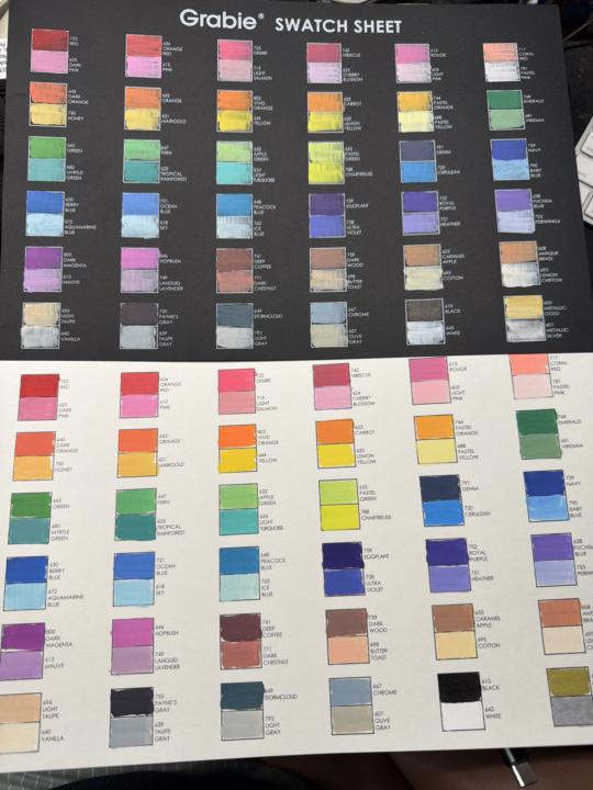
Color Snob
I have spent years studying color theory. I can explain warm vs cool palettes, simultaneous contrast, chroma, value relationships, atmospheric perspective, and pigment behavior. I have entire shelves dedicated to paint. And yet... I am once again staring at a marker swatch sheet wondering who approved these color names. Some are perfectly reasonable. Emerald. Navy. Cerulean. Black. Excellent. We know what we're working with. Then we suddenly take a hard left into things like: Hopbush. Stormcloud. Butter Toast. Caramel Apple. Desire. DESIRE?! What color is desire? Is it warm? Cool? Transparent? Granulating? Who knows~? But apparently~ it's pink~ (which... I have some feeling about this...) As artists, we spend a lot of time learning to see color accurately, but every now and then a manufacturer reminds us that color naming is less science and more "Greg from marketing had an idea." So today's question: What's the worst~or funniest~ art supply color name you've ever encountered? Because I refuse to believe "Desire" was the best option available that day. And also 4 of these are almost the exact same hue/ shade/ value~ 🤣
1 like • 12d
🤣 I can whole heartedly agree with you on this one! I feel like these names are leaning more toward nail polish colors than colors you'd want to pick for a painting 😆
1-10 of 178
@christopher-foster-8277
Illustrator, graphic designer, miniature artist. Finding inspiration in the garden one day at a time 🌿 VP at The Art Collective International
Active 1d ago
Joined Jul 12, 2025
virginia