Activity
Mon
Wed
Fri
Sun
Jul
Aug
Sep
Oct
Nov
Dec
Jan
Feb
Mar
Apr
May
Jun
What is this?
Less
More
Owned by Chris
Does Your Relationship With Your Teen Need a Do-Over? Join dozens of parents learning how to reconnect. We'll help get your relationship on track.
Memberships
🇨🇦 Toronto IRL
251 members • Free
Skool Dads
175 members • Free
Skool Nerds
26 members • Free
AuthorityCam
282 members • $29/year
The Standard
790 members • Free
The Skool Trauma Hub
109 members • Free
Claude for Coaches
937 members • $47
Authentic AF
206 members • Free
Skoolers
171.4k members • Free
23 contributions to Bio Builders

🔥
9d •
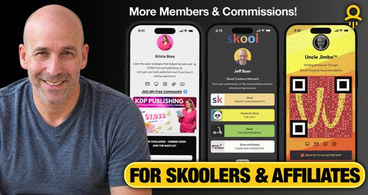
I Saw My Community in a Skool Ad... and It Was Terrible 😬
Recently, Skool featured Bio Builders in one of its Boost ads. At first, I was excited. Then I looked at the card. What did people see? 📱 A smartphone 📱 A QR code 🙂 My face What didn't they see? ❌ What the community is about ❌ Who it's for ❌ Why they should join If a complete stranger saw that card for 3 seconds, they would have no idea whether Bio Builders was about QR codes, digital business cards, websites, marketing, or something else entirely. That got me thinking... Many of us treat our community card like branding. But when your community appears in: - Skool Boost ads - Recommendations - Referral links - Shared posts - Search results ...that card becomes part of your conversion process. More than 50% of my traffic comes from referrals. Those visitors need to immediately understand why they're here. So I redesigned my card around two simple questions: Who is this for? 👉 For Skoolers & Affiliates What's the outcome? 👉 More Members & Commissions The lesson? Don't just make your community card look good. Make sure it answers: "Why should I click?" Have you looked at your community card lately through the eyes of a complete stranger? Drop a screenshot below. I'd love to see what you're using. 👇

🔥
1 like • 9d
@Steve Gast That's why I'm promoting an interactive workshop at my standard tier, called "10 Days to a Better Relationship with your Teen" and A/B testing different Discovery cards, copy and a new VSL. It's my first walking VSL
🔥
3 likes • 9d
@Jeff Baer Looks good. I'd ditch the New images and stories daily and if you really wanted it, keep it in the description
🔥
17d •
📱 What's On Your Lock Screen?
Your phone is one of the most-used tools in your business. What's currently on your lock screen or home screen? • Family photo? • Favorite quote? • Your business logo? • A community QR code? • Something else? Drop a screenshot below (if you're comfortable sharing it) and tell us what it means to you. 👇

🔥
1 like • 9d
My boys
🔥
14d •
📱 When Did You Last Scan a QR Code?
Be honest... What was the last QR code you scanned? - A restaurant menu? - A digital business card? - A product package? - An event flyer? - A Skool community? - Something else? QR codes have quietly become part of everyday life, but I'm curious how people are actually using them. Drop your answer below 👇 What was the last QR code you scanned, and where did you find it? Bonus points if it was for a Skool community. 😎
🔥
2 likes • 14d
I thought that was a covid thing!? 😉 Every presentation I do I use QR codes. They're invaluable. @Jeff Baer
🔥
23d •
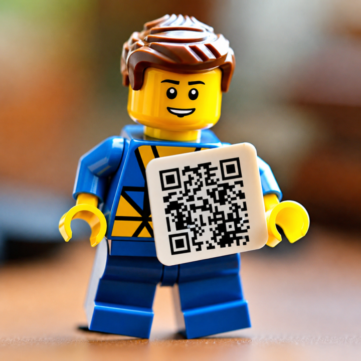
Logo QR Codes vs Traditional QR Codes 📱
I give away a lot of Free Logo QR Codes because people love them. Why? Because they're visual. They stand out. They look branded. And let's be honest... they're a lot more interesting than a plain black-and-white QR code. But here's something that might surprise you: Sometimes a Logo QR Code is NOT the best choice. My rule is simple: ✅ Close-range sharing (phone-to-phone, business cards, flyers handed directly to someone): Use a Logo QR Code. ✅ Long-distance scanning (presentations, trade shows, vehicle graphics, banners, signs): Use a traditional QR Code. Why? Every logo, color change, and design element removes a little bit of the QR code's built-in error correction. Modern Logo QR Codes are still very reliable, but when someone is trying to scan from across a room or a parking lot, I want every advantage possible. For maximum scan reliability, a traditional QR code wins. Think of it this way: - Logo QR Code = Better branding and visibility - Traditional QR Code = Maximum scanning performance I use both depending on the situation. What about you? Where is the largest QR code you've ever used? A business card? A banner? A vehicle? A presentation screen?

🔥
5 likes • 23d
One of your QR codes is front and center in my presentation tomorrow afternoon
🔥
4 likes • 23d
@Jeff BaerS’ all good, man
🔥
27d •
🎶 Which Contact in Your Phone Deserves Their Own Theme Song?
A little random, but I’m curious... Do you assign custom ringtones to people in your phone? My daughter and I are both huge Van Halen fans, so recently we picked "Eruption" as her ringtone. 🤘 Now whenever she calls, I know it's her before I even look at the screen. Plus, hearing Eddie Van Halen shred🎸 for a few seconds never gets old. It's one of those small things that makes me smile every time my phone rings. Even when it sounds off when I am hosting a meeting 😂 So what's your custom ringtone story? 📱 Who has one? 🎵 What song or sound did you choose? 😆 Any funny or meaningful reasons behind it? Drop it below—I can't be the only one still doing this! 👇

🔥
5 likes • 27d
My ex-wife
1-10 of 23

🔥
@chris-coulter-4736
Parents supporting parents. Real conversations, guidance, resources and care to help teens grow with confidence and hope. No parent left behind!
Active 36m ago
Joined Jan 19, 2026
INFJ
Toronto, Canada
Powered by