Activity
Mon
Wed
Fri
Sun
Aug
Sep
Oct
Nov
Dec
Jan
Feb
Mar
Apr
May
Jun
What is this?
Less
More
Owned by Carin
How to launch your podcast in 7 Days with guided implementation. Ditch overwhelm and finally share the stories you want to be telling and capturing.
Memberships
Advertise Business Club
219 members • Free
Skool Nexus
198 members • Free
SkoolHers
533 members • $9/month
Natural Hair P.R.O
36 members • $47/month
Spoiled Stylist Society
98 members • Free
CryptoEase with Mike
84 members • Free
Perennial Life Planning
31 members • Free
Content Her Way - Collective
69 members • Free
SS
Stay Sharp Academy
2 members • Free
36 contributions to TheArtCollectiveInternational
🔥
3d •
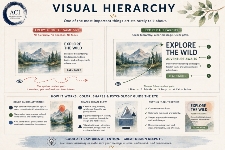
👁 Visual Hierarchy
One of the biggest differences between creating beautiful work and creating effective work is understanding where the viewer looks first. Our eyes don’t absorb everything at once. They naturally follow a path~ As artists and designers, we can influence that journey. Visual hierarchy is the intentional use of size, color, contrast, spacing, shapes, and placement to guide the viewer through your work in the order you want it to be experienced. Think about what happens when someone opens a webpage, looks at a poster, or glances at a painting. What do they notice first? What keeps their attention? Where do they look next? Without hierarchy, the eye wanders. With hierarchy, the eye flows~ This is where color psychology and shape psychology begin working together. A bright accent color naturally pulls attention. A dark value against a light background creates contrast. Circles tend to draw the eye inward and create unity. Squares and rectangles communicate stability and structure. Triangles, diagonals, and arrows create movement and direction. White space gives everything room to breathe. None of these principles exist in isolation. They’re all working together to create a visual conversation between your work and your viewer. Whether you’re painting, designing a logo, building a website, or creating social media graphics, you’re constantly answering one simple question: “Where do I want someone to look first?” If you can answer that intentionally, you’ve already begun creating visual hierarchy. Because good design doesn’t just capture attention~ it guides it~!

🔥
1 like • 3d
this is a really thought provoking post!!!
🔥
1 like • 3d
@Hansheng Lee useful for podcasters too. 😉

🔥
1 like • 8d
sooooo prettyyyyyyyyy..... 😍
🔥
May 15 •
1 Week of Practice~
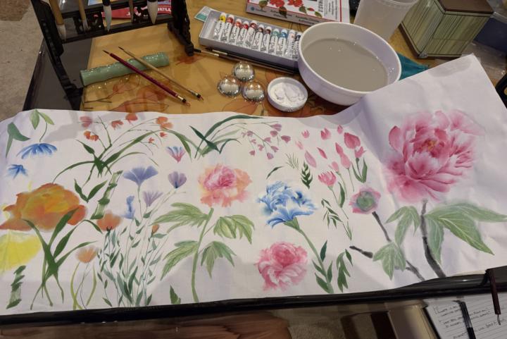
One week of intentional practice with new tools and materials can change a lot. This past week I spent 1 hour a day really learning my new paper, brushes, and water ratios instead of rushing to make finished work. Just slowing down and experimenting, researching, and playing~ seeing how much water the paper can actually hold, how pigment disperses, when ink blooms beautifully versus when it muddies, how different brushes carry and release paint. This kind of practice is IMPORTANT~! We NEED this to further ourselves. We can't expect to get better on a whim and some sheer luck. A week of focused experimentation builds familiarity. Familiarity builds confidence. Confidence builds fluency. Suddenly your hand hesitates less because you understand your materials instead of fighting them. I think a lot of artists feel pressure to constantly produce finished pieces, but growth happens in the quieter moments more often than not~ the testing, the failed marks, the weird little experiments, the “what happens if I try this?” sessions. Practice is not wasted time. Learning your tools is part of the art itself. What would it look like for you if you spent even 20 minutes a day learning your tools, materials, process, or craft a little more~? (Here are my 6 days... I somehow didn't take a pic of some of the things I added~ last one was from tonight where I started playing with ideas for how this can be applied to designs and patterns~ slightly blame @Jen Ritchie for that 🤣🫶🏻)
🔥
1 like • 18d
wow these are so beautiful to look at. Big Smiles
🔥
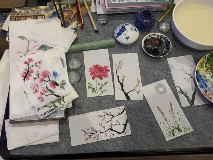
25d •
Midnight Musings
One of the things people don't often see is how much of an artist's life is spent in studies. Not the finished paintings hanging on a wall~ or polished images that make it to social media. And definitely not the pieces that find homes with collectors usually~ Studies. Tonight's table is covered in blossoms, branches, leaves, grasses, and little experiments. Some worked. Some didn't. A few taught me exactly what I needed to learn. Others taught me what not to do next time. That's the nature of practice. I think we sometimes forget that mastery isn't built through grand moments of inspiration. It's built through repetition. Through painting the same flower twenty times. Through learning how a brush holds water. Through understanding why one line feels alive and another feels stiff. Through hundreds of small decisions that nobody else will ever notice. Basically~ Practice~ I've spent years creating finished work, but lately I've found myself appreciating these quieter~ lighter~ calmer~ moments more. There is something deeply satisfying about sitting down with a brush and simply studying. No deadline. No expectation. Just curiosity. What happens if this branch bends a little further? What if that blossom opens a little more? What if I try it again? The funny thing is that these small exercises rarely stay small. Every finished painting, every series, every collection begins somewhere on a cluttered table like this. A few brushstrokes. A discarded sketch. A study that unexpectedly becomes something more. (And end up on a cluttered table of paintings too 🤭, but don't worry~ they all will be used for something else...) But tonight isn't about finishing anything. It's about learning. And I think there is a certain peace in that. Sometimes progress looks less like crossing a finish line~ and more like a table covered in possibilities, chances, moments, and potential~
🔥
1 like • 18d
everything in that photo... where do those beautiful paintings go after they are done?
🔥
May 3 •
🎨 Prompt Me: Luminous
This week’s word: Luminous Light doesn’t always have to be bright to be powerful. Sometimes it’s soft. Sometimes it flickers. Sometimes it’s barely there~ but still enough to guide the way. What does luminous mean in your work right now? Is it: – A glow breaking through darkness – Reflected light on water, glass, or skin – Something internal~ quiet, steady, enduring – Neon, bioluminescence, or something otherworldly – A moment, a memory, a presence that lingers You don’t have to paint/ draw/ write~ the light literally. You can suggest it. Contrast it. Hide it. Let it feel just out of reach. Let this one be about atmosphere, not perfection. Create something that explores luminous in your own way~ visual, written, abstract, or conceptual. Play with contrast, edges, and where light chooses to exist (or not). Drop your work below~ we’d love to see how your light shows up this week ✨

🔥
3 likes • May 4
@Maizi. Exe is that a computer you build out? looks really cool and some editing happening on screen?
🔥
3 likes • May 4
Time feels like I can't keep up right now and all I want to do is stay up late drawing with this post. Nuggets of inspiration, pulling me, tugging at my sleeves, or like the paw of my cat gently touching my arm asking me to embark on a different adventure. Yes please, I say. I welcome this very much.
1-10 of 36

🔥
@carin
Hairdresser and 🎙️Host of Hair Stories With Chantel. I help wannabe podcasters finally hit record and launch their show without the overwhelm.
Active 7h ago
Joined Jan 22, 2026
INFJ
Los Angeles, CA