Activity
Mon
Wed
Fri
Sun
Aug
Sep
Oct
Nov
Dec
Jan
Feb
Mar
Apr
May
Jun
Jul
What is this?
Less
More
Owned by Brenda
creating a mindful, reflective, sustainable & regenerative lifestyle one day at a time
former TIZZit's - LogBooks & Monday Accountability
Memberships
Empowered AI Collective™
3k members • Free
Perennial Life Planning
32 members • Free
Shopify AI Growth Collective
7 members • Free
Lunar Leo Design Vault
146 members • Free
Pinterest Skool
5.5k members • $7/month
Decster - CSM for Skool
200 members • Free
Focus + Flourish Lounge™
73 members • Free
Regenerative Gardening
235 members • Free
#𝐁𝐢𝐳𝐒𝐢𝐬𝐭𝐞𝐫
2.2k members • Free
51 contributions to TheArtCollectiveInternational

🔥
10d •
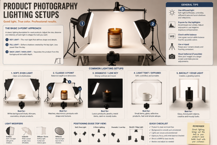
Product Photography Lighting and Set Up
It’s Less About Your Camera, More About Your Light. A common misconception I see is people think is that they need an expensive camera to take good product photos. Its 2026 and most of our cameras can do more now than our older cameras (not everything~! But for product photos, it is enough.). You really don’t~ A phone with good lighting will almost always beat an expensive camera with bad lighting. You are not just trying to make your product brighter~ think about how to show its shape, texture, color, and craftsmanship. Here are a few basics to get you started: 💡 Key Light This is your main light. It creates the overall look of your product and defines its form. I usually place it at about a 45° angle and slightly above the product. 💡 Fill Light This softens harsh shadows created by your key light. It doesn’t have to be another light~ you can often use a white foam board or reflector to bounce light back onto your product. 💡 Back (or Rim) Light This helps separate your product from the background and gives it a little extra depth. It’s especially helpful for darker products. 📦 Use Diffused Light Harsh, direct light creates hard shadows and blown-out highlights. A softbox, light tent, diffuser, or even a sheer white curtain over a window can create much softer, more flattering light. 🎨 Keep Your Background Simple Your product should be the star. A clean white, black, gray, or neutral background works for most products without competing for attention. 📸 Use a Tripod Keeping your camera steady lets you use lower ISO settings for cleaner images and makes it easier to keep every photo consistent. ✨ Take More Than One Photo Try moving your lights a few inches. Raise them. Lower them. Rotate your product. Tiny adjustments can completely change the mood of a photograph. Whether you’re selling paintings, ceramics, candles, jewelry, woodworking, stickers, or handmade goods, good lighting helps people appreciate the work you’ve already put into creating it. You don’t need a professional studio to get started.

🔥
1 like • 8d
I saved this one!!! TY
🔥
1 like • 7d
My set up is often a floor lamp, a sheet draped over my laptop board on keyboard, tripod light bulb on other side that I move as I look through camera until the shadows are where I need them diffused light from window , overhead light and maybe a handheld - ha ha or on the roof on an overcast day
🔥
10d •
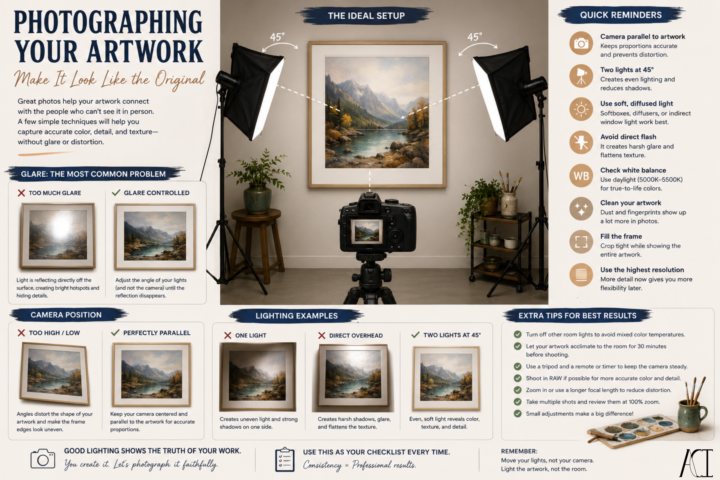
Photographing Your Artwork: Make It Look Like the Original
Have you ever finished a painting, taken a photo, and immediately thought… “Why doesn’t it look like my artwork?” You’re not alone. Most of the time, it isn’t your camera~ it’s the lighting. Here are a few things that make a huge difference: 🎨 Use Even Lighting Place two lights at roughly 45° angles to your artwork, one on each side. This creates even illumination across the surface and helps minimize harsh shadows. ☀️ Natural Light Works Too A bright, overcast day or indirect window light can produce beautiful, even lighting. Just avoid direct sunlight, which creates hot spots and washes out colors. 📸 Keep Your Camera Parallel If your camera is tilted, your artwork will look distorted. Keep your camera centered and as parallel to the artwork as possible. 📐 Fill the Frame Crop tightly while still showing the entire piece. The artwork should be the focus—not the wall around it. ✨ Watch for Glare Gloss varnishes, metallic paints, resin, and glass all love to reflect light. If you notice glare, don’t move the camera first. Move your lights. Even shifting a light a few inches can dramatically reduce reflections. 🎨 Check Your Colors Our eyes naturally compensate for different lighting conditions. Cameras don’t. Use consistent daylight-balanced lighting and check your white balance so your colors stay true to the original. 🧹 Clean Before You Shoot Dust, fingerprints, and stray fibers are much easier to spot in a photograph than they are in person. A quick wipe-down can save you editing time later. Try photographing the same artwork with just one change at a time~ move a light, adjust the camera height, or change the angle slightly. You’ll be surprised how much a small adjustment can improve the final image.
🔥
1 like • 8d
Great reminders!!! TY
🔥
14d •
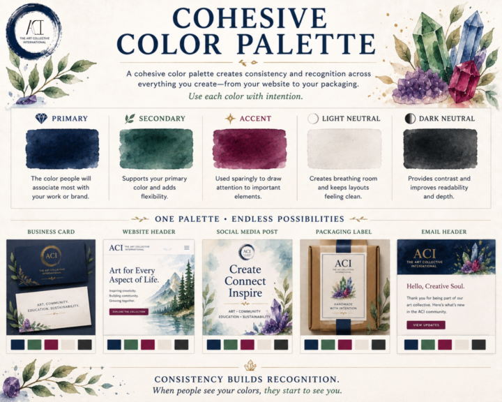
🎨 Cohesive Color Palette
A cohesive color palette isn't about limiting your creativity~ Consistency is the goal to keep everything cohesive. Whether you're designing a website, packaging your artwork, building a portfolio, or posting on social media, a thoughtful palette helps your work feel connected~even before someone recognizes your name. A simple palette is often all you need: 💎 Primary Color The color people will associate most with your work or brand. 🌿 Secondary Color Supports your primary color and adds flexibility. ✨ Accent Color Used sparingly to draw attention to important elements like buttons, links, or highlights. ⚪ Light Neutral Creates breathing room and keeps layouts feeling clean. ⚫ Dark Neutral Provides contrast and improves readability. You shouldn't try to use every color equally~ Aim to use each color intentionally~! When the same colors appear consistently across your website, business cards, packaging, social posts, and promotional materials, they become part of your visual identity. People begin to recognize your work before they even read your name. That's the power of a cohesive color palette~! Here's a look at an alternate version of ACI if we had taken a different direction with our brand colors. Revisiting these concepts was a lot of fun. Some of these palettes are from the very beginning of ACI, before our visual identity really started to take shape. In the end, we intentionally chose a foundation of black, white, and neutral tones with gemstone accents. Our goal was simple: let the art take center stage. We wanted our branding to frame the work~ and not to compete with it. For us~ the strongest design decision wasn't choosing more color but knowing when to use less and how~ and an image of ACI's actual brand colors and use ideas~ ^_^
🔥
2 likes • 13d
I love playing with colour harmonies and accents!!!
🔥
18d •
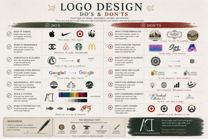
The Art of a Good Logo
A logo doesn't have to tell your entire story. It isn't your mission statement, your values, or your elevator pitch. A logo is like a signature~ Its job is to identify you clearly, consistently, and confidently. The meaning comes from everything you build around it~ your work, your reputation, your community, and the experiences people have with your brand. That's why some of the most recognizable logos in the world are also some of the simplest. When you're designing a logo, ask yourself: • Can someone recognize it at a glance? • Will it still work at the size of a favicon and on a storefront? • Does it still make sense in black and white? • Is it memorable because of its shape, not just its color? • Will it still feel relevant in ten or twenty years? A great logo doesn't have to be the loudest in the room~ I can be the one that quietly becomes familiar through years of good work. Design with intention~! Build for the long run~!
🔥
3 likes • 18d
I was making mine too detailed like miniature art but then realized when I did the favicon how much better it reads as a simple linear drawing
🔥
2 likes • 17d
@Christopher Foster love it

24d •
New Art Material Obsession
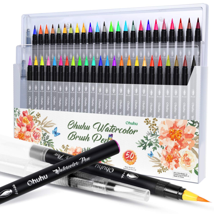
I've been really into watercolor for quite some time now, but lately I've been feeling ready to experiment and branch out into other mediums alongside it. My two current obsessions are Ohuhu watercolor brush pens and non-shake acrylic brush pens. The watercolor brush pens allow me to achieve concentrated color and fine details that can be more difficult to control with a traditional paintbrush. The acrylic brush pens have been fantastic for highlights and foreground details because they can be applied over watercolor without disturbing the layers underneath. One thing I've especially enjoyed about the non shake acrylic pens is their thicker paint consistency. They tend to provide more uniform coverage and are less prone to bleeding, making them great for those final finishing touches. What art material have you been obsessed with lately? 🎨
🔥
2 likes • 23d
nice shares!!!
1-10 of 51

🔥
@brenda
https://oneseedwonders.ca/ where creative process is highly featured in sustainable & regenerative daily practice
Active 13m ago
Joined Jul 10, 2025
Toronto