Activity
Mon
Wed
Fri
Sun
May
Jun
Jul
Aug
Sep
Oct
Nov
Dec
Jan
Feb
Mar
Apr
What is this?
Less
More
Owned by Ambeck
A transformation Faith-Based AI + Creativity Haven for Women New to the Digital space, gain clarity, build digital products with AI, and earn income.
Memberships
Indigo AI
12 members • Free
THE DIRECTORS EYE ™
245 members • $97
Canva Clicks
76 members • Free
Luxe Planner Society
71 members • Free
AI Automation Society
341.4k members • Free
Skill & Soul Studio
120 members • Free
Your First $5k Club w/ARLAN
27.3k members • Free
PromptBank
1.7k members • Free
SETOINOVATE Creative Solutions
32 members • Free
5 contributions to Canva Clicks

8d •
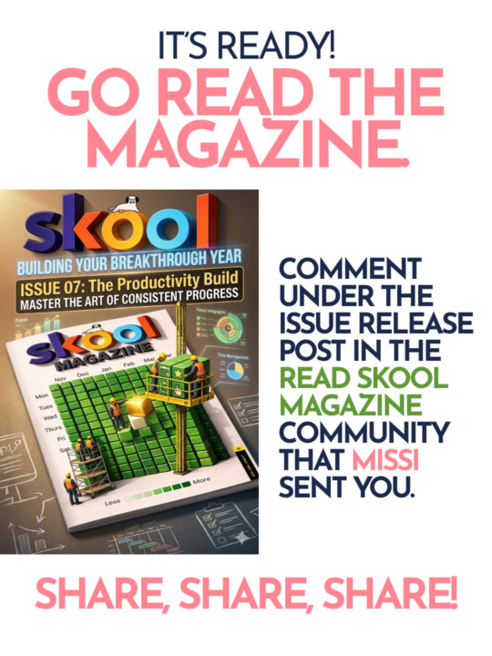
Skool Magazine Issue 7
The magazine is out yall! Please go have a read, comment on the issue 7 release post that Missi sent you, and share it in your communities if you can. Let me know if yall see any familiar faces!! (Hint, make sure you read all the way to the end of the magazine) I had the pleasure of working on this magazine with some amazing people. https://www.skool.com/read-skoolmagazine-here-5800/about?ref=d9db5bb3015d4205a4f76abfaa2d0e5d

🔥
1 like • 7d
thank you for sharing
🔥
1 like • 7d
@Missi Mullis sure i will 😊
11d •
Week 2 Challenge
🎨 Week 2 Challenge: Stop the Scroll This week we’re staying in graphic design — but we’re solving a real problem. Last week we played with color. This week we’re tackling hierarchy — and we’re doing it through one of the most powerful formats in social media: the carousel. Your challenge: Design the FIRST page of a carousel post for your product, brand, or offer. ***ADDING BC STITCHES TOLD ME TO. YOU'RE ONLY CREATING THE FIRST PAGE OF A CAROUSEL POST IN THIS CHALLENGE." The cover has one job: make someone want to swipe. Not explain everything. Not list every feature. Just stop the scroll and create enough curiosity that they have to see what’s next. Before you open Canva, pick ONE of these four approaches for your cover: 1. Pattern interrupt — grab attention so fast they can’t scroll past 2. Call out the right person — speak directly to your audience so they feel seen 3. Create curiosity — tease what’s coming without giving the answer 4. Set a clear expectation — tell them exactly what they’ll get if they swipe Pick one. Commit to it. Then build your design around it. One non-negotiable rule: Your hook — a headline, a bold question, or a powerful statement — has to dominate everything else on the page. Everything else exists to support it, not compete with it. Your cover should include: • The hook — your dominant headline, question, or statement (this is the whole challenge) • Context — one short line that tells the viewer what this is or who it’s for • CTA — something that earns the swipe, not just asks for it. Make it feel like a natural extension of your hook. Think less “swipe to read more” and more: “Swipe before you post another flyer” “Swipe if you’ve ever stared at a blank Canva screen” “Swipe — this one’s for you” The CTA should make them feel like swiping is the obvious next move. A few things to play with (try them & see which one you like best): • Size contrast — make your hook dramatically bigger than everything else • Negative space — give your hook room to breathe
🔥
1 like • 7d
@Missi Mullis ahah i know i love a challenge but carousels ahah am here for it thank you
🔥
1 like • 7d
@Missi Mullis yeah great 👍 👌
9d •
Zoom call tonight at 7
Gets get in a zoom call tonight at 7pm eastern to discuss this week’s challenge 👉 the first page of a carousel post. Where can you use carousel posts? Instagram Facebook TikTok Threads
🔥
1 like • 7d
missed it but i will ctahc up with teh recording thank you
8d •
Brag a little
Share what you’re working on - no matter what it is! I’m gonna start a menu planner for two weeks as a part of our financial budgeting here at home. It’ll be framed and hang on the kitchen/dining room wall (or maybe in my “office” since that’s where I’m at the most) What are YOU doing today?

🔥
2 likes • 7d
@Missi Mullis am seriously trying it today ahah
🔥
1 like • 7d
@Missi Mullis ill do as am loading stuff to my beacons and ill see if I can pay yvrough it and yes ill share my experience once am done
7d •
How we feeling?
👀 We’re midweek and I need to know… How’s your carousel cover coming along? Drop a comment below! 👇 • 🔥 Already submitted — I’m ready! • 🎨 Still designing but I’ve got a vision • 😅 I haven’t started yet… no judgment • 🤯 I’m stuck — send help! If you’re stuck, drop your question right here in the comments. That’s what this community is for. 🙌 And if you need help bringing it to life in Canva — just ask. We’ve got you. 🛠️ ⏰ Submissions close Sunday by 7pm EST — right before the live review on TikTok. 📬 Submit here: https://form.jotform.com/260936862197066

🔥
1 like • 7d
I came in half way I dont nnow whats going on some shared lights on the project will help thank u
1-5 of 5

🔥
@ambeck-sabi-5363
A Woman called to serve, A MHP, A Woman blessed with different talents and by the Grace of God ,honing them all to make a difference be a blessing🙌
Active 1h ago
Joined Apr 13, 2026
UNITED KINGDOM