
6d •
New Community
Hey yall! I've got the new community up! It officially launches Aug 3, 2026 I'm giving everyone the opportunity to go ahead and get in at a reduced rate before the launch date. Once the community launches officially, there will be a price increase for new members! If you want in here's the link! https://www.skool.com/canva-with-missi-8632/about Hope to see you there, ready to learn Canva click by click - from scratch!

Jun 15 •
Community Update
I took a break last week (much needed!) I’ve decided to close the community for now. I’m rebuilding, but I needed to get back in alignment with myself. Thank you for all your support. It means a lot to me ♥️♥️♥️ If you are a premium member please cancel your subscription, & check your inbox soon to hear from me. Love, Missi 🫶🏼
May 27 •
Logos
Will you be attending my branding classes? Whether you need to build your brand, revamp it, or completely overhaul your brand.. You don’t want to miss Branding Tuesdays! I want to get you inspired. Get your creative cap on and check out this logo creator on IG, then come back and let me know … what does your logo say about your brand? https://www.instagram.com/sarjoey
May 29 •
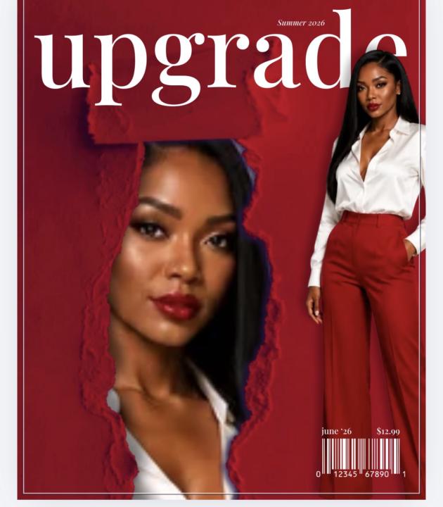
Challenge?
How are those magazine covers coming along? Here’s mine so far! Share what you’ve got if you want to ♥️ There’s replays available if you’d like to watch them
Jun 7 •
🚨 Premium Modules Closing! 🚨
The premium modules will be closing tonight at 6pm! What that means? You still have us here in the community to answer questions and learn, but to access premium modules you will need to be on the premium tier 🫶🏼

1-30 of 89
powered by
skool.com/the-canva-curriculum-6147
Learn Canva with hands-on training, weekly events, templates, a free eCourse & tools to make your brand stand out.
Suggested communities
Powered by