Activity
Mon
Wed
Fri
Sun
Aug
Sep
Oct
Nov
Dec
Jan
Feb
Mar
Apr
May
Jun
Jul
What is this?
Less
More
Memberships
One Seed Wonders Community
31 members • Free
Perennial Life Planning
32 members • Free
Crap Academy
183 members • Free
Cre8tiv Collective
67 members • Free
Chunky Glitter’s Sparkle Skool
49 members • Free
Shopify Growth Collective🥂
984 members • Free
TheArtCollectiveInternational
87 members • Free
184 contributions to TheArtCollectiveInternational

🔥
3d •
🎨 WIP Wednesday
Let’s see what you’re working on~! It doesn’t have to be finished~ It doesn’t have to be polished~ It doesn’t even have to be going well~! Sketches. Paintings. Sculptures. Digital work. Photography. Fiber arts. Woodworking. Jewelry. That project you’ve restarted three times… it all counts~! Share what you’re making, tell us where you’re at, and if you’re stuck on something, ask. Sometimes a fresh set of eyes is all it takes to get moving again. Progress is still progress~even when it’s messy~! Progress over perfection~! Drop your work in the comments. I’d love to see what everyone has on their desk this week. 🎨✨

1 like • 15h
Working on a lotus bookmark! Had an idea to add some nice shimmer ambiance. Excited to lay down the color palette and bring it to life!
1 like • 14h
@Hansheng Lee Thanks I'll be sure to share when I'm done!
🔥
3d •
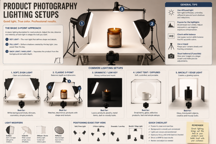
Product Photography Lighting and Set Up
It’s Less About Your Camera, More About Your Light. A common misconception I see is people think is that they need an expensive camera to take good product photos. Its 2026 and most of our cameras can do more now than our older cameras (not everything~! But for product photos, it is enough.). You really don’t~ A phone with good lighting will almost always beat an expensive camera with bad lighting. You are not just trying to make your product brighter~ think about how to show its shape, texture, color, and craftsmanship. Here are a few basics to get you started: 💡 Key Light This is your main light. It creates the overall look of your product and defines its form. I usually place it at about a 45° angle and slightly above the product. 💡 Fill Light This softens harsh shadows created by your key light. It doesn’t have to be another light~ you can often use a white foam board or reflector to bounce light back onto your product. 💡 Back (or Rim) Light This helps separate your product from the background and gives it a little extra depth. It’s especially helpful for darker products. 📦 Use Diffused Light Harsh, direct light creates hard shadows and blown-out highlights. A softbox, light tent, diffuser, or even a sheer white curtain over a window can create much softer, more flattering light. 🎨 Keep Your Background Simple Your product should be the star. A clean white, black, gray, or neutral background works for most products without competing for attention. 📸 Use a Tripod Keeping your camera steady lets you use lower ISO settings for cleaner images and makes it easier to keep every photo consistent. ✨ Take More Than One Photo Try moving your lights a few inches. Raise them. Lower them. Rotate your product. Tiny adjustments can completely change the mood of a photograph. Whether you’re selling paintings, ceramics, candles, jewelry, woodworking, stickers, or handmade goods, good lighting helps people appreciate the work you’ve already put into creating it. You don’t need a professional studio to get started.
3 likes • 3d
This is definitely the biggest thing I'm currently struggling with. Thanks for sharing this information! Unfortunately I do not have the proper equipment 😭 I think my wallet is already crying 🤣
3 likes • 3d
@Hansheng Lee Can't wait! Thank you!

8d •
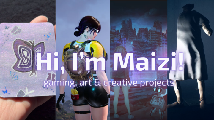
Capturing my channel in a short intro
I recently updated the intro video that new viewers see on my YouTube channel, and it turned into more of a creative challenge than I expected. The hardest part wasn’t editing. It was figuring out how to capture what Maizi is in such a short amount of time. I know the usual advice is to focus on one topic or create separate channels for different interests. I’ll be honest… I don’t have the energy to manage more than one channel. 😭 After a lot of brainstorming, I realized it made more sense to keep everything together. Gaming is still the main focus, but I also wanted the channel to reflect the other creative things I enjoy, like art, editing, vlogs, and behind-the-scenes projects. I’d love to hear your first impression. Does the thumbnail and intro communicate that balance, or is there anything you’d change?
2 likes • 4d
I’m so glad you finally made your intro video! It really captures the heart of what you’re trying to create and gives people a wonderful introduction to your channel. It’s been so much fun watching you grow as a creator, and I can see your confidence and quality improving with every video. Keep up the amazing work! I’m so proud of you! 💜
🔥
7d •
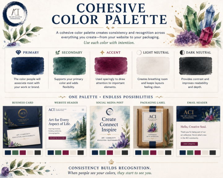
🎨 Cohesive Color Palette
A cohesive color palette isn't about limiting your creativity~ Consistency is the goal to keep everything cohesive. Whether you're designing a website, packaging your artwork, building a portfolio, or posting on social media, a thoughtful palette helps your work feel connected~even before someone recognizes your name. A simple palette is often all you need: 💎 Primary Color The color people will associate most with your work or brand. 🌿 Secondary Color Supports your primary color and adds flexibility. ✨ Accent Color Used sparingly to draw attention to important elements like buttons, links, or highlights. ⚪ Light Neutral Creates breathing room and keeps layouts feeling clean. ⚫ Dark Neutral Provides contrast and improves readability. You shouldn't try to use every color equally~ Aim to use each color intentionally~! When the same colors appear consistently across your website, business cards, packaging, social posts, and promotional materials, they become part of your visual identity. People begin to recognize your work before they even read your name. That's the power of a cohesive color palette~! Here's a look at an alternate version of ACI if we had taken a different direction with our brand colors. Revisiting these concepts was a lot of fun. Some of these palettes are from the very beginning of ACI, before our visual identity really started to take shape. In the end, we intentionally chose a foundation of black, white, and neutral tones with gemstone accents. Our goal was simple: let the art take center stage. We wanted our branding to frame the work~ and not to compete with it. For us~ the strongest design decision wasn't choosing more color but knowing when to use less and how~ and an image of ACI's actual brand colors and use ideas~ ^_^
1 like • 4d
Color is so important and can communicate so much. This post really puts into perspective how important the language of color is.
🔥
6d •
🎨 Prompt Me: Resist
Work of the Week~ Resist Art has ALWAYS been an act of resistance~ Resistance against forgetting~ Against silence~ Against conformity~ Against the idea that beauty, truth, or humanity should be sacrificed for convenience~ Resistance can be loud~ Other times~ it's quiet. And occasionally it's~ Painting anyway Writing anyway Creating anyway, creating inspite of~ Every artist eventually chooses what they're willing to resist~ and what they're willing to stand for~ Throughout history, artists have resisted with paint, clay, ink, thread, music, photography, and film~ not always by fighting against something, but by choosing to create something worth preserving. What does resistance mean in your creative practice?
2 likes • 4d
@Maizi. Exe I feel like we are raised to think resistance is a bad thing. In reality it’s necessary for growth in so many ways!
1-10 of 184

@christopher-foster-8277
Illustrator, graphic designer, miniature artist. Finding inspiration in the garden one day at a time 🌿 VP at The Art Collective International
Active 9h ago
Joined Jul 12, 2025
virginia