
Pinned

Jun 23 •
Welcome to The Small Business 500. Here's why we built it.
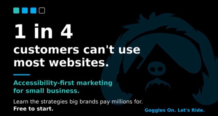
Most small business websites quietly turn customers away. The contrast is too low to read, the text too small, the menus don't work with a keyboard or screen reader. The owner never sees it. They just wonder why traffic isn't converting. Here's what nobody talks about: 1 in 4 people live with a differing ability. That's 1 in 4 of your potential customers hitting a wall on a site that wasn't built with them in mind. Leave them out and you don't just lose a sale, you lose someone who would have come back and told their friends. We built this community because accessibility shouldn't be a luxury only big brands can afford. It should be the foundation every small business starts on. And the same things that make a site work for everyone make it faster, clearer, and better at converting. Accessible and profitable point the same direction. What you get here, free: Every week we run a live call and break down one real, doable step to grow your business and make it more accessible at the same time. Plain English, no jargon, no compliance scare tactics. Just something you can knock out that week, plus a room full of owners who care about doing this right. Your first two steps: 1. Comment below and introduce yourself. What do you do, and what's the one thing you wish your website did better? 2. Get to the next weekly call. That's where the momentum is. When you're ready to have it done for you, our Full Send tier is where we build your custom, accessibility-focused website. No rush. Start free, learn the strategy, and that door is there when you want it. Welcome. We're glad you're here. Goggles On. Let's Ride.
0
0
5h •
Headings: How Screen Readers Read Your Page
Think about how you read a newspaper. You do not read every word. You scan the big headlines, find the story you want, and dive in. Headings on your website work the same way, and for some visitors they are the only way to navigate at all. Getting them right helps everyone. Here is what to know. 1. Headings are your page outline. Good headings act like the table of contents for a page. They break your content into clear sections a reader can scan. Before anyone reads a single paragraph, your headings tell them what the page covers. 2. Screen readers jump between them. Some visitors use a screen reader, software that reads a page aloud. These visitors often jump from heading to heading to find what they need, the way you scan headlines. If your headings are clear, they can navigate. If there are none, they are stuck reading everything in order. 3. Use real headings, not just big bold text. This is the common mistake. People make a line big and bold and think it is a heading. It looks like one, but the software does not know it is one. Your website builder has a real heading style. Use that, so the structure is truly there, not just for show. 4. Keep a logical order. One main title at the top, then sections underneath in a sensible order. Do not skip around or use heading styles just because you like how they look. A clean order helps machines and people follow your page. 5. Clear headings help everyone. Good headings let a busy customer skim and find the part they care about. They also help Google understand what your page is about and how it is organized. One habit, several payoffs. Quick check: look at a page on your site. Can you understand the whole thing just by reading the headings? If yes, you are on track. If not, tighten them up. Goggles On. Let's Ride.
0
0
3d •
The One Clear Answer Rule for AI
AI tools and Google both want the same thing when they read your page: one clean answer they can lift and show to a customer. If your answer is buried under a wall of fluff, they cannot find it, so they skip you and pick the site that made it easy. Making it easy is not hard. Here is the one clear answer rule. 1. Put the answer first. When you address a question, give the answer in the first sentence or two. Do not warm up, do not set the scene, just answer. The details can come right after. Answer first, explain second. 2. Do not bury it in fluff. Long, flowery introductions push the answer down the page where machines and busy people miss it. Cut the throat clearing. Every extra sentence before the answer is a chance to lose the reader. 3. Use plain language. Write the answer the way you would say it to a customer across the counter. Skip the industry terms. A plain, direct answer is the kind that gets picked up and quoted. 4. This wins featured spots. When your answer is clean and up front, Google is more likely to feature it in that highlighted box at the top, and AI tools are more likely to quote you. That is free visibility going to the clearest answer, not always the biggest business. 5. See the difference. Before: "There are many factors that go into how quickly a plumber can arrive, and every situation is unique, but rest assured we care deeply about your needs." After: "We usually arrive within two hours for emergencies. Here is how our scheduling works." The second one answers the question. The first one wastes everyone's time. Simple rule: answer in the first two sentences, then explain. Read your top page and ask whether a stranger gets the answer right away, or has to dig for it. Goggles On. Let's Ride.
0
0
3d •
Replay: Is Your Website Built on Solid Ground?
Monday's call replay is up in the Classroom under Weekly Call Replays, "Sep 28th - Replay." Melissa walked the whole accessibility foundation: the checks every site should pass before anything else gets added on top. THE CHECKS 1. Put the mouse down and press Tab (2:11) The first press should show a "Skip to main content" link. Every press after, you should see exactly where you are. Reach the menu, the Book Now button, and the form, and get back out. 2. Do you have an accessibility statement? (4:40) Look in your footer. A good one says you care in plain words, names the guidelines you work toward, admits what is not perfect yet, gives a real person with a phone number and email, and shows the date it was last reviewed. Free starting point: w3.org/WAI/planning/statements/generator 3 and 4. Zoom to 200 percent, then listen for 30 seconds (7:46) Command and plus on a Mac, Control and plus on Windows. Then turn on the screen reader already on your computer: Command F5 on a Mac, Control, Windows, and Enter on Windows. 5. Forms and color (10:36) Labels that stay put while you type, errors that name the problem, and color never the only signal. THE SCORECARD (12:42) Ten yes or no questions. Fewer than 7 is not a failing grade. It is your to-do list, in order. LIVE ON EGMERMARKETING.COM (14:35) Tabbing through a real site, zooming it, and walking through its accessibility statement. Want a quick look at your own site? Free scan: accessibility.egmermarketing.com HOMEWORK Score your site on the ten questions and post your count below. No statement yet? Draft one with the free generator. Question for the room: which of the ten surprised you? Goggles On. Let's Ride.
0
0
9d •
Captions: Don't Lose the Sound Off Crowd
Picture someone scrolling their phone in a quiet waiting room or a noisy break room. They land on your video. The sound is off, and they are not turning it on. If your video only works with audio, it just lost that viewer in a second. Captions fix that, and they do more than you think. Here is why they matter. 1. Most people watch with the sound off. This is just how phones are used now. People scroll in bed, at work, on the bus, all with the sound muted. Captions let them follow every word without ever tapping the volume. No captions means no message got through. 2. They help customers who cannot hear. Some of your customers are deaf or hard of hearing. Captions are how they get your message at all. It is a small kindness that opens your business to more people, and it is simply the right thing to do. 3. Auto captions are only a start. Most phones and platforms can generate captions automatically. That is a helpful first draft, but it makes mistakes, especially with names, trade terms, and town names. Read them over and fix the errors before you post. Sloppy captions look worse than none. 4. Add them everywhere you post video. Put captions on your social videos and on any video living on your website. Wherever a customer might watch you, make sure they can follow along in silence. Consistency means nobody gets left out. 5. Captions give Google text to read. Here is a bonus. The words in your captions are text, and text is something search engines can read. That helps them understand what your video is about. A caption serves the viewer and the search engine at once. Quick check: open your last video and turn the sound all the way down. Can you still follow it? If not, add captions and clean up the errors before you share it again. Goggles On. Let's Ride.
0
0
1-30 of 46
powered by
skool.com/the-small-business-500-3834
Stop riding blind. Where local businesses go from invisible to booked. See clearly, get seen, and ride with owners doing the same.
Suggested communities
Powered by