
Feb 11 • 📊 Learning & Technique
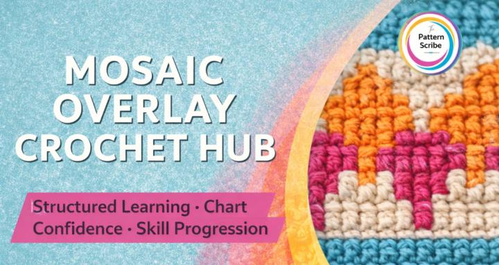
A Small Chart Detail That Changes Everything
Do you see how the front loop double crochets stack vertically?
That’s what creates the clean “column” effect in overlay mosaic.
Once you understand that logic, charts stop feeling random — and start feeling structured.
Does anyone else look for vertical flow first when reading a chart?
1
2 comments
A Small Chart Detail That Changes Everything
powered by
skool.com/the-pattern-scribe-8072
A hub for crocheters who want clarity, control and deeper learning in mosaic overlay crochet design.
Suggested communities
Powered by