
Pinned

May 19 •
Personality type + color season: building the data set
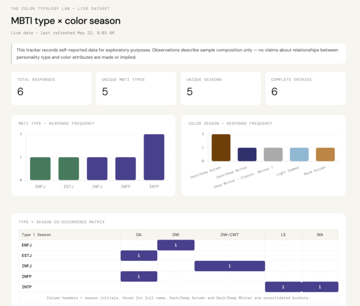
📊 UPDATE: You can now add your entry directly to the live tracker at mbti-color-season.netlify.app — just scroll down to the entry form. The dataset and charts update in real time! ________________________________________________________________________________ Many of you have already shared your type and season somewhere in the group (the welcome thread, comments, DMs). I'm asking you to drop it here again so I can have it all in one place and start looking at patterns. 👩🎓🔍 What I hope to explore, to start, is whether type correlates with anything measurable on the color side (or vice versa). I'll share patterns back with the group as the data set builds and use what comes in to shape the next round of research questions. If you have a pattern you're curious about, drop it in the comments. This is a collective effort. 🧪 The grid starts here. In the future, I will tag new members here so they can continue to add to the data. Drop your information below using this format: MBTI type | color season | any contested or alternate results Example: ESTJ | Dark Autumn | also tested as Deep Winter 👇 If you only have one of the two, drop what you know. Partial data still counts.
19h •
Favorite Color to Wear?
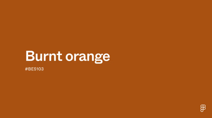
Hi all! Slowing down today and, for those that know their best color attributes, thought it would be fun to share out favorite color to wear. Share your season or tonal combination and a swatch of your favorite color. I will go first. As a Dark Autumn who can borrow from Deep Winter, my favorite color to wear is a burnt orange. And yes, this is a proof point towards the idea you often subconsciously already know your "season." Burnt orange is a deep, warm shade that combines the vibrancy of orange with a subtle infusion of brown, giving it a rich, earthy quality. It's positioned in the red-orange side of the color wheel, exuding a sense of energy and enthusiasm while maintaining a cozy and inviting feel. https://www.figma.com/colors/burnt-orange/
3d •
What's happening IRL
Hi all! I know I just threw out a bunch of new posts this morning. I've been missing being more active in here and finally had the time to get back in. In fact, I have been so engrossed that it is 11 am EST and I am still sitting here in my bathrobe happily typing away thinking about personality and color. With a slight break to discuss S corps and estimated taxes with my new tax accountant. I'm hoping to get some time today to continue my Personality Hacker's Profiler training modules. If so, I am sure I will be back posting about some new "a ha" moment in share here. Let me know what your IRL looks like right now!
3d •
Color Attribute Explorer: what changed since launch
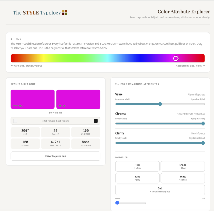
The launch landed about where I'd hoped: useful enough to be worth people's time, with plenty of room left to keep building. @Kiersten Emmi put it well when she called the vocabulary section a goldmine and admitted she'd never heard of "toasted" as a color modifier before trying this. That's basically the whole reason the tool exists: most of the words people in color analysis use constantly (bright, muted, soft, burnished) get handed to you without ever being precisely defined. At the end of the day, that's probably a fair description of why this Skool group exists too. My ESTJ side has never been able to just accept a term at face value. I want to understand and implement the concept, not just have the word. Here's what changed in the few weeks since this landed in the Classroom: - Temperature slider. Nudge any selected hue warmer or cooler within its own hue family. A warm blue pulls toward violet, a cool blue pulls toward teal, same hue family, different temperature. - Hex code input. @Mary Molle asked directly for this: "I wish I could enter a hex code in the tool." Now you can, instead of being limited to the pure hues in the original picker. - Color analyzer. Enter any hex code, a garment color, a paint swatch, whatever you're trying to place, and get a breakdown of value, chroma, clarity, and temperature, plus a tentative season estimate. One caveat: this reads a garment color, it doesn't diagnose you. A few things are still in motion based on what's already come up in the comments, worth naming now so you can weigh in before any of it is locked in: - A glossary mapping the typical attribute ranges for each of the 16 subseasons is coming, so you can see roughly where a subseason tends to fall on value, chroma, clarity, and temperature instead of just seeing a name attached to it. - The vocabulary reference page is getting a few more entries, starting with luminescence. If there's a term you've run into that doesn't have a clean definition yet, this is the place to flag it. - The pure hue reference still shifts when you move the temperature slider. That's a bug, not a feature, and it's on the list to fix.
1
0
26d •
Introducing the Color Attribute Explorer
A new tool just landed in the Classroom! The Color Attribute Explorer lets you select any pure hue and adjust value, chroma, and clarity independently. See exactly what each attribute does in isolation rather than just reading about it. It also includes five modifiers: tint, shade, tone, toast, and dull. When you apply any of them, ghost indicators appear on the sliders showing which attributes are shifting and why. There is an explanation panel for each one that gets into the actual mechanism (including why tinting and shading are not simply opposites, and why toasting a cool hue also dulls it). At the bottom of the tool there is a full color vocabulary reference. Every term you have probably encountered in color analysis (bright, muted, soft, burnished, jewel-toned, earthy) is translated into its precise attribute definition. The Soft vs Muted entry is worth reading on its own. Find it in the Classroom under Color Attribute Explorer. Go play with it! This is a first version and I would love your feedback. What would make it more useful to you? What's missing, what's confusing, what do you want to be able to do that you can't do yet? Drop it in the comments.
1-29 of 29
powered by
skool.com/the-color-typology-lab-7535
Exploring personality type and the implementation of personal color analysis results. MBTI, Enneagram, OCEAN, and color frameworks.
Suggested communities
Powered by