
15d • General discussion
The "Invisible" Mistake in Modern Color
Here's what a 14-year-old taught me about color grading:
I was watching Die Hard (1988) with my nephew over Christmas.
He paused and said: "Uncle Kazi, it feels like they didn't even grade this movie. It just feels so realistic."
A kid who grew up on Spider-Man and Fortnite noticed something most professionals miss:
The best color grading is invisible.
Walter Murch said the same about editing—"the best edit is the one you don't see."
Meanwhile, modern films like Ip Man 4 and Wicked look like someone smudged the screen. Over-saturated. Washed out. Weirdly stylized when the story doesn't call for it.
Die Hard? 35mm Panavision. Lit properly. Minimal intervention.
The skin tones look like skin. The blacks are black. My eyes believe what they're seeing.
The takeaway: Match your grade to your genre.
→ Drama? Stay neutral and invisible. → Fantasy (Dune, Euphoria)? Go wild. → Period piece? Let the story breathe.
Stop chasing looks. Start chasing authenticity.
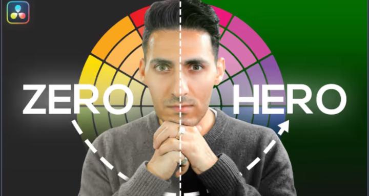
Full breakdown in my latest video ↓
✅ Why 1988 Die Hard looks more "real" than 2019 Ip Man 4
✅ The Walter Murch principle: invisible editing (and grading)
✅ When stylized grading works (Dune, Euphoria, Severance)
✅ When neutral grading is the right call (dramas, period pieces)
✅ Quick examples of choosing the right look for your project
1
0 comments
The "Invisible" Mistake in Modern Color
powered by
skool.com/the-color-grading-vault-3449
Your Complete Color Grading Knowledge Base. QazVerse
Suggested communities
Powered by