
Jan 16 • General discussion
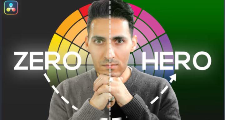
5 Color Grading Mistakes Destroying Your Commercial Work (With Solutions)
Introduction: The $10,000 Mistake
Picture this: You just landed your biggest commercial client yet. The shoot went flawlessly. The footage looks crisp. You spend hours perfecting every frame in DaVinci Resolve. You hit export, send it over, and... crickets.
Then comes the email: "This doesn't quite match our brand vision. Can we try a different direction?"
Sound familiar?
Here's the brutal truth: Most colorists aren't losing clients because of bad technical skills. They're losing them because of avoidable color grading mistakes that scream "amateur hour."
After 15 years working with brands like Adidas, Amazon Prime, and Universal Studios, I've seen (and made) every mistake in the book. The good news? Once you know what to avoid, fixing your workflow is easier than you think.
Let's dive into the 5 biggest color grading mistakes destroying commercial work—and exactly how to fix them.
1️⃣ Mistake #1: Treating Every Project Like a Blockbuster Fantasy Film
❌ The Problem:
You know that gorgeous teal and orange look from every Michael Bay movie? Yeah, it's stunning. But slapping it on a skincare commercial is like wearing a tuxedo to the beach—technically impressive, but completely wrong for the occasion.
I see this constantly: colorists applying heavy stylization to projects that need authenticity. A real estate commercial doesn't need the Blade Runner 2049 treatment. A corporate interview doesn't need the Mad Max: Fury Road color palette.
Real example: Remember Hitman 4? They took a period piece—something that should feel grounded and authentic—and pushed it into this weird, washed-out, over-stylized mess. The result? It pulled viewers OUT of the story instead of drawing them in.
✅ The Solution:
Match your grade to the genre and purpose.
Here's my decision framework:
- Commercial/Corporate/Documentary: Neutral, clean, authentic. Think Die Hard (1988)—what you see is what you'd see with your own eyes.
- Fashion/Beauty: Elevated but natural. Clean whites, perfect skin tones, subtle separation.
- Product Commercials: Poppy and vibrant, but not cartoonish. The product should look exactly like it does in real life (or better).
- Fantasy/Sci-Fi/Superhero: NOW you can go wild. Dune-level stylization works here because we're creating a world that doesn't exist.
Pro tip from Qazi: Walter Murch, the legendary editor behind The Godfather and Apocalypse Now, said "the best editing is where the edit is invisible." The same applies to color grading. If your grade is distracting from the message, you've failed.
Action step: Before you touch a single node, ask yourself: "What is the PURPOSE of this piece?" Let that guide every decision.
2️⃣ Mistake #2: Destroying Your Contrast (The Grey Curse)
❌ The Problem:
Open up 90% of modern films and commercials, and you'll see the same thing: everything lives in the middle. No true blacks. No clean whites. Just... grey. Everywhere.
This is what I call "The Grey Curse," and it's absolutely killing modern cinema and commercial work.
Look at Spider-Man: Far From Home. This is a SUPERHERO movie—the epitome of fantasy—and it looks like someone shot it on an iPhone with #nofilter. Where's the punch? Where's the drama? It's flat, lifeless, and boring.
Now compare that to Misery (1988). Look at those blacks. Look at that contrast. The image has WEIGHT. It has depth. It feels real because the contrast mimics how our eyes actually see the world.
✅ The Solution:
Protect your blacks and whites like your career depends on it—because it does.
Here's what to do:
- Check your waveform monitor religiously. Your blacks should actually HIT black (or close to it). Your whites should breathe at the top.
- Use the "squint test." Squint at your monitor. If everything blends into grey mush, you've lost your contrast.
- Reference real life. Go outside. Look at shadows—they're DARK. Look at highlights—they're BRIGHT. Your grade should reflect that reality (unless you're doing fantasy).
- Avoid the "lifted blacks" trap. Yes, lifted blacks can create a specific mood, but 99% of the time, you're just making your image look washed out and amateur.
Tool recommendation: If you're struggling with contrast, check out professional color grading tools like those available at Qazverse. Having preset looks built by someone with 15 years of experience can save you from the grey curse and help you nail contrast every single time.
3️⃣ Mistake #3: Ignoring Skin Tones (The Career Killer)
❌ The Problem:
You can get away with a lot in color grading. Weird skies? Sure. Stylized backgrounds? Why not. But mess up skin tones, and your client will NEVER hire you again.
I've seen colorists push skin tones too orange (hello, Trump filter), too magenta (zombie apocalypse vibes), or too green (seasick much?). And every single time, the client notices.
Why? Because humans are hardwired to recognize faces and skin. We spend our entire lives looking at people. When skin tones are off—even slightly—our brains scream "SOMETHING'S WRONG HERE."
✅ The Solution:
Master the skin tone line, and never deviate from it.
Here's your skin tone survival guide:
- Learn the vectorscope. Skin tones should fall along a specific line (roughly 11 o'clock to 1 o'clock depending on ethnicity). If you're off that line, you're in trouble.
- Use the "would I post this on Instagram?" test. Seriously. If you wouldn't post a photo with those skin tones on social media, don't deliver it to a client.
- Check multiple skin tones in the frame. If you have multiple people, they should all feel cohesive. One person shouldn't look like they're from Mars while another looks normal.
- White balance FIRST. Before you do anything creative, get your white balance correct. This is your foundation.
- Zoom in on faces. Don't just look at the overall image. Zoom into faces at 100% and make sure skin looks natural, healthy, and clean.
Real-world example: In Die Hard, Bruce Willis's skin tones are PERFECT. You're looking at him with your own eyes. There's natural warmth from the room lighting, but his skin looks exactly like skin should look. That's the standard.
Pro colorist secret from Qazi: When working on beauty or skincare commercials, I always create a dedicated node just for skin. This lets me perfect skin tones independently from the rest of the image. Game changer.
4️⃣ Mistake #4: Over-Saturating Everything (The Fortnite Effect)
❌ The Problem:
More color = better, right? WRONG.
I call this the "Fortnite Effect"—where colorists think cranking saturation to 11 makes their work more "cinematic" or "professional." Instead, it makes your commercial look like a video game cutscene.
Look at Wicked (2024). This is a movie that SHOULD be bursting with color. It's literally about a magical land with yellow brick roads and emerald cities. But instead, it looks like someone smudged Vaseline on the lens and called it a day. The colors are there, but they have no weight, no punch, no life.
Now flip to The Wizard of Oz (1939)—the FIRST color film ever made. Those colors POP. They're vibrant, they're bold, and they're BEAUTIFUL. And it's from 1939!
✅ The Solution:
Saturation is a scalpel, not a sledgehammer.
Here's how to use color properly:
- Selective saturation is your friend. Don't push saturation globally. Instead, target specific colors that need emphasis (like a product in a commercial).
- Desaturate to emphasize. Sometimes the best way to make something pop is to desaturate everything ELSE around it.
- Check your parade scopes. If your RGB channels are clipping or maxing out, you've gone too far.
- Use the "real life" test. Does that red shirt look like a red shirt you'd see in real life? Or does it look like someone spilled Kool-Aid on the footage?
- Remember: Contrast > Saturation. A well-contrasted image with moderate saturation will ALWAYS look better than a flat image with pumped-up colors.
Quick win: Instead of pushing saturation, try increasing contrast first. You'll be amazed how much more "colorful" your image feels without touching the saturation slider.
5️⃣ Mistake #5: Not Having a Consistent Workflow (The Time Killer)
❌ The Problem:
You're reinventing the wheel on every single project. One day you're building looks from scratch in DaVinci Resolve. The next day you're downloading random LUTs from the internet. The day after that, you're trying to recreate that look you did three months ago but can't remember how you did it.
Sound exhausting? That's because it is.
Here's the reality: In 2026, clients aren't paying you to build looks from scratch. They're paying you for results—fast, professional, and consistent results. If you can't deliver quickly, they'll find someone who can.
✅ The Solution:
Build a systematic workflow with professional color grading tools.
Here's what changed my career:
- Invest in quality presets and plugins. Stop wasting hours building looks from scratch. Professional colorists use tools built by other professionals. It's not cheating—it's smart business.
- Create your own LUT library. Save your best looks. Organize them by genre (commercial, narrative, documentary, etc.). Build your arsenal.
- Use node trees as templates. Set up your standard node structure and save it. Every project should start from the same foundation.
- Batch process when possible. If you're grading 50 clips for a commercial, don't grade each one individually. Create your hero grade and apply it across similar shots.
- Learn keyboard shortcuts. Seriously. If you're still clicking through menus, you're wasting hours every week.
Real talk from Qazi: After 15 years working with Kanye, Drake, and major Hollywood cinematographers, I built my workflow around speed and consistency. That's why I created tools that let you flip a switch and move on to the next project. Because nobody has time to spend 6 hours on a 30-second commercial.
Want to work faster? Check out professional color grading plugins and tools at Qazverse that can cut your grading time in half while delivering better results.
🎁 Bonus Mistake: Not Understanding When to Break the Rules
Here's the thing about all these "rules"—they're really guidelines. And the best colorists know exactly when to break them.
When to go neutral and authentic:
- Corporate videos
- Documentaries
- Real estate
- Interviews
- Period pieces (unless there's a creative reason)
- Beauty/skincare (usually)
When to go stylized and bold:
- Music videos
- Sci-fi/fantasy films
- Superhero content
- Fashion editorials
- Anything set in a non-realistic world
The key is INTENTIONALITY. If you're breaking a rule, know WHY you're breaking it and what you're trying to achieve.
3
0 comments
5 Color Grading Mistakes Destroying Your Commercial Work (With Solutions)
skool.com/the-color-grading-vault-3449
Your Complete Color Grading Knowledge Base. QazVerse
Powered by