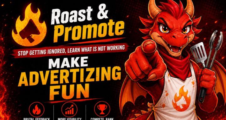
Roast my new image
Been working on an image for this community that is not bland and will make people click on it. Growth boots increased the reach here a lot, but convertion didn't follow, it's at 2% at the moment.
I'm still working on a new copy, but let's start with the image first.
This is the by the books template for cover images that work, your face on the side, the logo on the other side and a short text selling the idea bellow.
Except that I refuse to put my face here, since unlike many communities I'm not selling a funnel to my own services. I'm actually sharing that funnel with VIP members who will have the same place as I do to promote their work, be it in the classroom, "the hire a skooler" page or the live events they can host. So I'm not the center here, I'm not in the spotlight, I'm just a VIP in my own group. This is what I want to do here, and I'm actually planning another community that will have me more in the center of it.
So the face here is Roasty! He represents all of us. What do you think? Is this more clickable than the previous one?
15
32 comments

Roast my new image
powered by
skool.com/roast-promote-5332
Self Promotion done right! With feedback!
Get free posts Advertising you!
Learn by interacting!
Expose yourself to get critiques, not crickets!
Suggested communities
Powered by